- Made by AppCoda
- Contact us / Support
- Tweet this book
- Preface
- 1. The Development Tools, the Learning Approach, and the App Idea
- 2. Your First Taste of Swift with Playgrounds
- 3. Build Your First App in Swift and SwiftUI
- 4. Designing UI Using Stack Views
- 5. Introduction to Prototyping
- 6. Understanding List and ForEach
- 7. Customizing List Views
- 8. Displaying Confirmations and Handling List View Selection
- 9. Understanding Struct, Project Organization and Code Documentation
- 10. List Deletion, Swipe Actions, Context Menus and Activity Controller
- 11. Working with Navigation View
- 12. Detail View Enhancement, Custom Fonts and Navigation Bar Customization
- 13. Understanding Colors, Swift Extensions and Dynamic Type
- 14. Working with Maps
- 15. View Animations and Blur Effect
- 16. Working with Observable Objects and Combine
- 17. Working with Forms and Camera
- 18. Working with Core Data
- 19. Adding a Search Bar Using Searchable
- 20. Building Walkthrough Screens Using TabView
- 21. Working with Tab View and Tab Bar Customizations
- 22. Displaying Web Content with WKWebView and SFSafariViewController
- 23. Working with CloudKit
- 24. Localizing Your App to Support Multiple Languages
- 25. Deploying and Testing Your App on a Real iOS Device
- 26. Beta Testing with TestFlight and CloudKit Production Deployment
- 27. Submit Your App to App Store
- 28. Adopting Haptic Touch
- 29. Working with User Notifications
- 30. Appendix - Swift Basics
- Published with GitBook
Chapter 20
Building Walkthrough Screens Using TabView

If you're interested in the living heart of what you do, focus on building things rather than talking about them.
- Ryan Freitas, About.me
For the very first time launching an app, you probably find a series of walkthrough (or tutorial) screens. It's a common practice for mobile apps to step users through a multi-screen tutorial where all the features are demonstrated. Some said your app design probably fails if your app needs walkthrough screens. Personally, I don't hate walkthrough screens and find most of them pretty useful. Just make sure you keep it short. Don't take it too far to include long and boring tutorials. Here, I'm not going to argue with you whether you should or should not include walkthrough screens in your app. I just want to show you how.
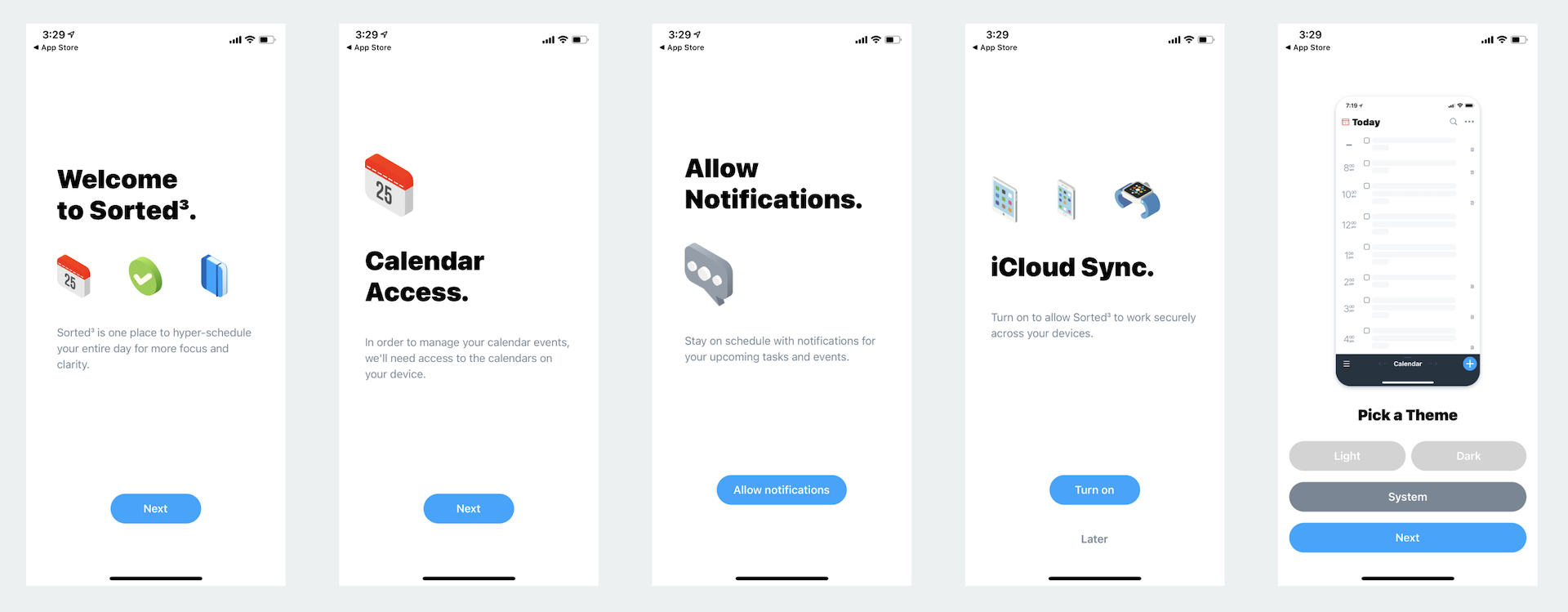
App developers don't just use walkthrough screens to show you the app features. Some apps uses a series of walkthrough screen to set up the app such as enabling notifications and choosing the color theme. Figure 20-1 shows you an example of walkthrough screens.
In this chapter, we'll discuss how to use TabView to create walkthrough screens. When I mention tab views, I guess you may think of an app with a tab bar. You can use TabView to present an interface with multiple tabs. SwiftUI's tab view allows you to do more than building a standard tab interface. By changing its style, you can easily turn a tab view into a paged scrolling view.
Let's get started.
A Quick Look at the Walkthrough Screens
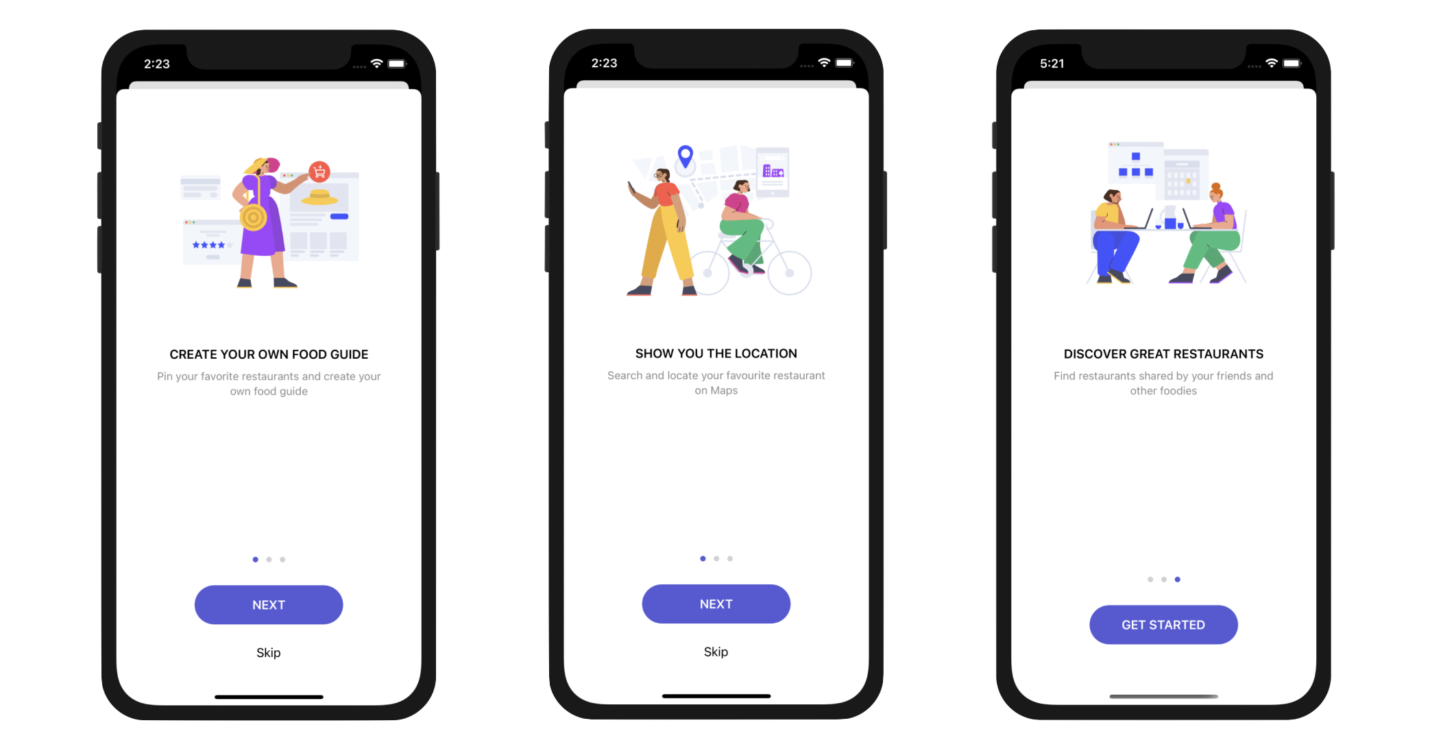
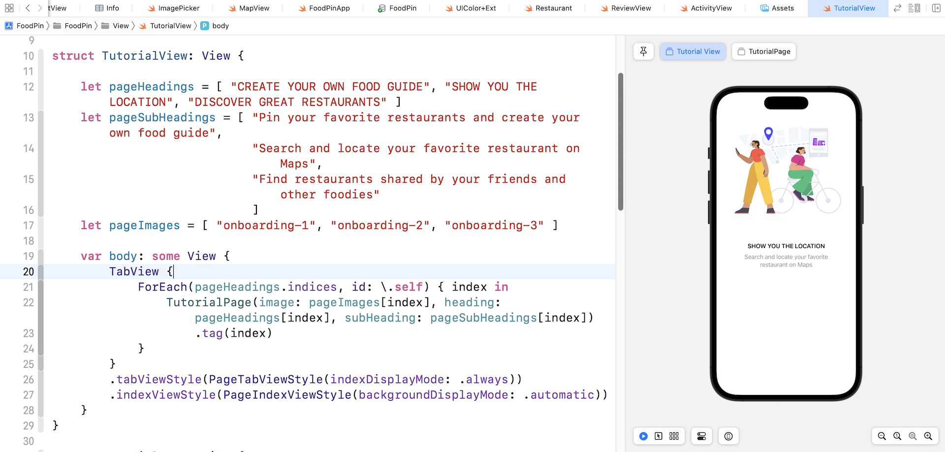
Let's have a look at the walkthrough screens. The app will display a total of three tutorial screens. The user will be able to navigate between pages by swiping through the screen or tapping the NEXT button.
In the last screen of the walkthrough, it displays a Get Started button. When the user taps the button, the walkthrough screen will be dismissed and never be shown again. At any time, the user can skip the walkthrough screens by tapping the Skip button. Figure 20-2 shows the screenshots of the walkthrough.
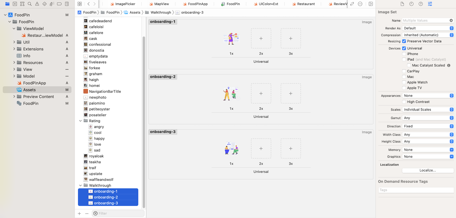
To create the screens, you need to prepare the images. First, download the image set from http://www.appcoda.com/resources/swift53/onboarding.zip and then import all the images (.svg) into the asset catalog. Please make sure you enable the Preserve Vector Data option for each of the images.
Creating the Tutorial View
As usual, we will create a separate view for the tutorial screen. In project navigator, right click the View folder and choose New File.... Select the SwiftUI View template and name the file TutorialView.swift.
For each page of the tutorial views, the layout is quite similar. So, let's create a subview named TutorialPage which displays the featured image, heading, and subheading. In the TutorialView.swift file, insert the following code snippet:
struct TutorialPage: View {

    let image: String
    let heading: String
    let subHeading: String

    var body: some View {
        VStack(spacing: 70) {
            Image(image)
                .resizable()
                .scaledToFit()

            VStack(spacing: 10) {
                Text(heading)
                    .font(.headline)

                Text(subHeading)
                    .font(.body)
                    .foregroundColor(.gray)
                    .multilineTextAlignment(.center)
            }
            .padding(.horizontal, 40)

            Spacer()
        }
        .padding(.top)
    }
}
This code is very straightforward that we use a VStack view to arrange the image, heading, and subheading. We use the Spacer() to align the components to the top part of the screen.
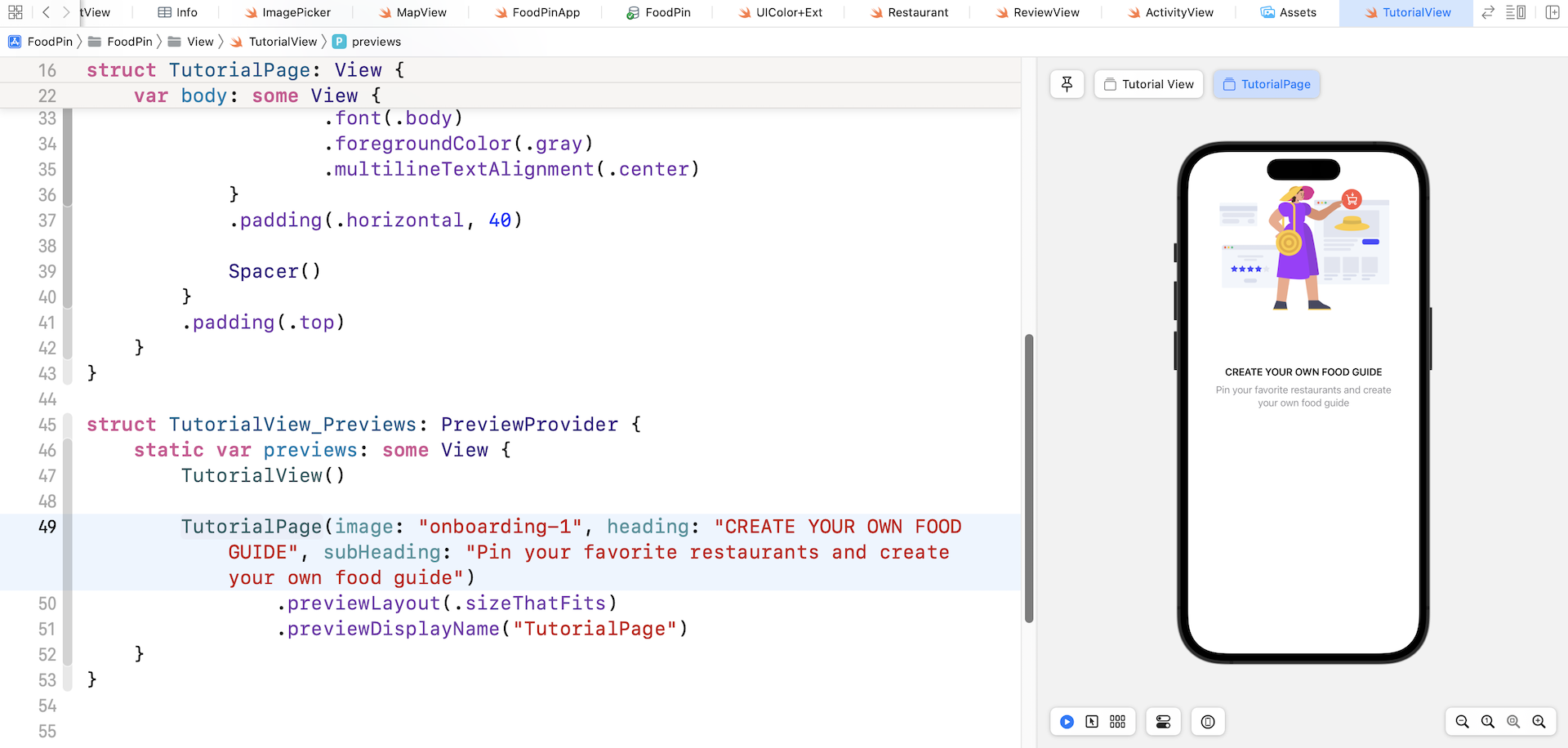
To preview the TutorialPage view, update TutorialView_Previews like this:
struct TutorialView_Previews: PreviewProvider {
    static var previews: some View {
        TutorialView()

        TutorialPage(image: "onboarding-1", heading: "CREATE YOUR OWN FOOD GUIDE", subHeading: "Pin your favorite restaurants and create your own food guide")
            .previewLayout(.sizeThatFits)
            .previewDisplayName("TutorialPage")
    }
}
By passing some test data to the TutorialPage view, Xcode should be able to render the preview.
Now that we have created the TutorialPage view, we can start to build the paging walkthrough views. In the TutorialView struct, declare the following variables to hold the heading, subheading, and images:
let pageHeadings = [ "CREATE YOUR OWN FOOD GUIDE", "SHOW YOU THE LOCATION", "DISCOVER GREAT RESTAURANTS" ]
let pageSubHeadings = [ "Pin your favorite restaurants and create your own food guide",
                        "Search and locate your favorite restaurant on Maps",
                        "Find restaurants shared by your friends and other foodies"
                        ]
let pageImages = [ "onboarding-1", "onboarding-2", "onboarding-3" ]
To create the paging scrolling view using TabView, you can update the body variable with the following code snippet:
TabView {
    ForEach(pageHeadings.indices, id: \.self) { index in
        TutorialPage(image: pageImages[index], heading: pageHeadings[index], subHeading: pageSubHeadings[index])
            .tag(index)
    }
}
.tabViewStyle(PageTabViewStyle(indexDisplayMode: .always))
.indexViewStyle(PageIndexViewStyle(backgroundDisplayMode: .automatic))
Inside the TabView, we present each page of the tutorials by using TutorialPage. The .tag modifier gives each page an unique index. To convert a standard tab view into a paged scrolling view, all you need to do is set the tab view style to PageTabViewStyle.
The indexViewStyle modifier is used to define the style of the paging indicator.
When you test the app in the preview pane, you can swipe left (or right) to navigate between pages. While we already attached the .indexViewStyle modifier and specified to display the page dots, you couldn't see the dots. The reason is that the dots are white by default.
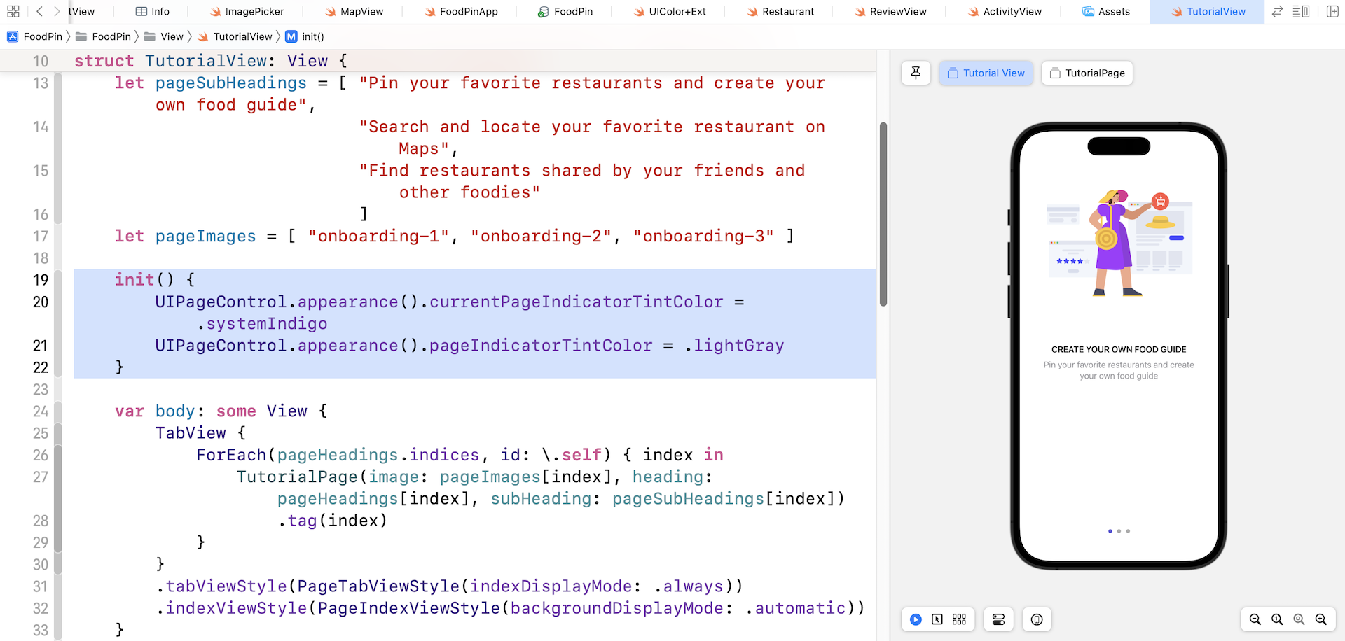
SwiftUI doesn't provide any modifier to configure the dots' color. We have to rely on the UIKit APIs. In TutorialView, add the init() method and set the page indicator's color like this:
init() {
    UIPageControl.appearance().currentPageIndicatorTintColor = .systemIndigo
    UIPageControl.appearance().pageIndicatorTintColor = .lightGray
}
We set the active dot's color to .systemIndigo and the rest of them to .lightGray. If you test the app again, you should see the page indicators.
Adding Next and Skip Buttons
There are something missing in the tutorial views, which are the Next, Skip, and Get Started buttons. When the Next button is tapped, the app navigates to the next page of the tutorial screens. How can you programmatically switch from one page to another using TabView?
The trick is to initialize TabView with the binding to the current page index. By doing so, the tab view will monitor the change of the current page index and scroll to the specified page index automatically.
Let's see how we can implement that. First, declare a state variable to keep track of the current page index:
@State private var currentPage = 0
We set the current page index to 0, which is the first page of the tutorial. Next, declare the following variable to retrieve .dismiss from the environment:
@Environment(\.dismiss) var dismiss
Later, we will use it to dismiss the tutorial view. To add the buttons below the page indicator, we wrap the TabView using a VStack. Update the body variable like this:
VStack {
TabView(selection: $currentPage) {
ForEach(pageHeadings.indices) { index in
TutorialPage(image: pageImages[index], heading: pageHeadings[index], subHeading: pageSubHeadings[index])
.tag(index)
}
}
.tabViewStyle(PageTabViewStyle(indexDisplayMode: .always))
.indexViewStyle(PageIndexViewStyle(backgroundDisplayMode: .automatic))
.animation(.default, value: currentPage)
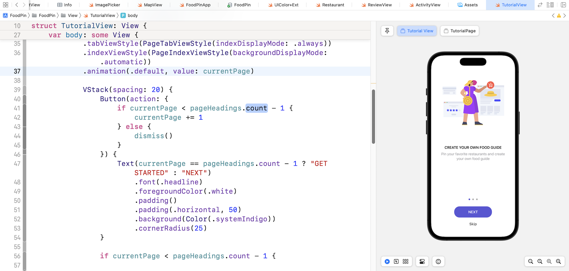
VStack(spacing: 20) {
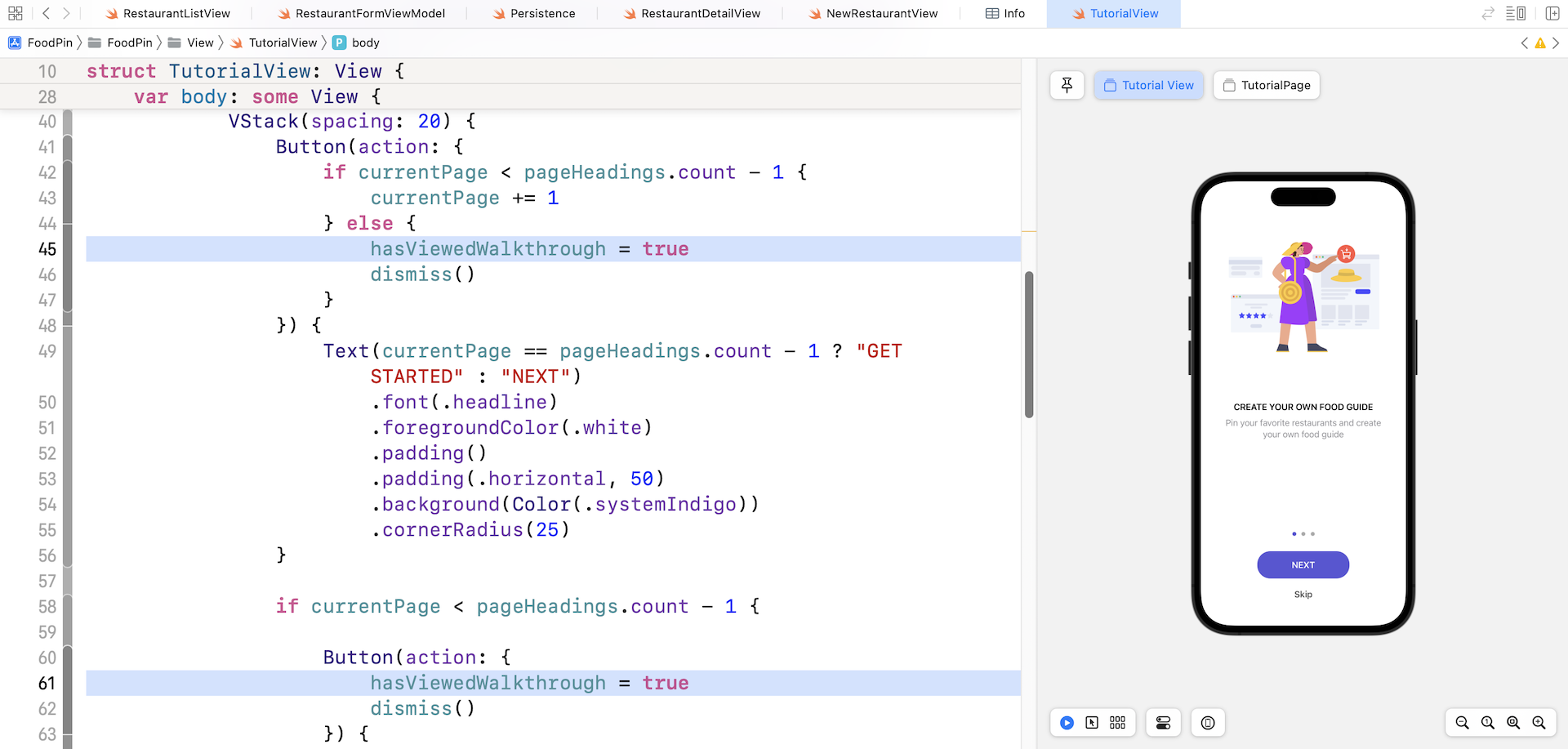
Button(action: {
if currentPage < pageHeadings.count - 1 {
currentPage += 1
} else {
dismiss()
}
}) {
Text(currentPage == pageHeadings.count - 1 ? "GET STARTED" : "NEXT")
.font(.headline)
.foregroundColor(.white)
.padding()
.padding(.horizontal, 50)
.background(Color(.systemIndigo))
.cornerRadius(25)
}
if currentPage < pageHeadings.count - 1 {
Button(action: {
dismiss()
}) {
Text("Skip")
.font(.headline)
.foregroundColor(Color(.darkGray))
}
}
}
.padding(.bottom)
}
We have a few changes in the code above:
- We instantiate the
TabViewwith theselectionparameter. The parameter takes in the binding to the current page index. By doing so,TabViewwill monitor the value change of the page index and automatically navigate to the updated page. - We added the
.animationmodifier to theTabViewto animate the page scrolling. - We have another
VStackview to arrange the buttons. First, it's the Next button. When the Next button is tapped, we increase thecurrentPageindex by1until it reaches the end of the tutorial pages. The label of this button will also be changed to Get Started when the user reaches the last page of the tutorial. - For the Skip button, it's displayed on all tutorial pages except the last one. This is why we wrap the
Buttonview with a conditional check.
Run the app in the preview to have a quick test. You can now navigate between tutorial views by using the swipe gesture and the Next button.
Presenting the Tutorial View
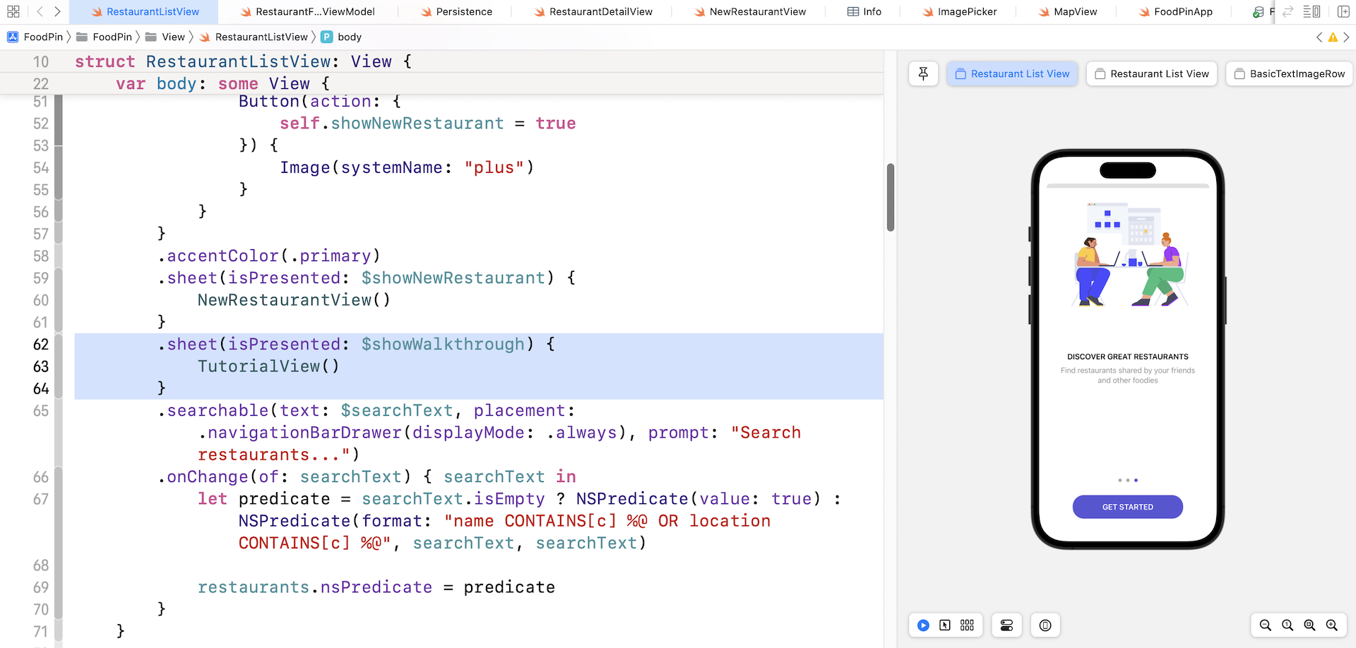
As mentioned before, the tutorial view should be brought up when a user first launches the app. So, we need to make some modifications to RestaurantListView. We will present the tutorial view using the sheet modifier.
Switch over to RestaurantListView.swift and declare a state variable:
@State private var showWalkthrough = true
This state variable indicates whether the tutorial view should be presented. Next, attach another sheet modifier to the navigation stack:
.sheet(isPresented: $showWalkthrough) {
    TutorialView()
}
Now let's run the app on a simulator to have a quick test. When the app launches, you should see the tutorial view. Cool, right?
Working with UserDefaults
Now the walkthrough is up and running. However, it's displayed over and over again. Every time when you launch the app again, the tutorial view is brought up.
In general, walkthrough or tutorial screens are displayed only when a user launches the app for the very first time. In order to do so, we need to find a way to store a status that indicates whether the user has viewed the walkthrough.
Where should we keep the status?
You've learned Core Data, so you probably want to keep the status in the local database. While this is an option, there is a simpler way to store the application and user settings.
The iOS SDK comes with the UserDefaults class for managing the user's defaults database, where you store key-value pairs persistently. The SwiftUI framework makes it even easier for developers to read and write values to the defaults database by introducing a dedicated property wrapper called @AppStorage.
To use @AppStorage, you can write the code like this:
@AppStorage("hasViewedWalkthrough") var hasViewedWalkthrough: Bool = false
This creates a new entry in the user's defaults database with the key set to hasViewedWalkthrough and the value false. SwiftUI will keep monitoring the value of hasViewedWalkthrough and update the UI accordingly. And, when we update the value, the updated value will also be written to the user's defaults database.
Now insert the code above in RestaurantListView. Base on the value of hasViewedWalkthrough, the app decides whether it should launch the tutorial view. Attach the onAppear modifier to the navigation stack:
.onAppear() {
    showWalkthrough = hasViewedWalkthrough ? false : true
}
When the list view appears, we check the value of hasViewedWalkthrough to see if we should open the tutorial view.
Also, update the default value of showWalkthrough to false because we now rely on the hasViewedWalkthrough to determine the value of showWalkthrough.
@State private var showWalkthrough = false
Now switch over to TutorialView and declare the following variable:
@AppStorage("hasViewedWalkthrough") var hasViewedWalkthrough: Bool = false
We need to update the value of hasViewedWalkthrough to true after a user reads the tutorial. Therefore, for the action closure of the Next button, insert a line of code to update the status to true:
hasViewedWalkthrough = true
You can place the code before the execution of dismiss(). The same line of code should also be added to the action closure of the Skip button (see figure 20-9).
It's time to have a test! Run the app on a simulator. You should see the tutorial screens when the app is launched.
Summary
In this chapter, we covered the basics of TabView and showed you how to make use of it for displaying paging views. Introduced in iOS 14, the @AppStorage property wrapper has made it so convenient to read and write values to the user's default system. With these two powerful features of SwiftUI, you should now understand how to create walkthrough or tutorial screens when your users first use the app.
For reference, you can download the complete Xcode project from http://www.appcoda.com/resources/swift57/swiftui-foodpin-walkthrough.zip.