- Made by AppCoda
- Contact us / Support
- Tweet this book
- Preface
- 1. The Development Tools, the Learning Approach, and the App Idea
- 2. Your First Taste of Swift with Playgrounds
- 3. Build Your First App in Swift and SwiftUI
- 4. Designing UI Using Stack Views
- 5. Introduction to Prototyping
- 6. Understanding List and ForEach
- 7. Customizing List Views
- 8. Displaying Confirmations and Handling List View Selection
- 9. Understanding Struct, Project Organization and Code Documentation
- 10. List Deletion, Swipe Actions, Context Menus and Activity Controller
- 11. Working with Navigation View
- 12. Detail View Enhancement, Custom Fonts and Navigation Bar Customization
- 13. Understanding Colors, Swift Extensions and Dynamic Type
- 14. Working with Maps
- 15. View Animations and Blur Effect
- 16. Working with Observable Objects and Combine
- 17. Working with Forms and Camera
- 18. Working with Core Data
- 19. Adding a Search Bar Using Searchable
- 20. Building Walkthrough Screens Using TabView
- 21. Working with Tab View and Tab Bar Customizations
- 22. Displaying Web Content with WKWebView and SFSafariViewController
- 23. Working with CloudKit
- 24. Localizing Your App to Support Multiple Languages
- 25. Deploying and Testing Your App on a Real iOS Device
- 26. Beta Testing with TestFlight and CloudKit Production Deployment
- 27. Submit Your App to App Store
- 28. Adopting Haptic Touch
- 29. Working with User Notifications
- 30. Appendix - Swift Basics
- Published with GitBook
Chapter 21
Working with Tab View and Tab Bar Customizations
If you're trying to achieve, there will be roadblocks. I've had them; everybody has had them. But obstacles don't have to stop you. If you run into a wall, don't turn around and give up. Figure out how to climb it, go through it, or work around it.
- Michael Jordan
The tab bar is a row of persistently visible buttons, which open different features of the app, at the bottom of the screen. Once a less-prominent UI design in the mainstream, the tab bar design becomes popular again lately.
Before the debut of the large screen devices, there were only 3.5-inch and 4-inch iPhones. One drawback of tab bars is that you sacrifice a bit of screen estate. This was really an issue for small screen devices. As Apple rolled out the iPhone 6 and 6 Plus with larger screen sizes in late 2014, app developers started to replace the existing menus of their apps with tab bars. At the time, the Facebook app switched from a sidebar menu design to a tab bar. Other popular apps like Whatsapp, Twitter, Quora, Instagram, and Apple Music also started to adopt tab bars for navigation.
Tab bars allow users to access the core features of an app quickly, with just a single tap. Though it takes up a bit of screen estate, it is worth it.
While navigation controllers let users navigate hierarchical content by managing a stack of view controllers, tab bars manage multiple view controllers that don't necessarily have a relation to one another. Normally a tab bar controller contains at least two tabs and you're allowed to add up to five tabs depending on your needs.
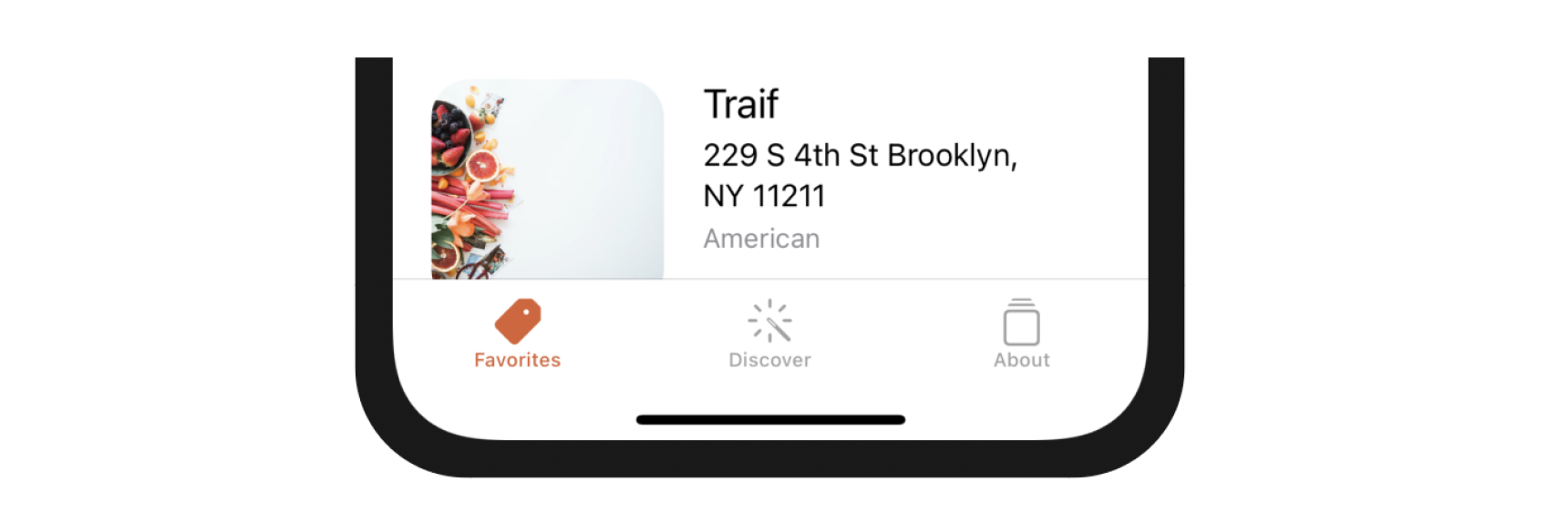
I already introduced TabView in the previous chapter. However, we configured it as a paged scrolling view. In this chapter, we will use it to create a standard tab interface as displayed in figure 21-1. We're going to create a tab bar with three items:
- Favorites - this is the restaurant list screen.
- Discover - this is a new screen to discover favorite restaurants recommended by your friends or other foodies around the globe. We will implement this tab in the iCloud chapter.
- About - this is the "About" the about screen of the app. Once again we'll keep this page blank until the next chapter.
On top of that, we will show to customize the tab bar in SwiftUI.
Creating Tab Interface Using TabView
When developing the tutorial view, we configured TabView to use the PageTabViewStyle like this:
TabView {
  .
  .
  .
}
.tabViewStyle(PageTabViewStyle(indexDisplayMode: .always))
This creates a paging scroll view that users can navigate from one page to another. To build a standard tab view, all you need to do is to omit the .tabViewStyle modifier and use the default style. Here is an example:
TabView {
   Text("Discover")
       .tabItem {
           Label("Discover", systemImage: "wand.and.rays")
       }
       .tag(1)

   Text("About")
       .tabItem {
           Label("About", systemImage: "square.stack")
       }
       .tag(2)
}
The code above creates a standard tab interface with a tab bar showing two tab items.
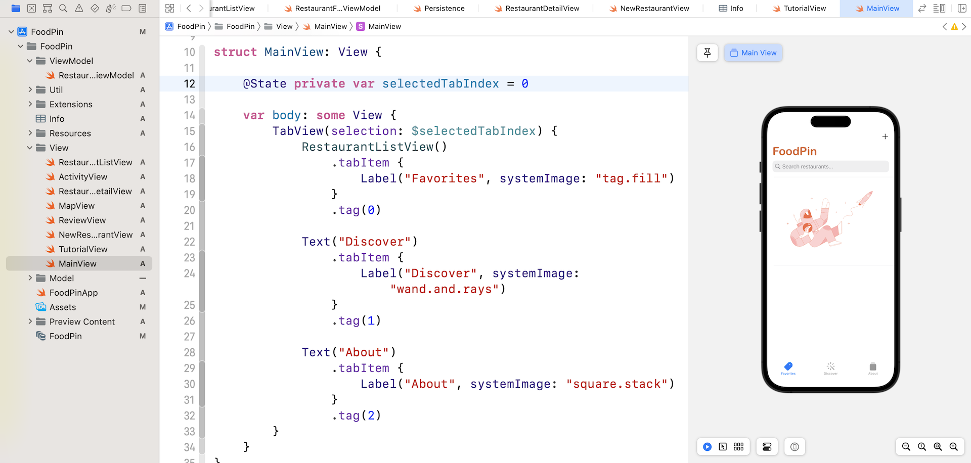
For our FoodPin project, we will create a separate file to hold the tab interface. Right click the View folder in the project navigator and choose New File.... Select the SwiftUI View template and name the file MainView.swift.
In the MainView struct, declare a state variable to hold the current tab index:
@State private var selectedTabIndex = 0
Then update the body view like this:
TabView(selection: $selectedTabIndex) {
    RestaurantListView()
        .tabItem {
            Label("Favorites", systemImage: "tag.fill")
        }
        .tag(0)

    Text("Discover")
        .tabItem {
            Label("Discover", systemImage: "wand.and.rays")
        }
        .tag(1)

    Text("About")
        .tabItem {
            Label("About", systemImage: "square.stack")
        }
        .tag(2)
}
We have three tabs for the tab view. The first tab is the RestaurantListView, while the other two are Text view. To create the tab bar UI, we wrap the three child views in a TabView. For each view, we attach the tabItem modifier to specify the name and image. The system images are from the built-in SF Symbols.
In the later chapters, we will implement the Discover and About view. Meanwhile, we just leave them as a simple text view. After the change, run the app in the preview pane and you should be able to interact with the tab bar.
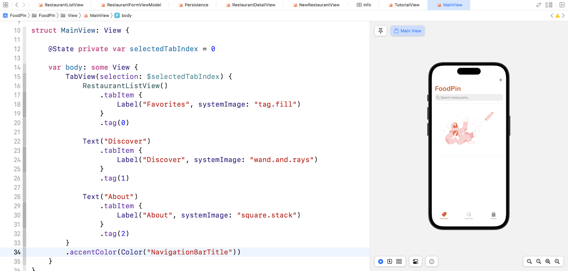
Adjusting the Color of Tab Bar Items
The color of the action tab item is in black. This is because we didn't specify the accent color for the tab view. To change the color of the active tab item, attach the .accentColor modifier to TabView:
.accentColor(Color("NavigationBarTitle"))
Try to test the app again. The tab bar should now disappear when you navigate to the detailed view.
Setting the Initial View
Assuming you follow all the code changes correctly, you should be able to preview the MainView in the preview pane. That said, if you run the app in a simulator, it will only load up the RestaurantListView because it's set as the initial view of the app.
To change that, open FoodPinApp.swift and update the body like this:
var body: some Scene {
    WindowGroup {
        MainView()
            .environment(\.managedObjectContext, persistenceController.container.viewContext)
    }
}
This is where you set the initial view of the application. Once you changed RestaurantListView to MainView, run the app on any simulators again. The app should now load the MainView instead of the RestaurantListView.
Summary
By now you should know how to create a tab UI and add new tab bar items. As you see, SwiftUI has made it so easy to embed any views in a tab view.
For reference, you can download the complete Xcode project from http://www.appcoda.com/resources/swift57/swiftui-foodpin-tabview.zip.