- Made by AppCoda
- Contact us / Support
- Tweet this book
- Preface
- 1. The Development Tools, the Learning Approach, and the App Idea
- 2. Your First Taste of Swift with Playgrounds
- 3. Build Your First App in Swift and SwiftUI
- 4. Designing UI Using Stack Views
- 5. Introduction to Prototyping
- 6. Understanding List and ForEach
- 7. Customizing List Views
- 8. Displaying Confirmations and Handling List View Selection
- 9. Understanding Struct, Project Organization and Code Documentation
- 10. List Deletion, Swipe Actions, Context Menus and Activity Controller
- 11. Working with Navigation View
- 12. Detail View Enhancement, Custom Fonts and Navigation Bar Customization
- 13. Understanding Colors, Swift Extensions and Dynamic Type
- 14. Working with Maps
- 15. View Animations and Blur Effect
- 16. Working with Observable Objects and Combine
- 17. Working with Forms and Camera
- 18. Working with Core Data
- 19. Adding a Search Bar Using Searchable
- 20. Building Walkthrough Screens Using TabView
- 21. Working with Tab View and Tab Bar Customizations
- 22. Displaying Web Content with WKWebView and SFSafariViewController
- 23. Working with CloudKit
- 24. Localizing Your App to Support Multiple Languages
- 25. Deploying and Testing Your App on a Real iOS Device
- 26. Beta Testing with TestFlight and CloudKit Production Deployment
- 27. Submit Your App to App Store
- 28. Adopting Haptic Touch
- 29. Working with User Notifications
- 30. Appendix - Swift Basics
- Published with GitBook
Chapter 4
Designing UI Using Stack Views

To the user, the interface is the product.
- Aza Raskin
I have given you a brief overview of SwiftUI and showed you how to work with some basic UI components including the vertical stack view (i.e. VStack). The first app which we have built was pretty simple. As your app UI becomes more complex, you will need to use different types of stack views to create the user interface. Most importantly, you need to learn how to build a UI that fits all screen sizes.
In this chapter, I will walk you through all types of stacks and build a more comprehensive UI, which you may come across in a real-world application. On top of that, I will introduce you another common SwiftUI component for displaying images. Here are the topics you will learn:
- Use image views to display images.
- Manage images using the built-in asset catalog.
- Use stack views to lay out user interfaces.
- Adapt stack views using Size Classes.
You'll be amazed how much you can get done using stack views.
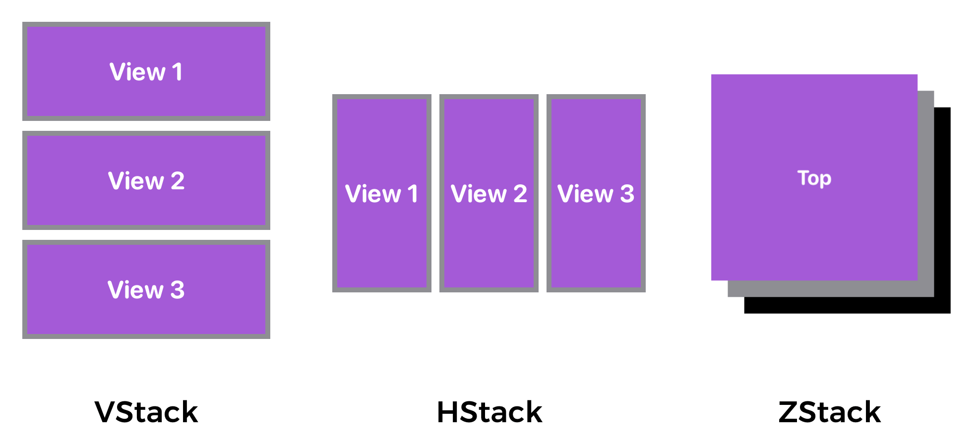
Understanding VStack, HStack and ZStack
SwiftUI provides three different types of stacks for developers to combine views in various orientations. Depending on how you're going to arrange the views, you can either use:
- HStack - arranges the views horizontally
- VStack - arranges the views vertically
- ZStack - overlays one view on top of another
The figure below shows you how these stacks can be used to organize views.
The Sample App
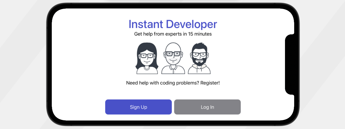
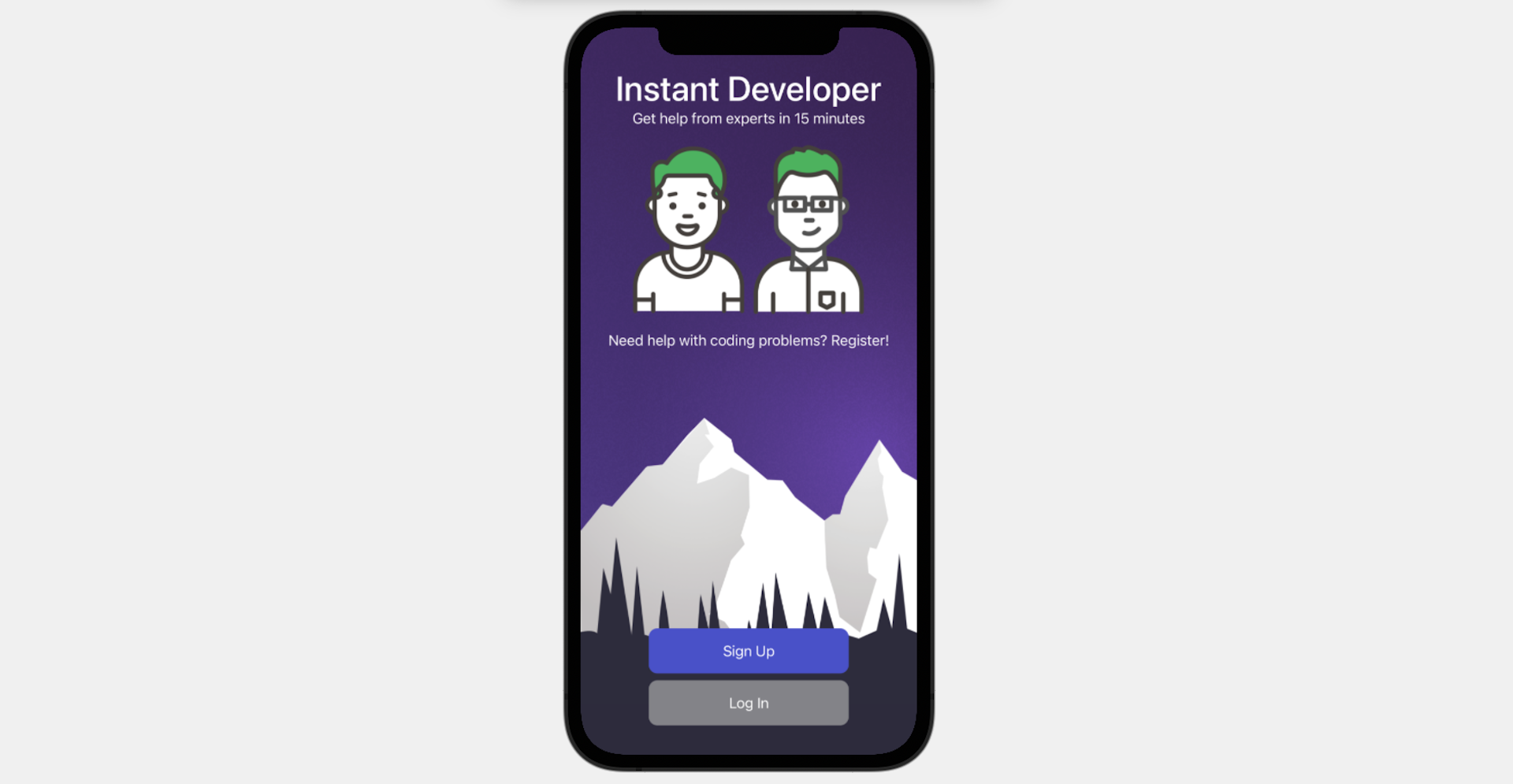
Let’s first take a look at the demo app we’re going to build. I will show you how to lay out a welcome screen like this using stack views:
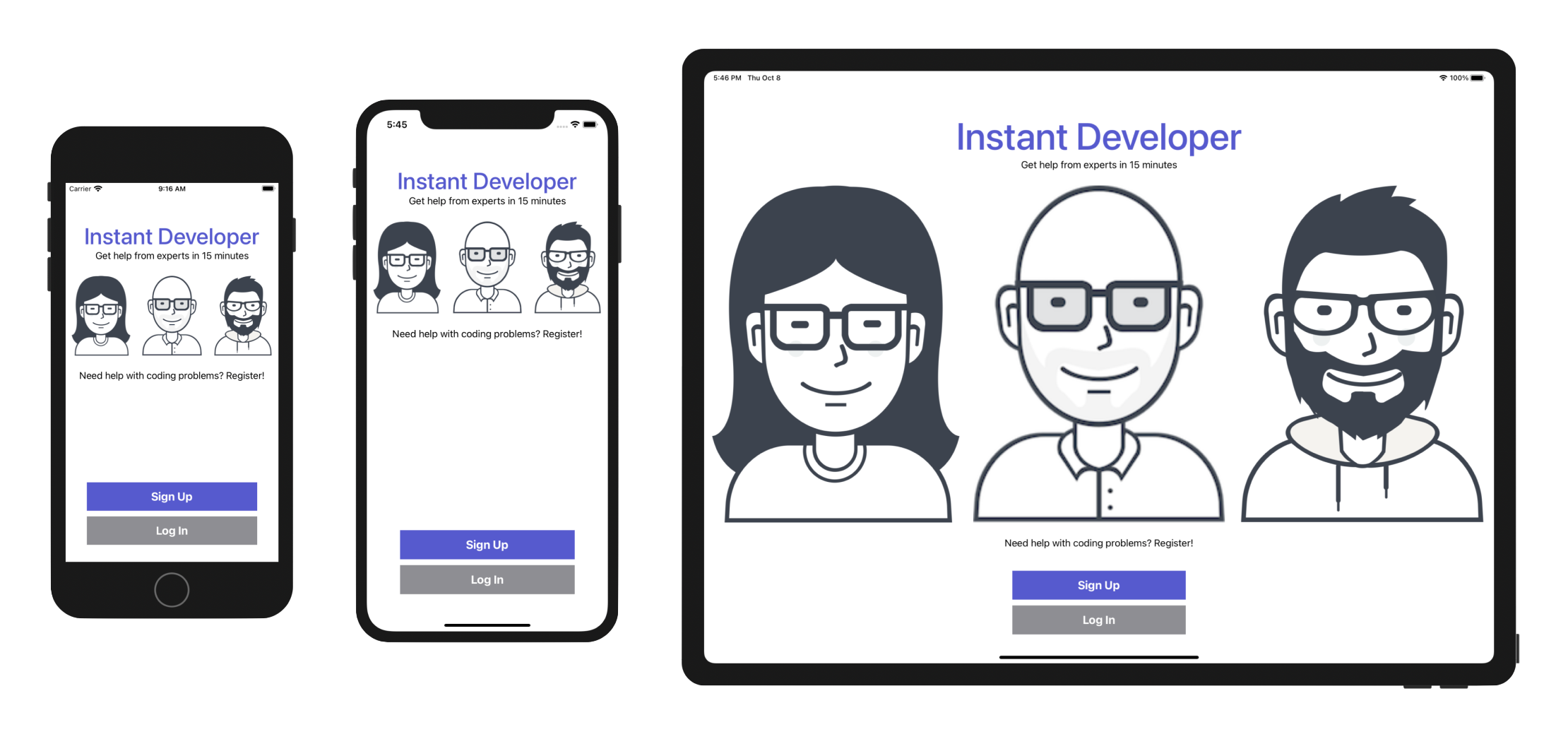
In the earlier chapters, you have used VStack to arrange UI components vertically. To build the app UI, you will need to mix different types of stack views. As you can see, the app UI works well on all screen sizes. If you have used UIKit before, you know it is inevitable to use auto layout to build UIs that fit all screen sizes. And, auto layout is a complicated subject and hard to learn for beginners. The good news is that SwiftUI no longer uses auto layout and makes it very easy to write adaptive UI. You will understand what I mean in a while.
Creating a New Project
Now fire up Xcode and create a new Xcode project. Choose Application (under iOS) > App and click "Next". You can simply fill in the project options as follows:
- Product Name: StackViewDemo – This is the name of your app.
- Team: Just leave it as it is.
- Organization Identifier: com.appcoda – It's actually the domain name written the other way round. If you have a domain, you can use your own domain name. Otherwise, you may use "com.appcoda" or just fill in "edu.self".
- Bundle Identifier: com.appcoda.StackViewDemo - It's a unique identifier of your app, which is used during app submission. You do not need to fill in this option. Xcode automatically generates it for you.
- Interface: SwiftUI - As explained before, Xcode now supports two ways to build UI. Please change the option to
SwiftUIbecause we will use SwiftUI for UI development. - Language: Swift – We'll use Swift to develop the project.
- Use Core Data: [unchecked] – Do not select this option. You do not need Core Data for this simple project.
- Include Tests: [unchecked] – Do not select this option. You do not need any tests for this simple project.
Click "Next" to continue. Xcode then asks you where to save the StackViewDemo project. Pick a folder on your Mac. Click "Create" to continue.
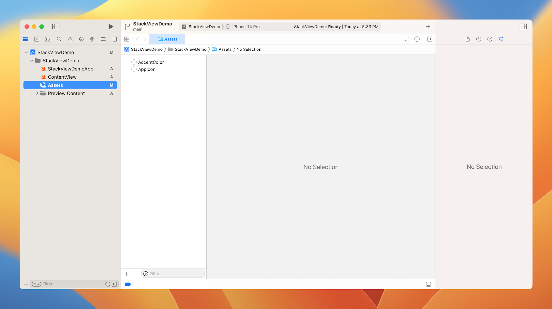
Adding Images to the Xcode Project
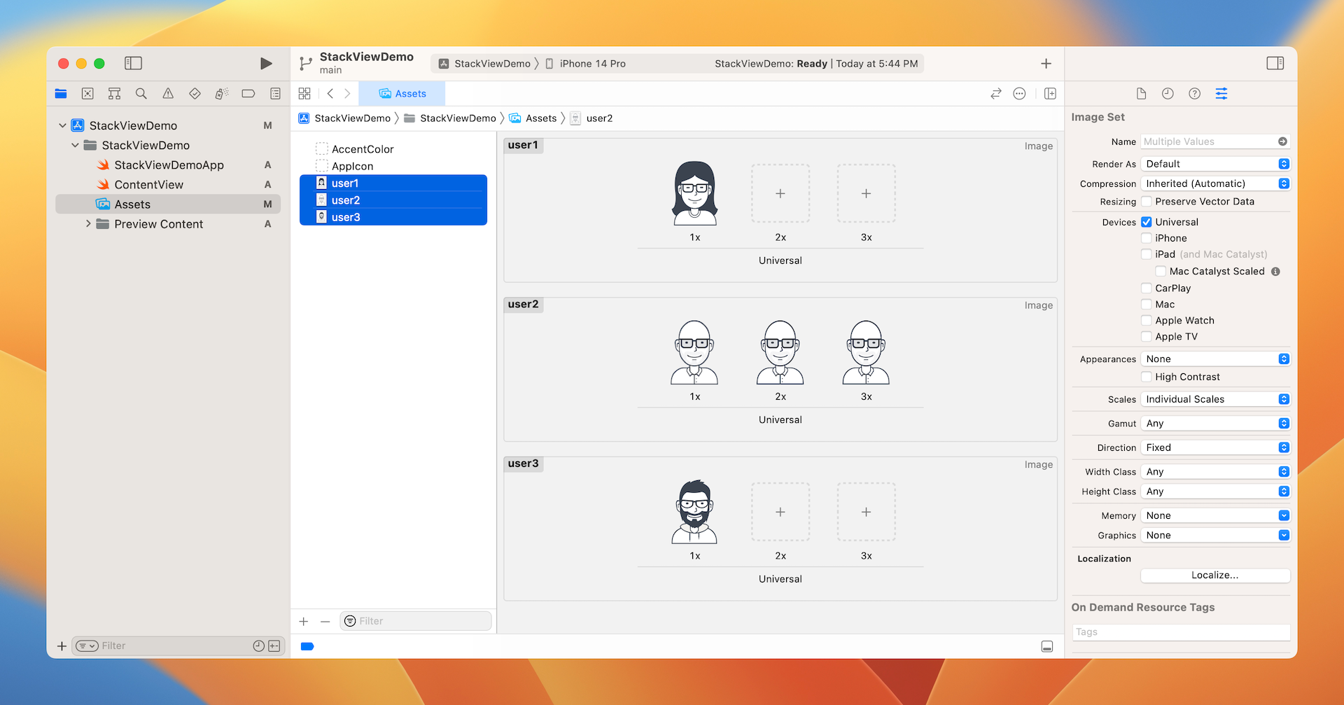
As you may notice, the sample app has three images. The question is how can you bundle images in Xcode projects?
In each Xcode project, it includes an asset catalog (i.e. Assets) for managing images and icons that are used by your app. Go to the project navigator and select the Assets folder. By default, it only contains the blank Appicon and AccentColor sets. We are not going to talk about app icons and accent colors in this chapter, but will revisit it later in the book.
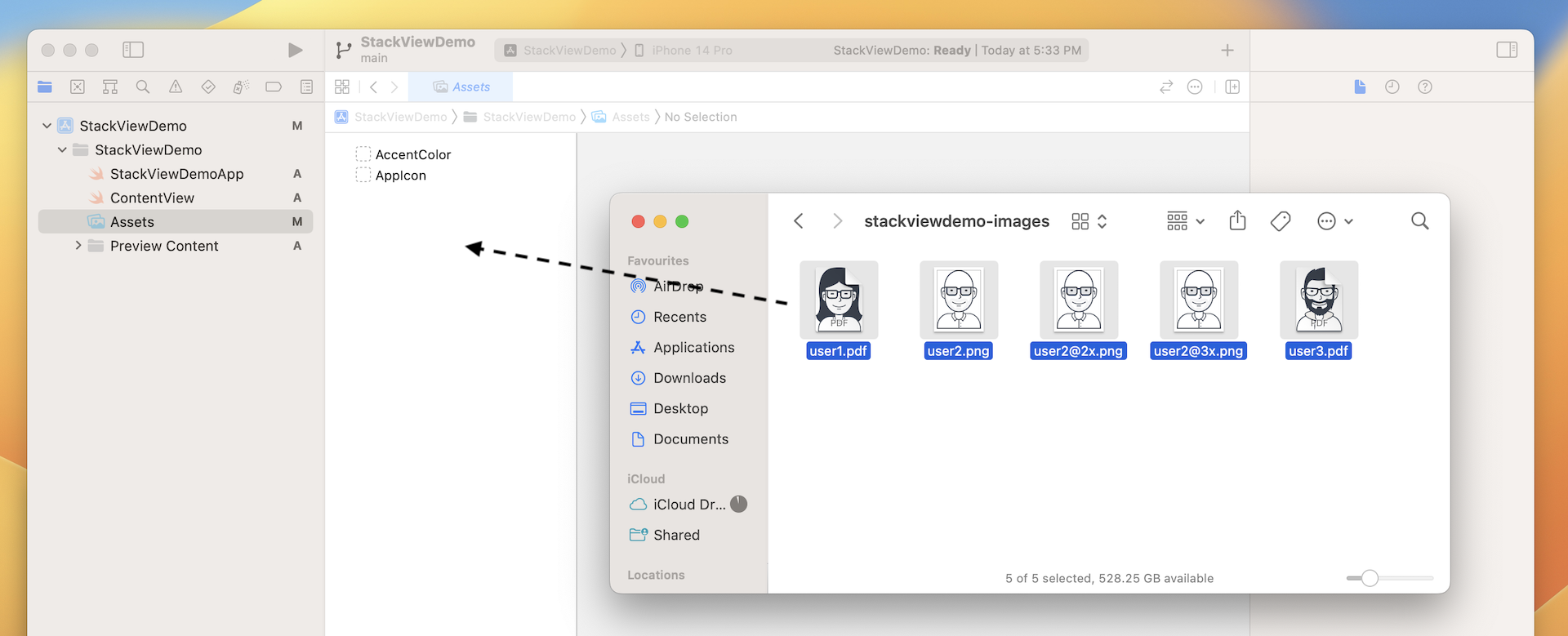
Now download this image set (https://www.appcoda.com/resources/swift4/stackviewdemo-images.zip) and unzip it on your Mac. The zipped archive contains a total of 5 image files:
- user1.pdf
- user2.png
- user2@2x.png
- user2@3x.png
- user3.pdf
Credit: The images are provided by usersinsights.com.iOS supports two categories of images: raster images and vector images. Common image formats like PNG and JPEG are classified as raster images. Raster images use a grid of pixels to form a complete image. One problem of raster images is that it doesn't scale up well. Increasing the size of a raster image usually means a significant loss of quality. This is why Apple recommends developers to provide three different resolutions of images when PNG is used. In this example, the image files comes with three versions. The one with @3x suffix, which has the highest resolution, is for iPhone 8 Plus, iPhone 13/14 Pro and Pro Max. The one with @2x suffix is for iPhone SE, iPhone 8, and iPhone 13/14, while the one without the @ suffix is for older devices with non-Retina display (e.g. iPad 2). For details about how the images are used, you can further refer to this link (https://developer.apple.com/design/human-interface-guidelines/ios/icons-and-images/image-size-and-resolution/).
Vector images usually have file types such as PDF and SVG. You can use tools like Sketch and Pixelmator to create vector images. Unlike raster images, vector images are comprised of paths instead of pixels. This allows the images to scale up without losing any image quality. Because of this feature, you just need to provide a single version of the image in PDF format for Xcode.
I intentionally include both image types in the example for illustration purpose. When developing a real world app, you usually work with either one or the other. So, which image type is more preferable? Whenever possible, ask your designer to prepare the images in PDF format. The overall file size is smaller and the images are scalable without losing quality.
To add the images to the asset catalog, all you need to do is drag the images from Finder, and drop them into the set list or set viewer.
Once you add the images to the asset catalog, the set view automatically organizes the images into different wells. Later, to use the image, you just need to use the set name of a particular image (e.g. user1). You can omit the file extension. Even if you have multiple versions of the same image (e.g. user2), you don't have to worry about which version (@2x/@3x) of the image to use. All these are handled by iOS accordingly.
Layout the Title Labels with Stack Views
Now that you've bundled the necessary images in the project, let's move onto the creation of stack views. First, open ContentView.swift. We'll start with the layout of these two labels.

I believe you know how to create these two labels because we have used VStack before. Stack view can arrange multiple views in both vertical and horizontal direction. The title and subtitle labels are arranged vertically. Therefore, vertical stack view is a suitable choice.
Now update the ContentView struct like this:
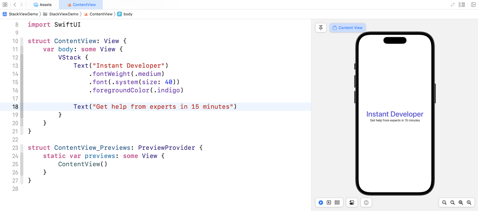
struct ContentView: View {
    var body: some View {
        VStack {
            Text("Instant Developer")
                .fontWeight(.medium)
                .font(.system(size: 40))
                .foregroundColor(.indigo)

            Text("Get help from experts in 15 minutes")
        }
    }
}
We use a VStack to embed two Text views. For the Instant Developer label, we make the font a little bit larger by setting a fixed font size (i.e. 40 points) and bold the font by changing the font weight. To change the font's color, we attach the foregroundColor modifier and set the color to .indigo.
Using Spacer and Padding
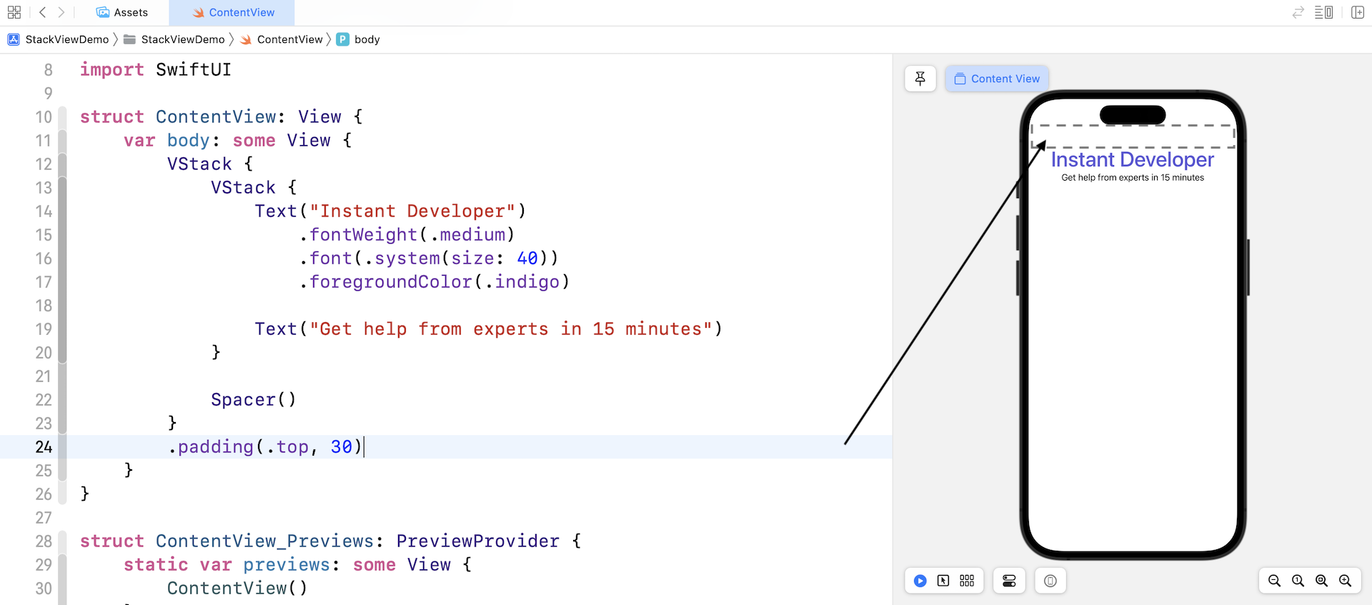
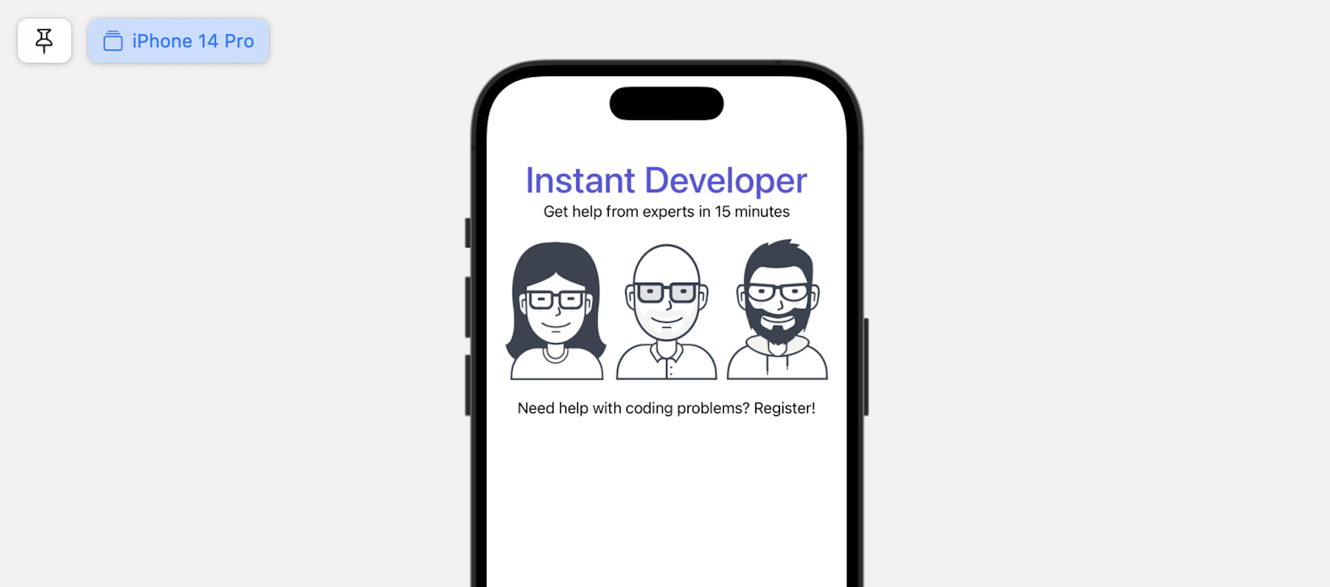
By default, the stack view is displayed at the center of the screen. However, if you refer to figure 4-2, these two labels should be placed close to the status bar. How can we move these two labels?
The trick here is to use a special SwiftUI component called Spacer. This spacer view is a view without content that takes up as much space as it can in a stack layout. For example, when you place a spacer view in a vertical layout, it expands vertically as much as the stack allows.
Let's see this spacer view in action, so you will understand how it can help you arrange the UI components.
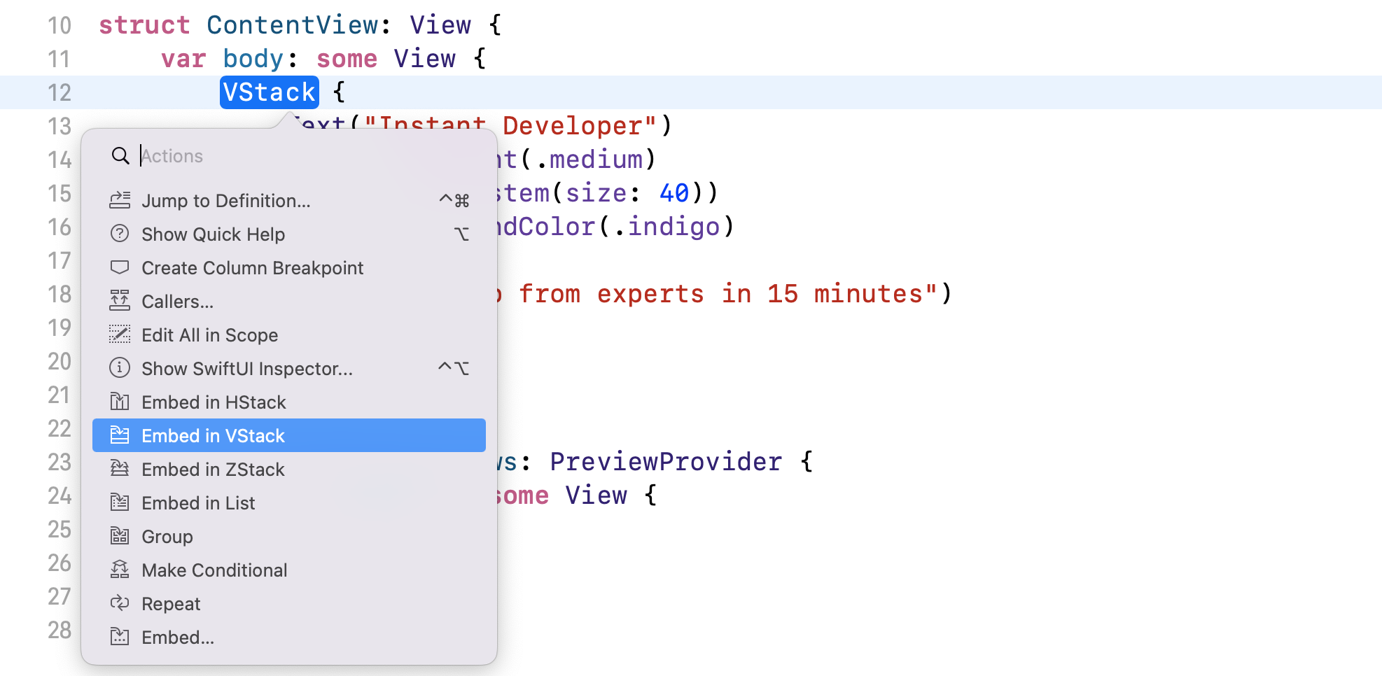
To push both labels to the upper part of the screen, we can create another VStack view (let's call this the root stack view) to embed the current VStack view and then add a Spacer view.
You can press and hold the command key, and then click on VStack. In the context menu, choose Embed in VStack. Xcode will automatically wrap the existing VStack in another VStack view.
Next, insert the Spacer view before the closing curly bracket of the root stack view (see figure 4-9).
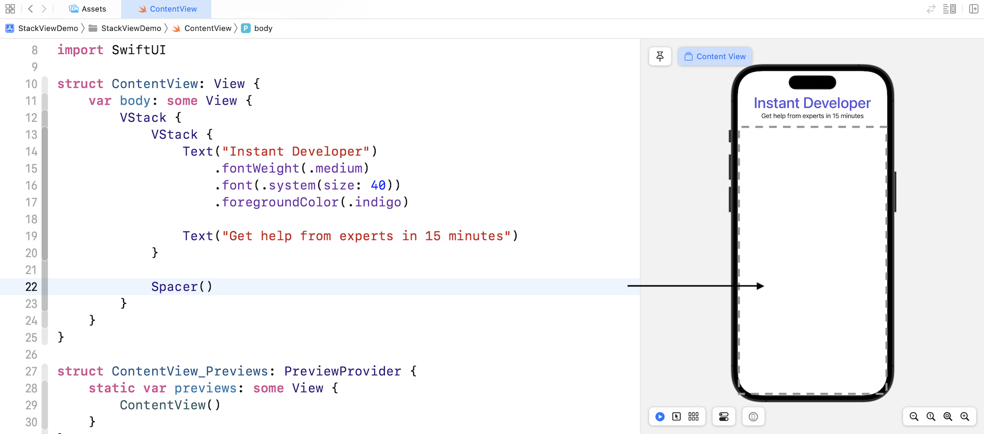
Once you add the spacer view, it expands to take up all the available space of the vertical stack view, pushing the labels to the top of the screen.
The two labels are still not placed at the expected position if you take a closer look at figure 4-2. It's now too close to the top edge of the screen. We need to leave some space between the edge and the text views.
In SwiftUI, you can use a modifier named padding to add space around a view. In this case, you can attach the padding modifier to the root VStack view like this:
VStack {

  .
  .
  .

}
.padding(.top, 30)
The padding modifier accepts two optional parameters. You can specify which edge to pad and the amount of the padding. Here, we tell SwiftUI to add padding to the top edge and set the amount to 30 points.
Padding is very useful in SwiftUI for arranging the view layout. By applying padding to a view, you can add some space between views.
Using Images
Next, we're going to lay out the three user images. In SwiftUI, we use a view called Image to display images. Since we already imported the images into the asset catalog, you can write the code like this to display an image on screen:
Image("user1")
You do not need to specify the file extension (e.g. png/jpg/pdf). All you need is tell the Image view the name of the image. To place the image under the text views, you can insert the line of code right before Spacer().
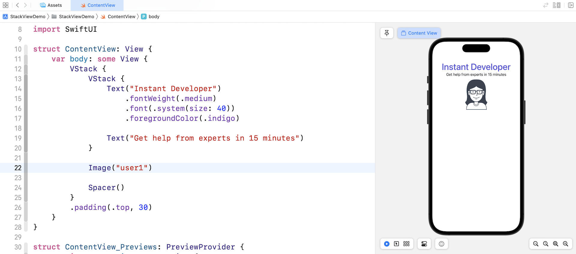
By default, iOS displays the image in its original size. To resize an image in SwiftUI, we can attach the resizable modifier like this:
Image("user1")
    .resizable()
iOS will stretch the image to fit the available area. Figure 4-12 shows the effect of the modifier.
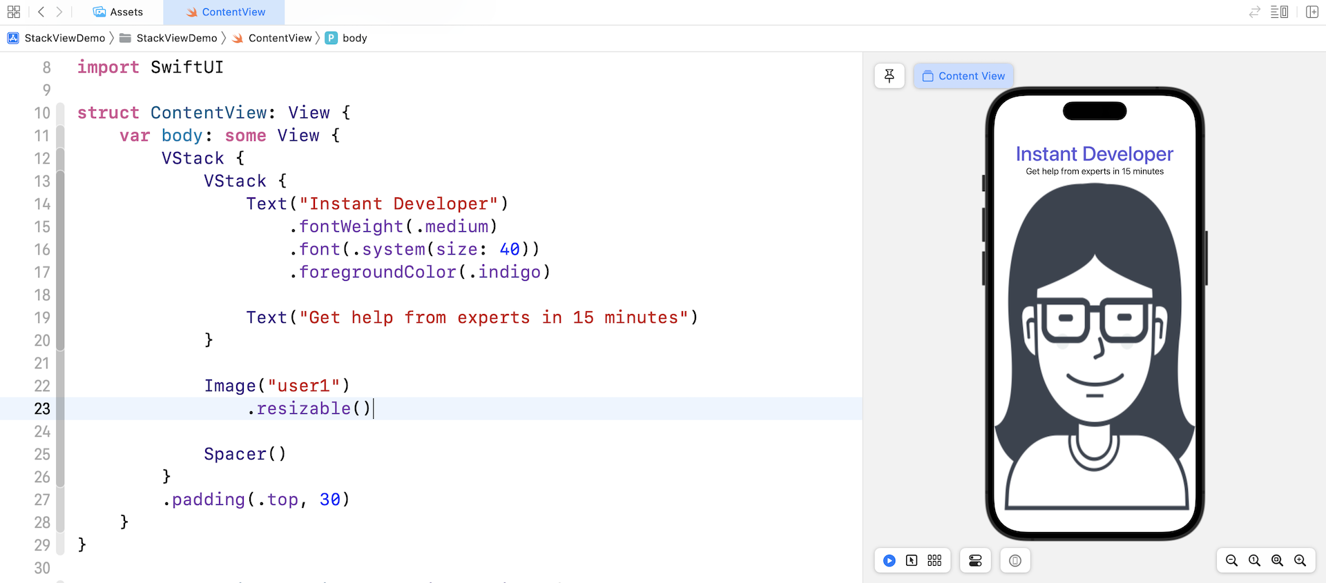
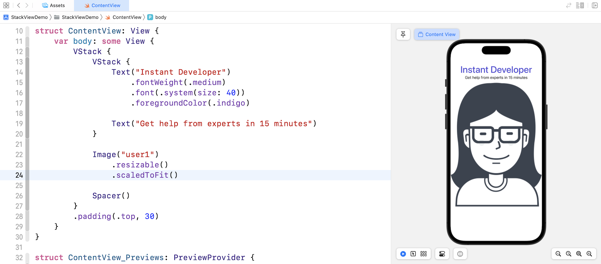
The stretch mode doesn't take into account the aspect ratio of the original image. It stretches each side to fit the view area. To keep the original aspect ratio, you can apply the modifier scaledToFit like this:
Image("user1")
    .resizable()
    .scaledToFit()
Alternatively, you can use the aspectRatio modifier and set the content mode to .fit. This will achieve the same result.
Image("user1")
    .resizable()
    .aspectRatio(contentMode: .fit)
After you apply the modifiers, the image will be automatically resized and retain the aspect ratio.
Arranging the Images Using Horizontal Stack Views
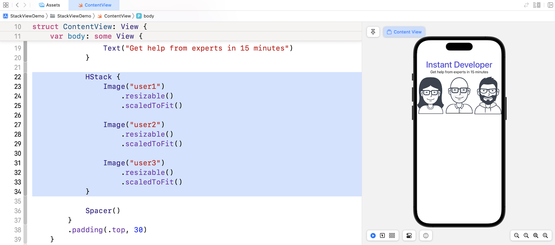
Now that you should understand how to display an image, let's see how to lay out the three images side by side. Earlier, we used VStack to arrange views vertically. The SwiftUI framework provides another type of stack views called HStack to arrange views horizontally.
Wrap the Image view using the HStack view and add the other two image views like this:
HStack {
    Image("user1")
        .resizable()
        .scaledToFit()

    Image("user2")
        .resizable()
        .scaledToFit()

    Image("user3")
        .resizable()
        .scaledToFit()
}
When you embed the image views in a horizontal stack, it places the images side by side, from left to right.
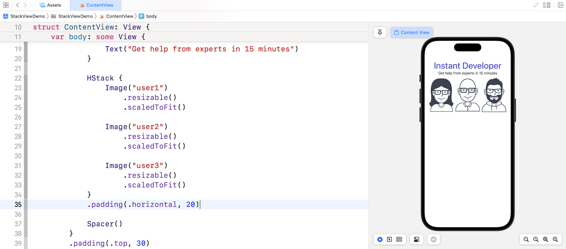
The image stack is too close to the left and right edges of the screen. To add some space, we can attach the padding modifier to the HStack like this:
HStack {
  .
  .
  .
}
.padding(.horizontal, 20)
This tells iOS to add a space of 20 points on the left and right edges of the HStack view.
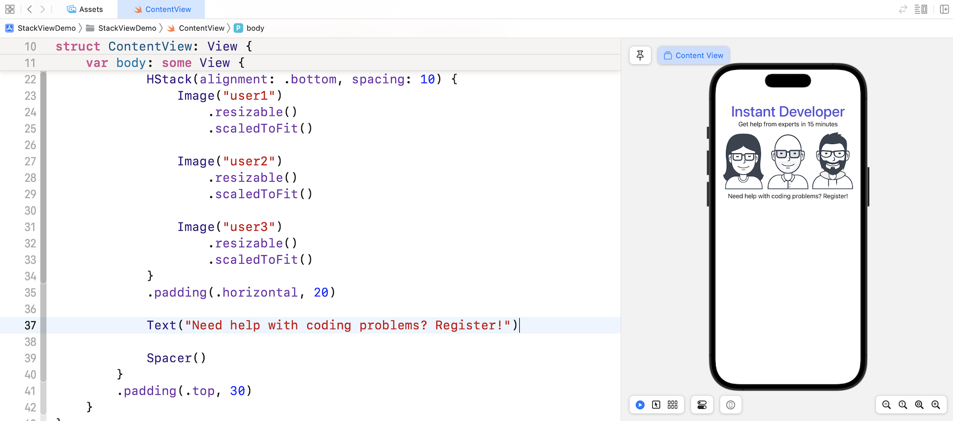
There are a couple of tweaks I want to implement for the horizontal stack view:
- If you take a closer look at the images, they are not perfectly aligned. We want all images are aligned to the bottom edge of the stack view.
- Let's add some spacing between the images.
The HStack view actually provides two optional parameters. One is alignment and the other is spacing. By passing an appropriate value for these parameters, we can easily accomplish the requirements mentioned above.
Let's change the initialization of HStack like this:
HStack(alignment: .bottom, spacing: 10) {
  .
  .
  .
}
This tells the horizontal stack view to align all image views to the bottom edge and add a spacing of 10 points between them.
The images should now align perfectly and looks better, right?
Adding a Label Below the Images
There is a label right below the images that we haven't added yet. The implementation should be very straightforward. You can insert the following line of code before the Spacer() view:
Text("Need help with coding problems? Register!")
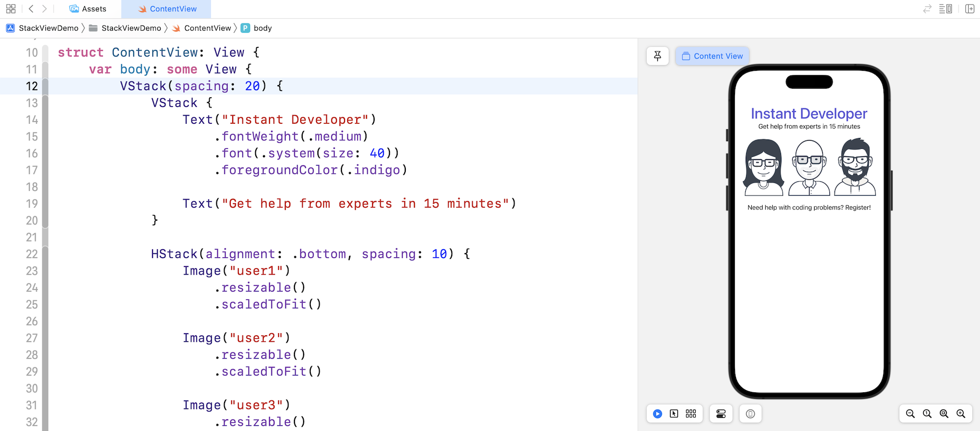
As you can see in the preview, the text views and image views are too close to each other. Similar to HStack, the VStack also accepts a parameter called spacing for you to add some spaces for items in the stack view.
Now update the root VStack view like this to specify the spacing:
VStack(spacing: 20) {
  .
  .
  .
}
You should notice the image stacks and the text views are now further apart.
Layout the Buttons Using a Stack View
We haven’t finished yet. Let's continue to layout the two buttons at the bottom of the screen. Both buttons have a fixed width of 200 points.
To create the Sign up button with purple background, you can write the code like this:
Button {

} label: {
    Text("Sign Up")
}
.frame(width: 200)
.padding()
.foregroundColor(.white)
.background(Color.indigo)
.cornerRadius(10)
You should be very familiar with the code because it is very similar to that for creating the Hello World button. The frame modifier is new to you. It's used to limit the width of the button to 200 points.
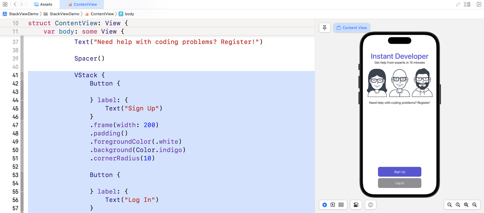
Again, to build the layout of the Sign Up and Log In buttons, we will embed them in a VStack view like this:
VStack {
    Button {

    } label: {
        Text("Sign Up")
    }
    .frame(width: 200)
    .padding()
    .foregroundColor(.white)
    .background(Color.indigo)
    .cornerRadius(10)

    Button {

    } label: {
        Text("Log In")
    }
    .frame(width: 200)
    .padding()
    .foregroundColor(.white)
    .background(Color.gray)
    .cornerRadius(10)
}
You can place the code after the Spacer() view. Once you made the change, you should see two buttons in the preview pane.
Previewing the UI Using Different Devices
Xcode shows the preview of the UI using our selected simulator. Say, for me, I selected the iPhone 14 Pro as the simulator. If you choose another simulator, Xcode then uses an alternate simulator to render the preview.
What if we want to preview the UI on multiple simulators? How can we do that?
Let's take a look at the preview code:
struct ContentView_Previews: PreviewProvider {
    static var previews: some View {
        ContentView()
    }
}
This code snippet is written for generating the preview of ContentView. Similar to Text and Image views, SwiftUI allows us to attach some modifiers to ContentView and specify the simulator we want to use.
Update the preview code like this:
struct ContentView_Previews: PreviewProvider {
    static var previews: some View {
        ContentView()
            .previewDevice(PreviewDevice(rawValue: "iPhone 12 Pro"))
            .previewDisplayName("iPhone 12 Pro")
    }
}
We attached two modifiers to the ContentView. The previewDevice modifier specifies which simulator to use. Here, it's iPhone 14 Pro. The previewDisplayName modifier sets the name of simulator. Instead of displaying the name as Preview, it is now shown as iPhone 14 Pro.
Now it comes to the interesting part. You can preview the UI on different simulators all at once by updating the code like this:
struct ContentView_Previews: PreviewProvider {
    static var previews: some View {
        Group {
            ContentView()
                .previewDevice(PreviewDevice(rawValue: "iPhone 12 Pro"))
                .previewDisplayName("iPhone 12 Pro")

            ContentView()
                .previewDevice(PreviewDevice(rawValue: "iPhone 12 Pro"))
                .previewDisplayName("iPhone 12 Pro")
                .previewInterfaceOrientation(.landscapeLeft)

            ContentView()
                .previewDevice(PreviewDevice(rawValue: "iPhone 12 Pro Max"))
                .previewDisplayName("iPhone 12 Pro Max")

            ContentView()
                .previewDevice(PreviewDevice(rawValue: "iPad Air (4th generation)"))
                .previewDisplayName("iPad Air")
        }
    }
}
After the code changes, the preview pane should show you 4 labels including iPhone 14 Pro, iPhone 14 Pro (Landscape), iPhone 14 Pro Max, and iPad Air. This is a great feature such that you can preview the UI to see if it works great on all devices.
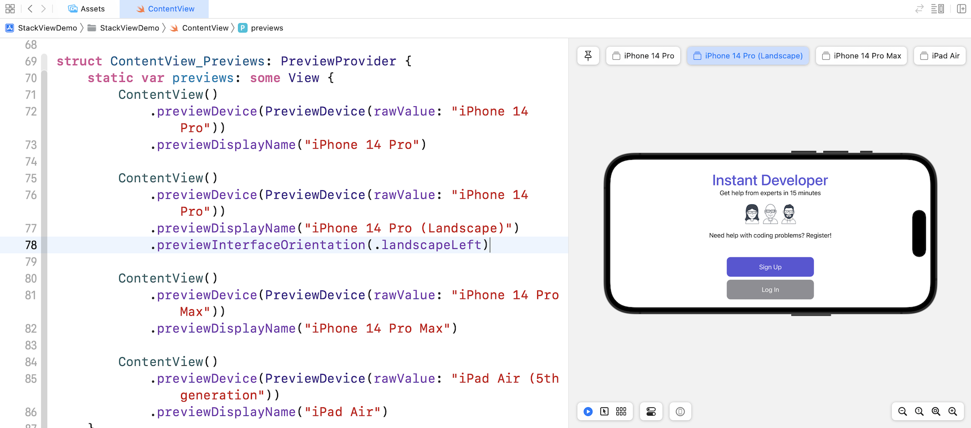
To preview the UI in landscape, you can attach the previewInterfaceOrientation modifier and set the value to .landscapeLeft or .landscapeRight.
Extracting Views for Better Code Organization
Before we continue to lay out the UI, let me show you a trick to better organize the code. As you're going to build a more complex UI that involves several components, the code inside ContentView will eventually become a giant code block that is hard to review and debug. It's always a good practice to break large blocks of code into smaller blocks so the code is easier to read and maintain.
Xcode has a built-in feature to refactor the SwiftUI code. For example, if we want to extract the VStack holding the Sign Up and Log In buttons, you can hold the command key and click the VStack. Then select Extract Subview to extract the code.
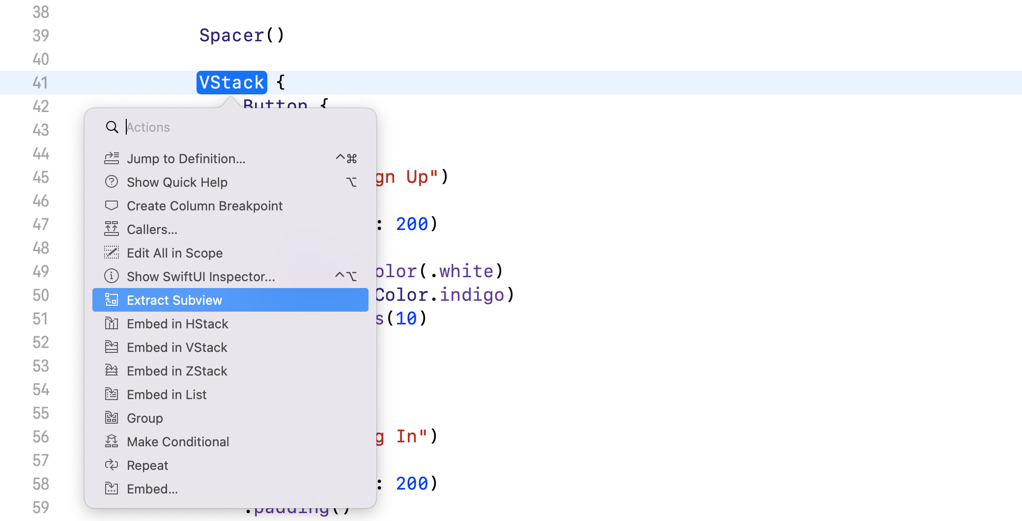
Xcode extracts the code block and creates a default struct named ExtractedView. Rename ExtractedView to VSignUpButtonGroup to give it a more meaningful name (refer to figure 4-22 for details).
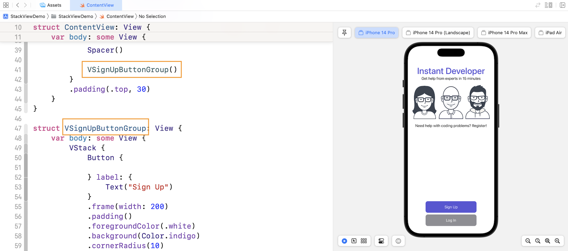
This is a very useful technique in developing SwiftUI applications. By extracting code into a separate subview, your code is now more organized. Take a look at the code block in ContentView. It's now much cleaner and easier to read.
Adapting Stack Views Using Size Classes
What do you think about the app layout in landscape orientation (see figure 4-20)? It doesn't look very good on iPhone. I want to place the buttons side by side, so it should free up more space to scale up the images.
Please keep in mind that this change only applies to iPhone in landscape orientation. For iPhone in portrait orientation, both buttons' position keeps intact. How can you do that?
This leads to the UI design concept known as Adaptive Layout. With adaptive layout, your apps can adapt their UI to a particular device and device orientation.
To achieve adaptive layout, Apple introduced a concept called Size Classes. This is probably the most important aspect which makes adaptive layout possible. Size classes are an abstraction of how a device is categorized depending on its screen size and orientation.
A size class identifies a relative amount of display space for both vertical (height) and horizontal (width) dimensions. There are two types of size classes: regular and compact. A regular size class denotes a large amount of screen space, while a compact size class denotes a smaller amount of screen space.
By describing each display dimension using a size class, this will result in four abstract devices: Regular width-Regular Height, Regular width-Compact Height, Compact width-Regular Height and Compact width-Compact Height.
The table below shows the iOS devices and their corresponding size classes:
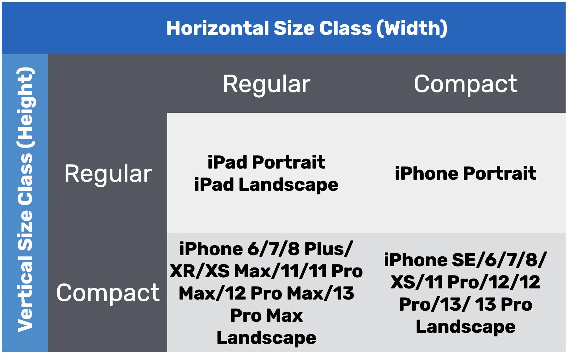
To characterize a display environment, you must specify both a horizontal size class and vertical size class. For instance, an iPad has a regular horizontal (width) size class and a regular vertical (height) size class. For our customization, we want to provide layout specializations for iPhones in landscape orientation. In other words, when the vertical size class is set to compact, we can change the layout of the buttons.
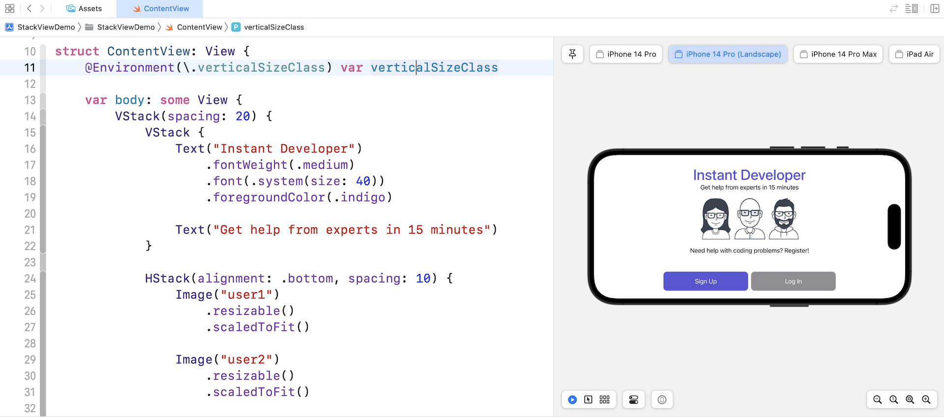
So, how can we find out the device's vertical size class? The SwiftUI framework provides the @Environment property wrapper to retrieve the vertical size class. You can insert the following line of code to get the current size class:
@Environment(\.verticalSizeClass) var verticalSizeClass
The value of verticalSizeClass will be automatically updated whenever the device's orientation changes.
With this variable, we can change the layout of the button group in reference to the value of verticalSizeClass. You can replace VSignUpButtonGroup() with the following lines of code:
if verticalSizeClass == .compact {
    HSignUpButtonGroup()
} else {
    VSignUpButtonGroup()
}
When the vertical size class is set to .compact, we align the button group horizontally by calling HSignUpButtonGroup(), which is a new view we are going to implement.
Now insert the following code to create the HSignUpButtonGroup view:
struct HSignUpButtonGroup: View {
    var body: some View {
        HStack {
            Button {

            } label: {
                Text("Sign Up")
            }
            .frame(width: 200)
            .padding()
            .foregroundColor(.white)
            .background(Color.indigo)
            .cornerRadius(10)

            Button {

            } label: {
                Text("Log In")
            }
            .frame(width: 200)
            .padding()
            .foregroundColor(.white)
            .background(Color.gray)
            .cornerRadius(10)
        }
    }
}
The code of HSignUpButtonGroup is almost the same as that of VSignUpButtonGroup. We just change VStack to HStack to layout both buttons side by side. Once you made the change, the preview should update the UI accordingly. For iPhone in landscape orientation, the buttons should be aligned horizontally.
Now the UI looks better on iPhone landscape. And, this is how we make use of size classes to provide UI specialization and fine tune the UI for different screen sizes.
Preserving Vector Data
Before I end this chapter, I want to show you a feature in Xcode known as Preserve Vector Data. I mentioned that we prefer to use vector images over raster images in iOS development because they can scale up or down without losing their quality. That's partially true.
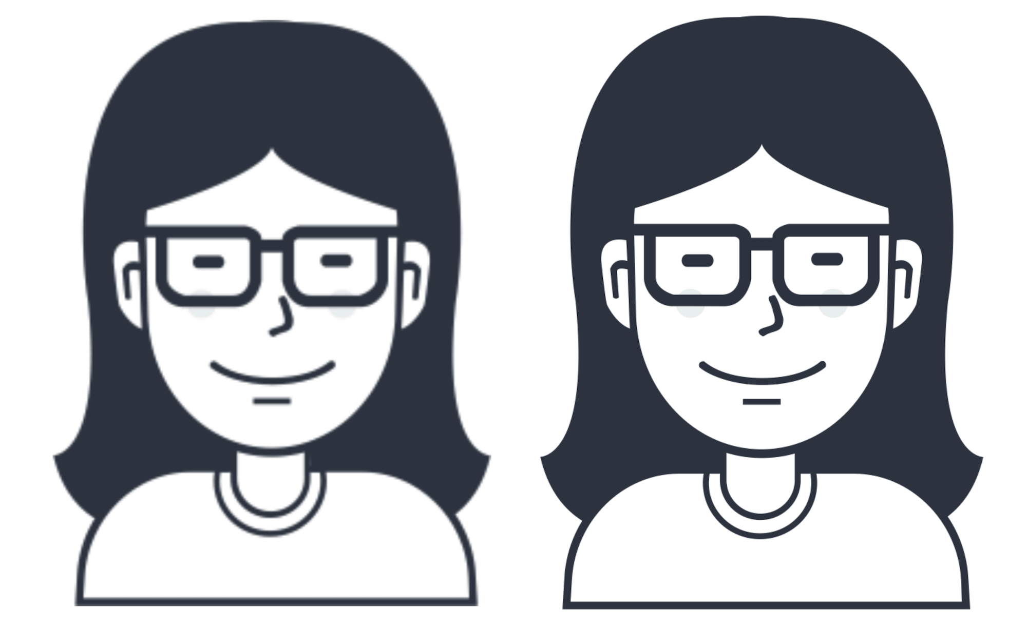
When a vector image is used, Xcode automatically converts it into static images (@1x, @2x @3x). It is pretty much like the user2 image we prepared, but the conversion is handled by Xcode. In this case, the image quality will still be slightly affected when the image is enlarged. If you try to run the demo on iPad Pro (12.9-inch), you should find that the image quality is not perfect.
Xcode comes with a feature called Preserve Vector Data that lets you preserve the vector data of the images. The option is disabled by default. To enable it, you can go to Assets.xcassets and choose one of the images. In the Attributes inspector, tick the Preserve Vector Data checkbox to enable the option.
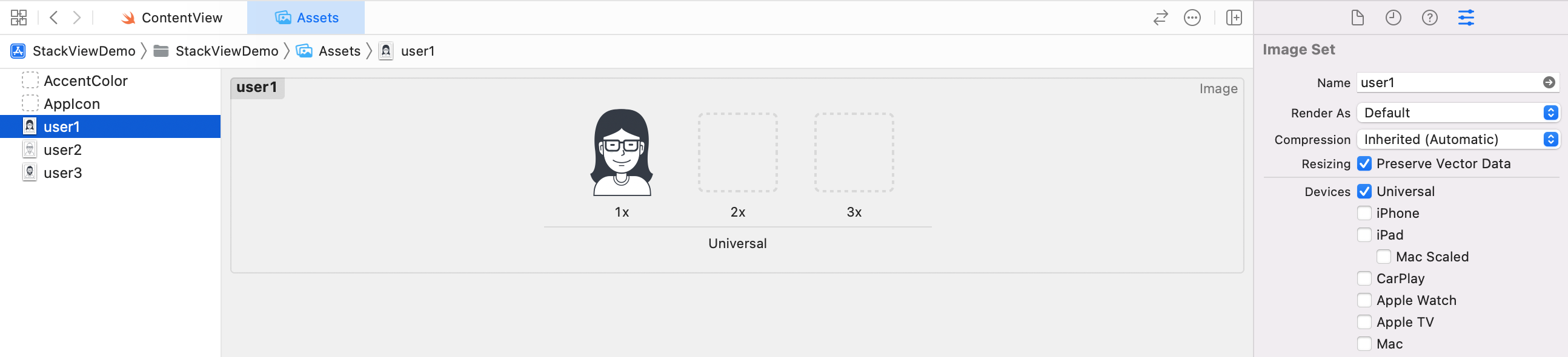
Now if you run the app on iPad Pro (12.9-inch) again, you will find the image looks much better. Figure 4-27 illustrates the image difference when the option is enabled or disabled.
Exercise #1
To help you better understand how stack views and size classes work, let's have an exercise. Try to build a UI like the one shown in figure 4-28. You can download the required images from http://www.appcoda.com/resources/swift4/student-tutor.zip
Credit: The background image is provided by Luka Dadiani.
As a hint, to implement the background image, you can attach the background modifier like this:
VStack {
  .
  .
  .
}
.background {
    Image("background")
        .resizable()
        .ignoresSafeArea()
}
Inside the modifier, you can place an image as the background. The ignoresSafeArea modifier of the Image view expands the image to take up the whole screen. You will understand what this means when you work on the exercise.
Summary
Congratulations! You have finished the chapter and learned how to build an adaptive UI using stack views and size classes.
Stack views is very powerful view components provided by the SwiftUI framework. By mixing VStack, HStack, and ZStack together, you can easily create complex UIs that adapt to different screen sizes. This is just an introduction to stack views. Later, when we build a real world app, you will learn more layout techniques using stack views.
For reference, you can download the complete Xcode project from:
- Complete project: http://www.appcoda.com/resources/swift57/swiftui-stackviewdemo.zip
- Solution to the exercise #1: http://www.appcoda.com/resources/swift57/swiftui-stackview-exercise.zip
Got a question? Join our Facebook group (https://www.facebook.com/groups/appcoda) to discuss with it with other developers.