- Made by AppCoda
- Contact us / Support
- Tweet this book
- Preface
- 1. The Development Tools, the Learning Approach, and the App Idea
- 2. Your First Taste of Swift with Playgrounds
- 3. Build Your First App in Swift and SwiftUI
- 4. Designing UI Using Stack Views
- 5. Introduction to Prototyping
- 6. Understanding List and ForEach
- 7. Customizing List Views
- 8. Displaying Confirmations and Handling List View Selection
- 9. Understanding Struct, Project Organization and Code Documentation
- 10. List Deletion, Swipe Actions, Context Menus and Activity Controller
- 11. Working with Navigation View
- 12. Detail View Enhancement, Custom Fonts and Navigation Bar Customization
- 13. Understanding Colors, Swift Extensions and Dynamic Type
- 14. Working with Maps
- 15. View Animations and Blur Effect
- 16. Working with Observable Objects and Combine
- 17. Working with Forms and Camera
- 18. Working with Core Data
- 19. Adding a Search Bar Using Searchable
- 20. Building Walkthrough Screens Using TabView
- 21. Working with Tab View and Tab Bar Customizations
- 22. Displaying Web Content with WKWebView and SFSafariViewController
- 23. Working with CloudKit
- 24. Localizing Your App to Support Multiple Languages
- 25. Deploying and Testing Your App on a Real iOS Device
- 26. Beta Testing with TestFlight and CloudKit Production Deployment
- 27. Submit Your App to App Store
- 28. Adopting Haptic Touch
- 29. Working with User Notifications
- 30. Appendix - Swift Basics
- Published with GitBook
Chapter 10
List Deletion, Swipe Actions, Context Menus and Activity Controller

If you spend too much time thinking about a thing, you'll never get it done. Make at least one definite move daily toward your goal.
– Bruce Lee
In the earlier chapter, you learned how to handle row selection. But how about deletion? How can we delete a row from a list view? It's a common question when building a list-based app. Select, delete, insert and update are the basic operations when dealing with data. We've discussed how to select a row. Let's talk about deletion in this chapter. In addition, we'll go through a couple of new features to the FoodPin app:
- Adding a custom action button when a user swipes horizontally in a table row. This is usually known as swipe actions in SwiftUI.
- Adding a social sharing feature to the app, that enables users to easily share the restaurants.
There is a lot to learn in this chapter, but it's going to be fun and rewarding.
Performing Row Deletion
Let's move onto the coding part and see how we can delete a row from a table view. We'll continue to develop the FoodPin app (if you haven't completed the previous exercise, you can start with by downloading the project from (http://www.appcoda.com/resources/swift57/swiftui-foodpin-oop.zip) and add the "delete" feature.
SwiftUI has made it very easy for developers to implement the swipe-to-delete feature. There is a built-in modifier called .onDelete that can be attached to ForEach. In the RestaurantListView struct, modify the code of the List view like this:
List {
    ForEach(restaurants.indices, id: \.self) { index in
        BasicTextImageRow(restaurant: $restaurants[index])
    }
    .onDelete(perform: { indexSet in
        restaurants.remove(atOffsets: indexSet)
    })

    .listRowSeparator(.hidden)
}
.listStyle(.plain)
This is how you can activate the swipe-to-delete feature in a list view. Please note that the .onDelete modifier is attached to ForEach.
In the closure of onDelete, it passes you a set of indices for deletion. We can use it to delete the records from the collection of data.
Looks simple, right? Let's run the app and test it.
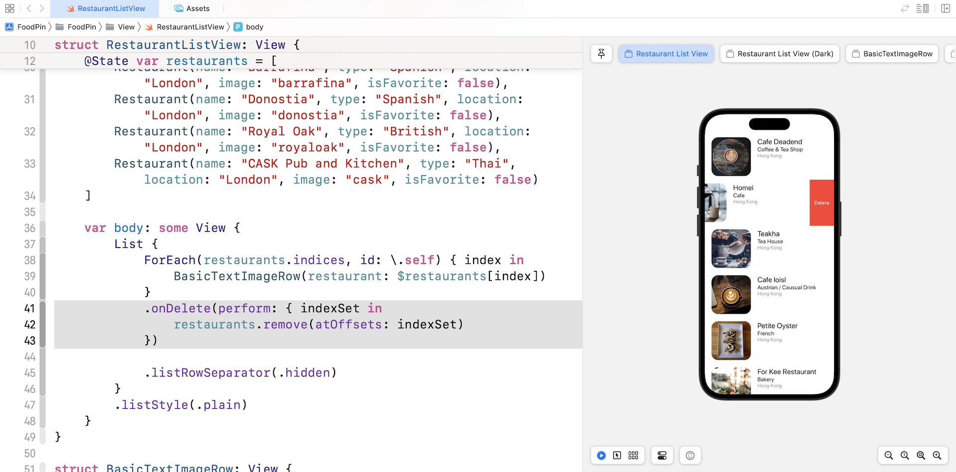
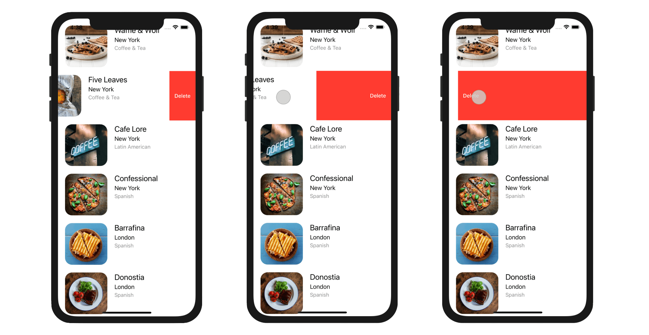
You can swipe left to make the delete button visible. The button is automatically generated by iOS when the .onDelete modifier is used. You can either tap the Delete button or continue to swipe to the left edge to remove the item.
Using Swipe Actions
When you swipe left a row in the stock Mail app, you will see a Trash button, a Flag, and a More button. The More button will bring up an action sheet providing a list of options such as Reply, Flag, etc. If you swipe right, you will find the Archive button.
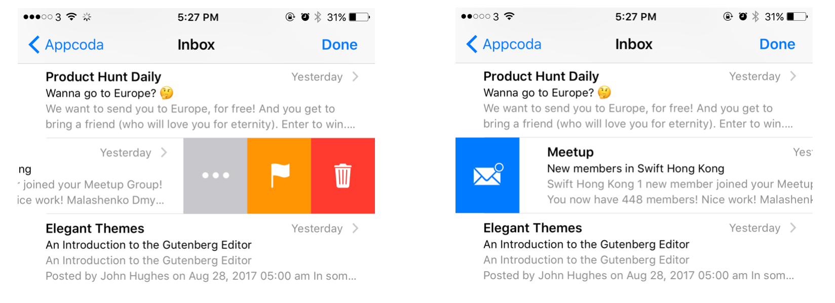
In iOS 15, SwiftUI introduced a new modifier called swipeActions for developers to create this kind of swipe actions.
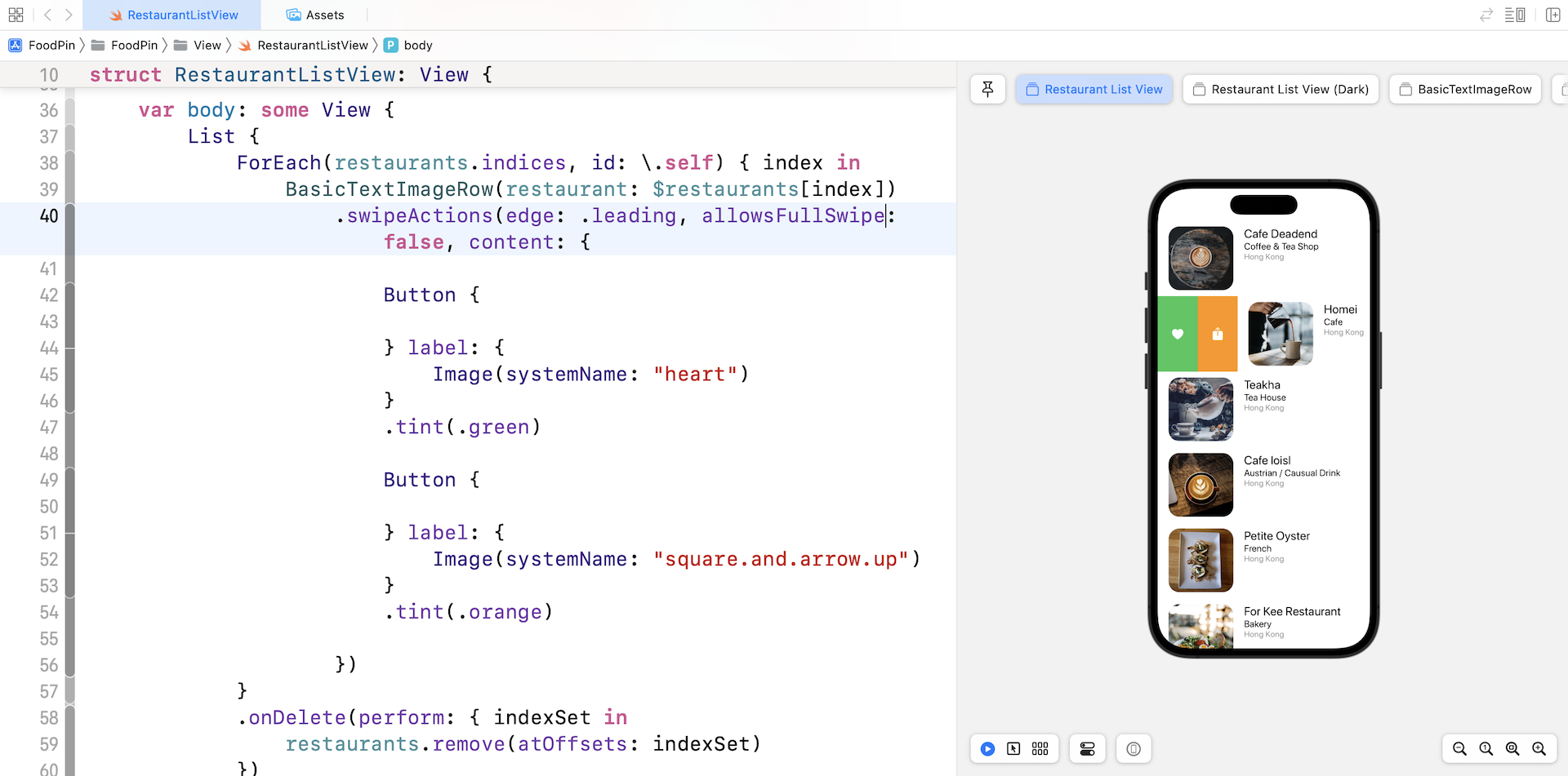
For example, if we want to add two actions: Reserve a table and Mark as favorite when the user swipe right the row, you can attach the swipeActions modifier to the BasicTextImageRow:
BasicTextImageRow(restaurant: $restaurants[index])
    .swipeActions(edge: .leading, allowsFullSwipe: false, content: {

        Button {

        } label: {
            Image(systemName: "heart")
        }
        .tint(.green)

        Button {

        } label: {
            Image(systemName: "square.and.arrow.up")
        }
        .tint(.orange)

    })
The swipeAction modifier allows you to define which edge (leading/trailing) to display the swipe actions. In the example, we set it to the leading edge. In the content parameter, we added two buttons for demo purposes. When you run the app in the preview, swipe right any of the rows in the list. You should reveal the action buttons.
Other than swipe actions, there is another way to display option menu. Let's check it out and delete the swipeActions modifier.
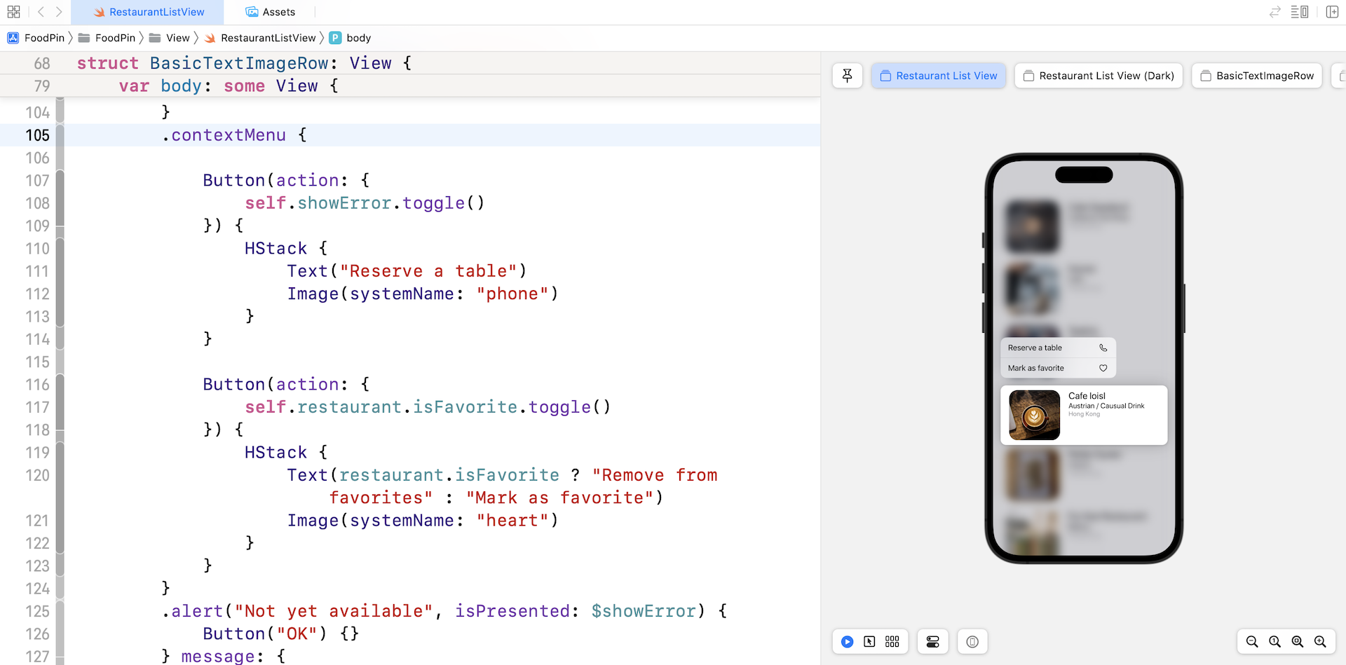
Creating Context Menu
Instead of using swipe actions, we can display the actions in a context menu. In iOS, users can usually tap and hold a row in the list to bring up a context menu (see figure 10-5). Similar to swipe actions, the SwiftUI framework also made it very simple to create a context menu. You just need to attach the contextMenu container to a view and configure its menu items.
In BasicTextImageView, remove both .onTapGesture and .confirmationDialog modifiers. And then attach the .contextMenu modifier to the HStack view:
HStack {
  .
  .
  .
}
.contextMenu {

    Button(action: {
        self.showError.toggle()
    }) {
        HStack {
            Text("Reserve a table")
            Image(systemName: "phone")
        }
    }

    Button(action: {
        self.restaurant.isFavorite.toggle()
    }) {
        HStack {
            Text(restaurant.isFavorite ? "Remove from favorites" : "Mark as favorite")
            Image(systemName: "heart")
        }
    }
}
.alert("Not yet available", isPresented: $showError) {
  .
  .
  .
}
Inside the contextMenu, we created two buttons: one for Reserve a table and the other for Mark as favorite. The order of the buttons inside the closure of the contextMenu modifier determines its display order in the context menu.
That's all the code you need to present a context menu. Run the app in a simulator or in the preview pane. Tap and hold any of the restaurants will bring up the context menu.
Understanding SF Symbols
With over 4,000 symbols, SF Symbols is a library of iconography designed to integrate seamlessly with San Francisco, the system font for Apple platforms. Symbols come in nine weights and three scales, and automatically align with text labels. They can be exported and edited using vector graphics editing tools to create custom symbols with shared design characteristics and accessibility features. SF Symbols 4 features over 700 new symbols, variable color, automatic rendering, and new unified layer annotation.
Before I showed you how to work with activity controller, let's talk about the system images we used earlier in the context menu. Where do the icons come from? Needless to say, you can provide your own images to use in the app. Starting from iOS 13, Apple introduced a large set of system images called SF Symbols that allows developers to use them in any apps. Along with the release of Xcode 14, Apple released SF Symbols 4 with more configurable symbols, multicolor support, and new unified layer annotation.
These images are referred as symbols since it's integrated with the built-in San Francisco font. To use these symbols, no extra installation is required. As long as your app is deployed to a device running iOS 13 (or later), you can access these symbols directly.
To use the symbols, all you need to prepare is find out the name of the symbol. With over 4,000 symbols available for your use, Apple has released an app called SF Symbols 4 (https://devimages-cdn.apple.com/design/resources/download/SF-Symbols-4.dmg), so that you can easily explore the symbols and locate the one that fits your need. I highly recommend you to install the app before proceeding to the next section.
Once you find out the name of the symbol, you can display the image by using this line of code:
Image(systemName: "phone")
Working with Activity Controller
One of the goals in this chapter is to show you how to add a Share feature for users to share their favorite restaurants. Figure 10-7 shows an example of activity view on iOS. By using an activity view, users can easily copy the restaurant information and paste it in other apps (e.g. Messages).
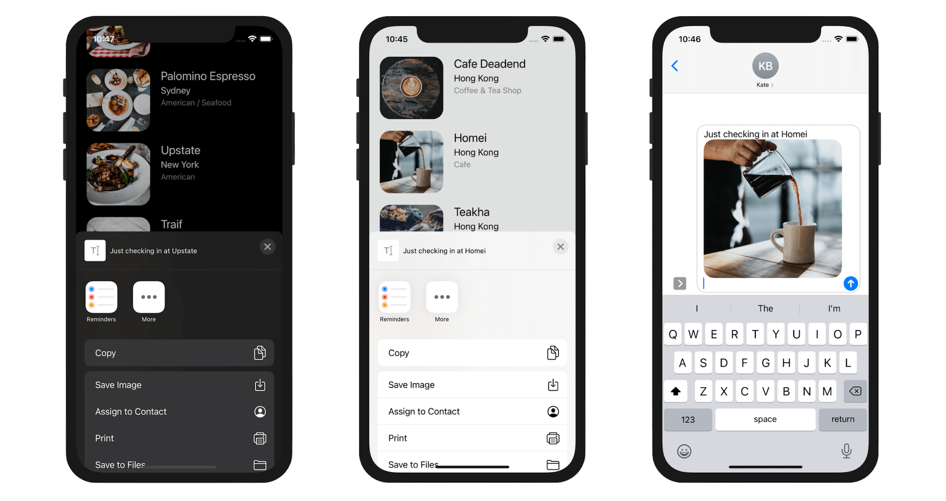
In UIKit, it comes with a standard view controller called UIActivityViewController that provides several standard services, such as copying items to the clipboard, sharing content on social media sites, sending items via Messages, etc. Unfortunately, the current version of SwiftUI still doesn't have this native component.
Whenever there is any missing components in SwiftUI, we can always borrow it from the UIKit framework. You can place UIKit views and view controllers inside SwiftUI views by creating types that conform to the UIViewRepresentable and UIViewControllerRepresentable protocols.
In the project navigator, right-click the View group and choose New File.... Choose the Swift File template and name the file ActivityView.swift. Once created, replace its content like this:
import SwiftUI

struct ActivityView: UIViewControllerRepresentable {

    var activityItems: [Any]
    var applicationActivities: [UIActivity]? = nil

    func makeUIViewController(context: Context) -> some UIViewController {
        let activityController = UIActivityViewController(activityItems: activityItems, applicationActivities: applicationActivities)
        return activityController
    }

    func updateUIViewController(_ uiViewController: UIViewControllerType, context: Context) {

    }
}
To use UIActivityViewController in UIKit, we create a new type called ActivityView which conforms to UIViewControllerRepresentable. The protocol requires us to provide the implementation of makeUIViewController and updateUIViewController. In the makeUIViewController method, we instantiate an instance of UIActivityViewController with the activity items and application activities.
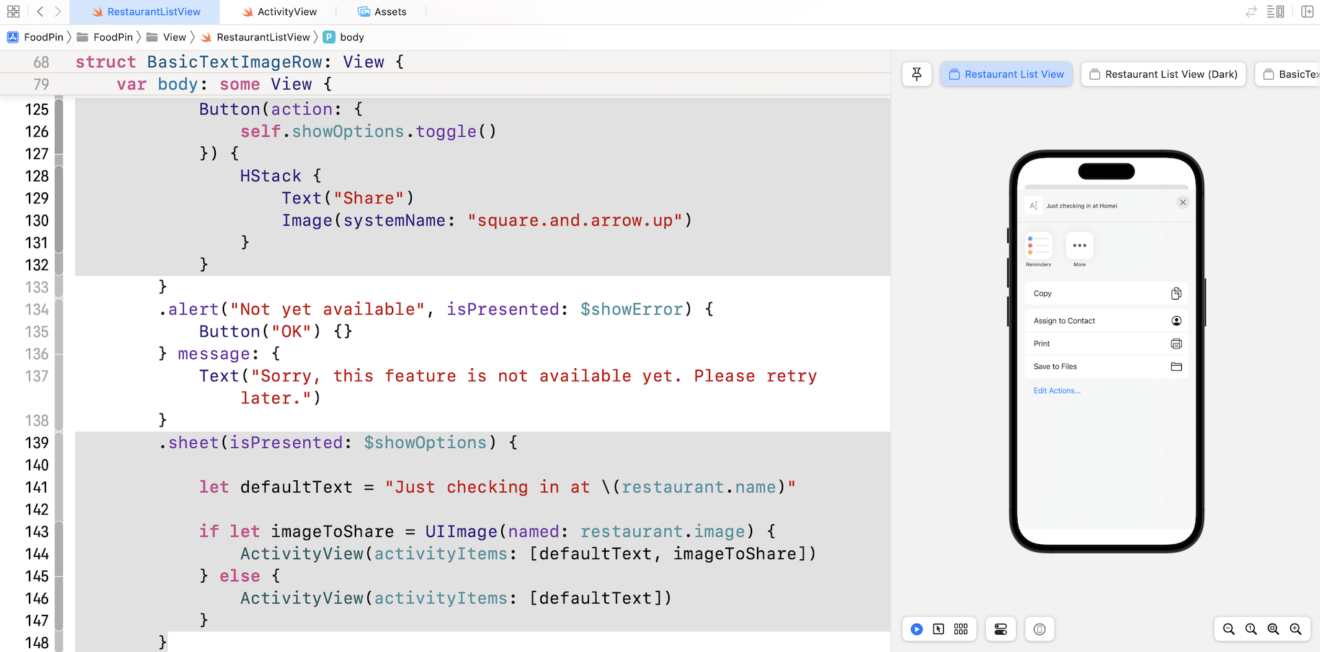
Now you are ready to use ActivityView in SwiftUI apps. We will create an additional item in the context for bringing up the activity view. Switch over to RestaurantListView.swift and add new button in the context menu of BasicTextImageRow:
Button(action: {
    self.showOptions.toggle()
}) {
    HStack {
        Text("Share")
        Image(systemName: "square.and.arrow.up")
    }
}
To present the activity view, attach the .sheet modifier to the HStack view:
.sheet(isPresented: $showOptions) {

    let defaultText = "Just checking in at \(restaurant.name)"

    if let imageToShare = UIImage(named: restaurant.image) {
        ActivityView(activityItems: [defaultText, imageToShare])
    } else {
        ActivityView(activityItems: [defaultText])
    }
}
The .sheet modifier monitors the change of showOptions. When it’s set to true, the app brings up the activity view controller. We instantiate the activity view with a message and the selected restaurant image.
If you run the app and choose the Share option in the context menu, you will see the activity view. In the activity view, you can choose Copy to copy the default text. And then you can paste it into apps like iMessage.
You can’t test social sharing using the simulator. But if you deploy the app to a real device with Twitter or Facebook installed, you will find the options in the activity view.
Summary
In this chapter, I showed you how to manage deletion in a table view and taught you how to create swipe action in a list. You also learned how to create a context menu and use UIActivityViewController for implementing a sharing feature. The FoodPin app is getting better and better. You should be proud of your achievement so far.
For reference, you can download the complete Xcode project (including the solution to the exercise) from http://www.appcoda.com/resources/swift57/swiftui-foodpin-list-deletion.zip.
In the next chapter, we'll take a look at something new and create a navigation controller.