- Made by AppCoda
- Contact us / Support
- Tweet this book
- Preface
- 1. The Development Tools, the Learning Approach, and the App Idea
- 2. Your First Taste of Swift with Playgrounds
- 3. Build Your First App in Swift and SwiftUI
- 4. Designing UI Using Stack Views
- 5. Introduction to Prototyping
- 6. Understanding List and ForEach
- 7. Customizing List Views
- 8. Displaying Confirmations and Handling List View Selection
- 9. Understanding Struct, Project Organization and Code Documentation
- 10. List Deletion, Swipe Actions, Context Menus and Activity Controller
- 11. Working with Navigation View
- 12. Detail View Enhancement, Custom Fonts and Navigation Bar Customization
- 13. Understanding Colors, Swift Extensions and Dynamic Type
- 14. Working with Maps
- 15. View Animations and Blur Effect
- 16. Working with Observable Objects and Combine
- 17. Working with Forms and Camera
- 18. Working with Core Data
- 19. Adding a Search Bar Using Searchable
- 20. Building Walkthrough Screens Using TabView
- 21. Working with Tab View and Tab Bar Customizations
- 22. Displaying Web Content with WKWebView and SFSafariViewController
- 23. Working with CloudKit
- 24. Localizing Your App to Support Multiple Languages
- 25. Deploying and Testing Your App on a Real iOS Device
- 26. Beta Testing with TestFlight and CloudKit Production Deployment
- 27. Submit Your App to App Store
- 28. Adopting Haptic Touch
- 29. Working with User Notifications
- 30. Appendix - Swift Basics
- Published with GitBook
Chapter 15
View Animations and Blur Effect

Animation can explain whatever the mind of man can conceive. This facility makes it the most versatile and explicit means of communication yet devised for quick mass appreciation.
– Walt Disney
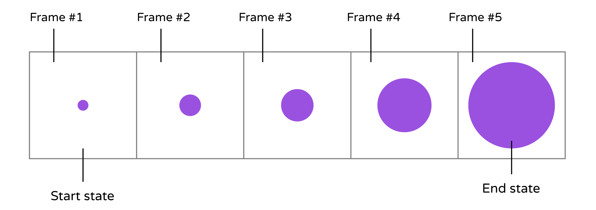
First things first, what's an animation? How is an animation created? Animation is a simulation of motion and shape change by rapidly displaying a series of static images (or frames). It is an illusion that an object is moving or changing in size. For instance, a growing circle animation is actually created by displaying a sequence of frames. It starts with a dot. The circle in each frame is a bit larger than the one before it. This creates an illusion that the dot grows bigger and bigger. Figure 15-1 illustrates the sequence of static images. I keep the example simple so the figure displays 5 frames. To achieve a smooth transition and animation, you'd need to develop several more frames.
Now that you have a basic idea of how animation works, how do you create an animation in SwiftUI? Consider our growing circle example. You know the animation starts with a dot (i.e. start state) and ends with a big red circle (i.e. end state). The challenge is to generate the frames between these states. Do you need to think of an algorithm and write hundreds of lines of code to generate the series of frames in between? No, SwiftUI takes care all these heavy lifting. The framework helps you compute the frames between the start and end state resulting in a smooth animation.
Have you ever used the magic move animation in Keynote? With magic move, you can easily create slick animation between slides. Keynote automatically analyzes the objects between slides and renders the animations automatically. To me, SwiftUI has brought Magic Move to app development. Animations using the framework are automatic and magical. You define two states of a view and SwiftUI will figure out the rest, animating the changes between the two states.
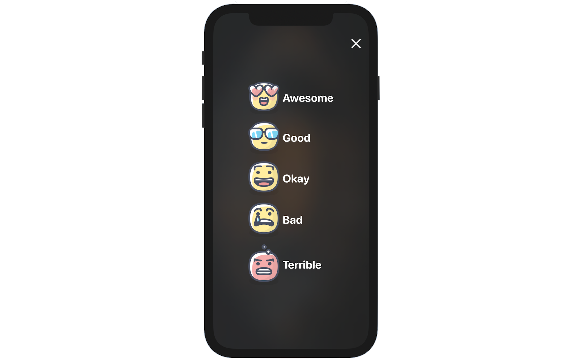
There is no better way to understand the technique than by working on a real example. What we are going to do in the chapter is to create a new Rate button in the detail view. When it's tapped, the app brings up a Review view for users to select the rating of the restaurant. What's more we will add a blurring effect and animations to the Review view.
Adding the Image Assets
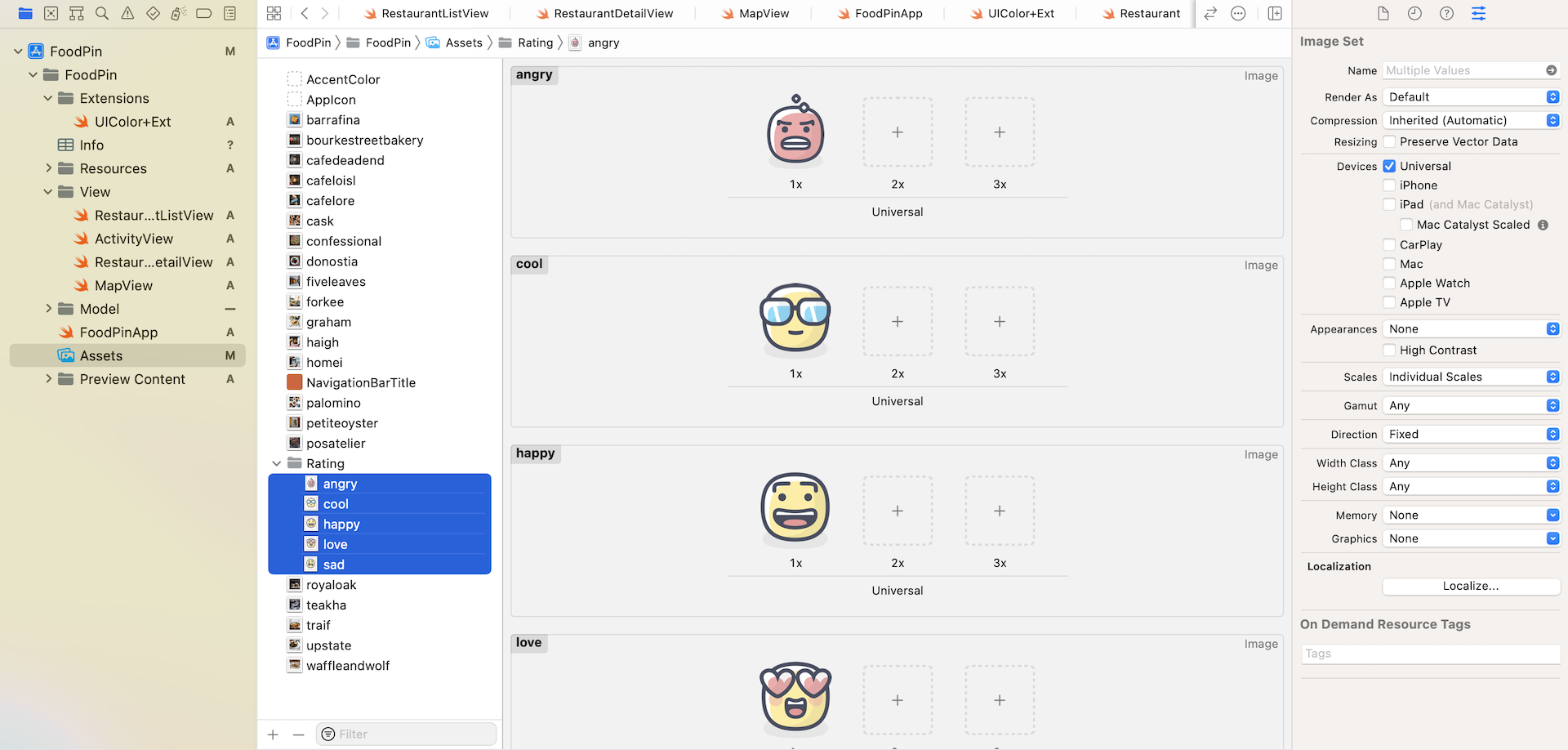
Now let's move onto the implementation of the Review view. The view displays five rating buttons for users to select. Based on what you've learned, it shouldn't be difficult for you to create this type of UI layout. Let's first prepare the images.
You can download this image pack (https://www.appcoda.com/resources/swift4/FoodPinRatingButtons.zip) and add the icons to the asset catalog (i.e. Assets.xcasssets). Optionally, you can create a folder in the asset catalog to store the images.
Using Enumeration to Represent Ratings
Let's begin with the model, that is the Restaurant.swift file. There are many ways to represent the ratings in Swift. For example, you may use a string to store the rating like this:
var rating = "awesome"
Or you may use an integer to represent a rating:
var rating = 5 // awesome
For this application, I prefer to store the ratings in the form of enumeration. An enum (short for enumeration) in Swift lets you define a common type for a group of related values. Insert the following code in the Restaurant struct:
enum Rating: String, CaseIterable {
    case awesome
    case good
    case okay
    case bad
    case terrible

    var image: String {
        switch self {
        case .awesome: return "love"
        case .good: return "cool"
        case .okay: return "happy"
        case .bad: return "sad"
        case .terrible: return "angry"
        }
    }
}
To create an enum, you start with the enum keyword, followed by the name of the enum. Here, we use the name Rating. The values defined in the enum (i.e. awesome, good, okay, bad, and terrible) are known as enumeration cases. Since we have 5 different types of rating, the Rating enum has 5 cases. Enum is a type in Swift, so you can use this Rating type like this:
var rating: Rating = .awesome
rating.image // this returns "love"
In an enumeration, you are allowed to define functions and variables. In the code above, we also declare an image variable, which returns the image name of the rating. For example, if the rating's value is set to .awesome, the image variable returns "love".
What's String and CaseIterable for? Each case of an enum is allowed to have a prepopulated value known as Raw Values. The String type indicates that strings are used for raw values. You can explicitly assign the raw values like this:
enum Rating: String, CaseIterable {
    case awesome = "awesome"
    case good = "good"
    case okay = "okay"
    case bad = "bad"
    case terrible = "terrible"

    .
    .
    .
}
Since the raw values are the same as the case name, we can omit it and let Swift generate the values for us.
Lastly, what's CaseIterable? When using enum, it's very common that you need to find out the total number cases or iterate over the cases. To do so, you adopt the CaseIterable protocol. Later, you can use the following code to count the cases:
let totalCases = Rating.allCases.count
And, we can lay out the rating buttons by using a ForEach loop like this:
ForEach(Restaurant.Rating.allCases, id: \.self) { rating in
   // Present the rating button
}
Implementing the Review View
Great! You should have some ideas about enumeration. Let's move onto the implementation of the review view. In the project navigator, right click the View folder and choose New File.... Select the SwiftUI View template and name the file ReviewView.swift.
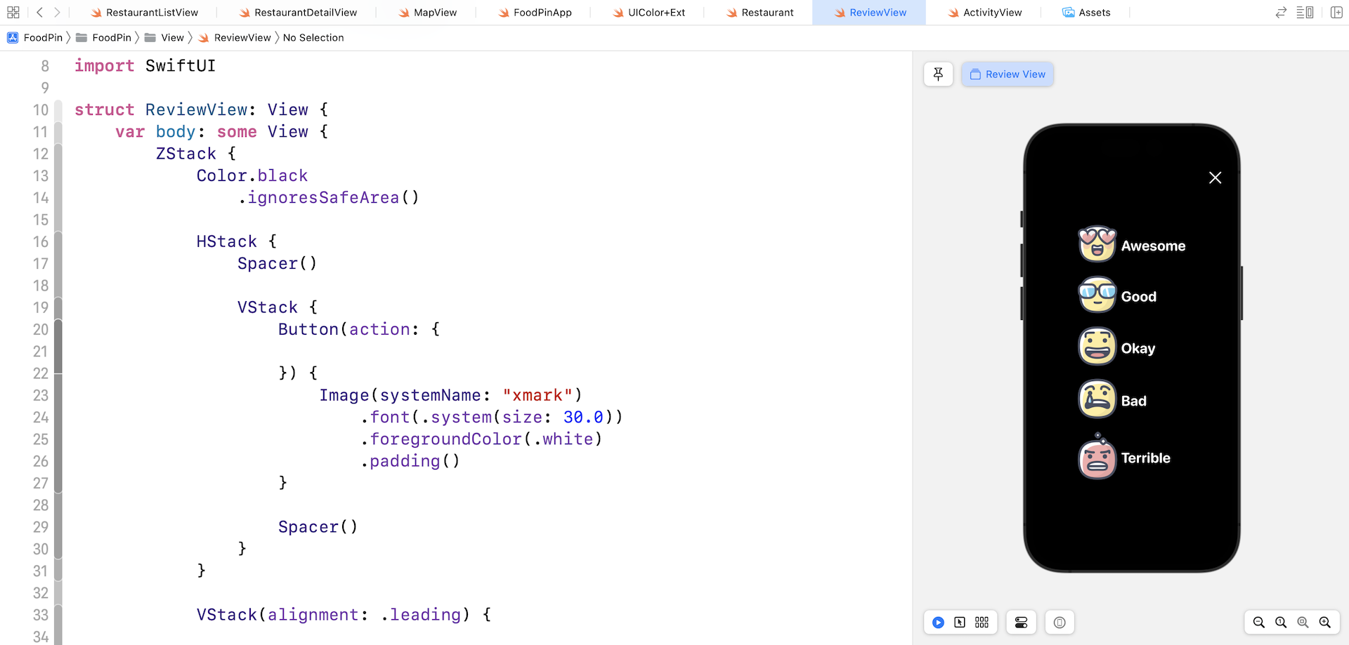
To create the review view as shown in figure 15-2, I will use a ZStack to hold three view components including the background, close button, and the group of ratings buttons. Update the ReviewView struct like this:
struct ReviewView: View {
    var body: some View {
        ZStack {
            Color.black
                .ignoresSafeArea()

            HStack {
                Spacer()

                VStack {
                    Button(action: {

                    }) {
                        Image(systemName: "xmark")
                            .font(.system(size: 30.0))
                            .foregroundColor(.white)
                            .padding()
                    }

                    Spacer()
                }
            }

            VStack(alignment: .leading) {

                ForEach(Restaurant.Rating.allCases, id: \.self) { rating in

                    HStack {
                        Image(rating.image)
                        Text(rating.rawValue.capitalized)
                            .font(.system(.title, design: .rounded))
                            .fontWeight(.bold)
                            .foregroundColor(.white)
                    }
                }
            }
        }
    }
}
The Color view is set to black and attached with the ignoresSafeArea modifier to expand the view to full screen. For the close button, we use the system image named xmark from SF Symbols.
The top layer is the VStack view that contains the rating buttons. Since the Rating enum adopts the CaseIterable protocol, we can easily iterate over all cases. For each rating button, we use a HStack to arrange the image and text.
Once you made the changes, you should see the UI as displayed in figure 15-4.
Applying a Visual Blur Effect
The Review view is still not done yet. If you refer to figure 15-2, the view should have a blurry background instead of having a solid black background. This can be realized by applying a blur effect on a restaurant image.
Before I talk about the blur effect implementation, let's add the background image first. Declare a variable in ReviewView to hold the Restaurant object:
var restaurant: Restaurant
We will use the restaurant's image as the background. Insert the following code snippet at the beginning of ZStack to display the image:
Image(restaurant.image)
    .resizable()
    .scaledToFill()
    .frame(minWidth: 0, maxWidth: .infinity)
    .ignoresSafeArea()
You should see an error in ReviewView_Previews because we've added the restaurant property. To fix the issue, simply pass a sample restaurant like this:
ReviewView(restaurant: Restaurant(name: "Cafe Deadend", type: "Coffee & Tea Shop", location: "G/F, 72 Po Hing Fong, Sheung Wan, Hong Kong", phone: "232-923423", description: "Searching for great breakfast eateries and coffee? This place is for you. We open at 6:30 every morning, and close at 9 PM. We offer espresso and espresso based drink, such as capuccino, cafe latte, piccolo and many more. Come over and enjoy a great meal.", image: "cafedeadend", isFavorite: true))
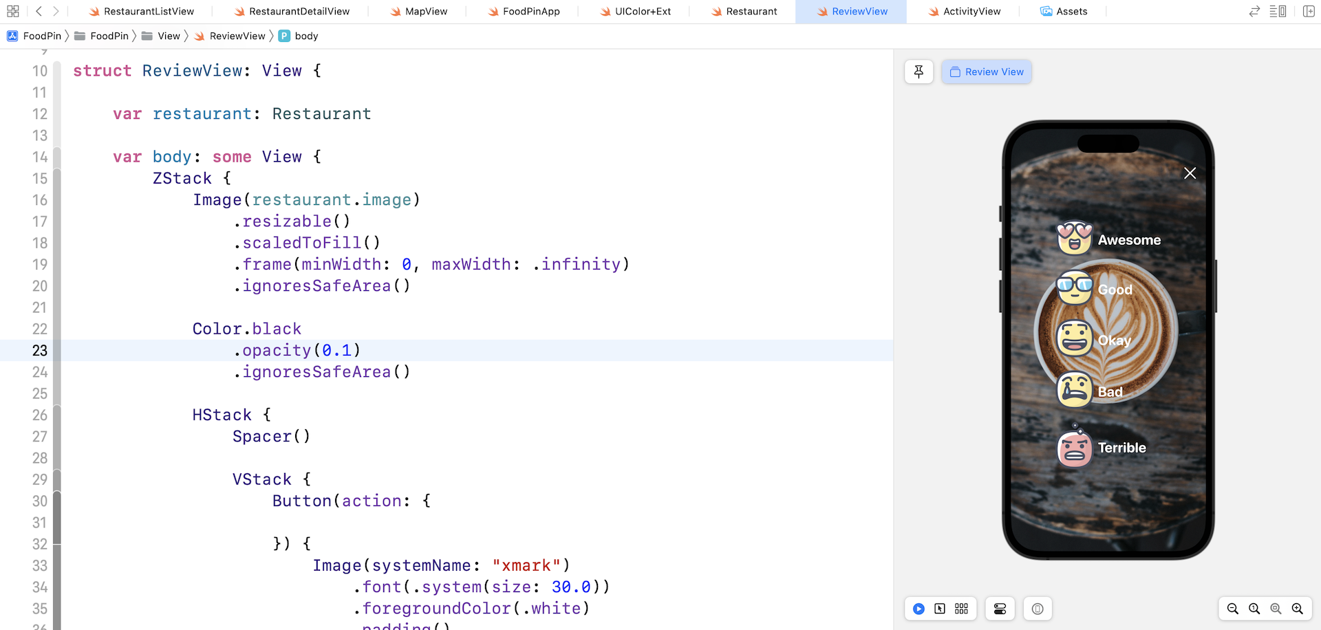
Even though you have added the background image, you won't see any visual change for the Review screen. The image is completely blocked by the Color view. Let's change the opacity of the Color view to 0.1:
Color.black
    .opacity(0.1)
    .ignoresSafeArea()
Once you made the change, the resulting screen should look like figure 15-5.
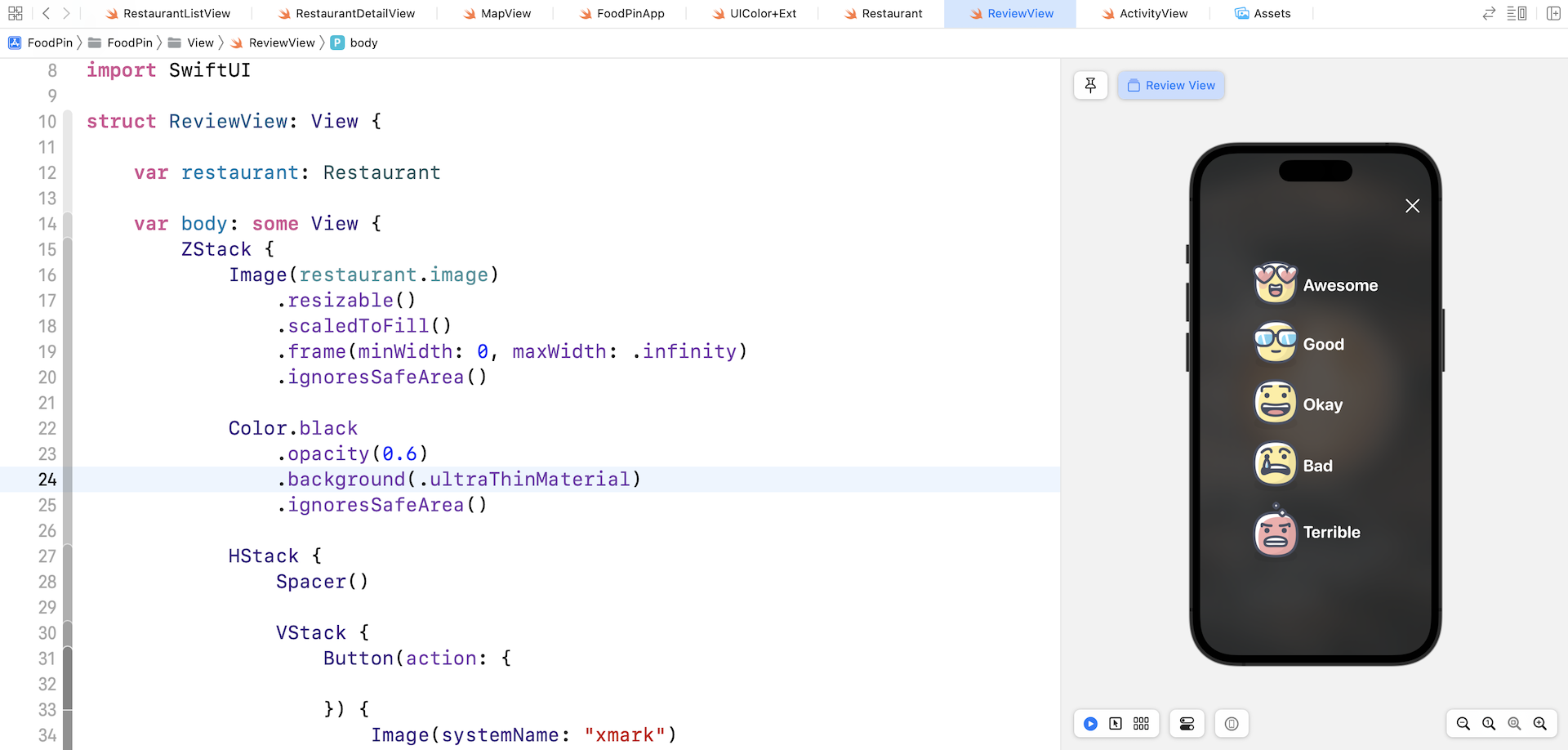
Prior to iOS 15, you have to revert it back to UIKit and make use of the UIVisualEffect class to apply visual effects to a view. With the release of iOS 15, SwiftUI comes with a native modifier for adding blur effects.
All you need to do is attach the background modifier and specify the material type. Update the Color view like this:
Color.black
    .opacity(0.6)
    .background(.ultraThinMaterial)
    .ignoresSafeArea()
The SwiftUI framework provides 5 types of materials, each with a different thickness including:
- .ultraThinMaterial
- .thinMaterial
- .regularMaterial
- .thickMaterial
- .ultraThickMaterial
The thickness of the material determines how much of the background content can be seen. The thicker the material, the less background content can be passed through. In the code above, we updated the opacity to 0.6 and use the .ultraThinMaterial for the background.
You will immediately see the visual blur in the preview. To test out the effect of each material, you can update the background modifier with different materials.
Displaying the Review Screen
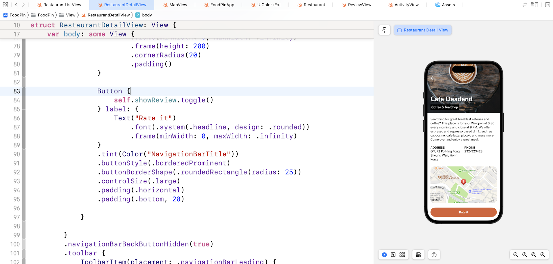
Now let's head back to RestaurantDetailView.swift and add the Rate button. By tapping the button, the app will display the Review screen.
First, create a state variable named showReview to control the appearance of the Review view:
@State private var showReview = false
At the end of the VStack view (i.e. after NavigationLink), insert the following code to create the button:
Button {
    self.showReview.toggle()
} label: {
    Text("Rate it")
        .font(.system(.headline, design: .rounded))
        .frame(minWidth: 0, maxWidth: .infinity)
}
.tint(Color("NavigationBarTitle"))
.buttonStyle(.borderedProminent)
.buttonBorderShape(.roundedRectangle(radius: 25))
.controlSize(.large)
.padding(.horizontal)
.padding(.bottom, 20)
We implemented a rounded rectangular button using some new modifiers introduced in iOS 15. The tint modifier sets the color of the button. iOS 15 offers three default styles of Button. In the code above, we use the .borderedProminent style to present a button with a solid background. .bordered and .borderless are the other two styles.
The buttonBorderShape modifier lets us define the border shape of the button. In this case, we set it to the rounded rectangular shape. The controlSize modifier defines the size of the button.
When the button is tapped, we toggle the value of showReview in order to trigger the display of ReviewView. If you run the app in the preview pane, you should now see the Rate it button in the detail view.
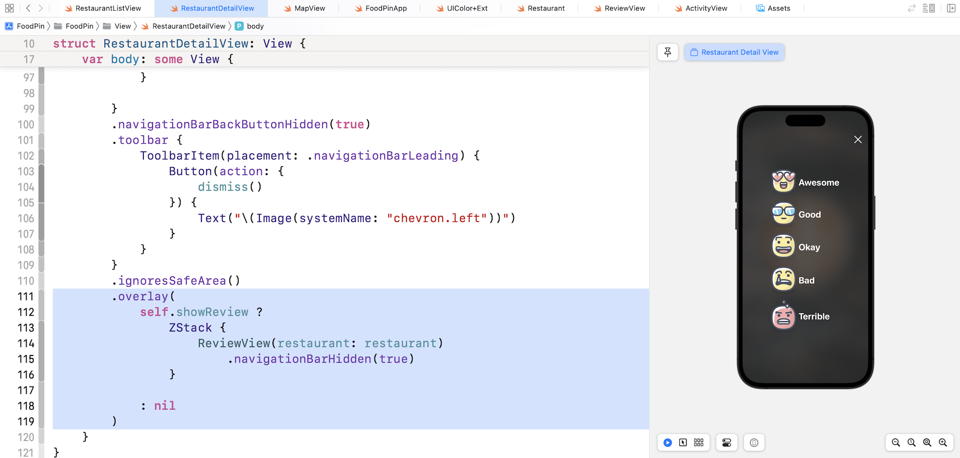
To bring up the ReviewView, attach the .overlay modifier to the ScrollView (refer to figure 15.8 if you are not sure where to insert the code snippet):
.overlay(
    self.showReview ?
        ZStack {
            ReviewView(restaurant: restaurant)
                .navigationBarHidden(true)
        }

    : nil
)
You may question why we displayed the ReviewView as an overlay instead of presenting it as a sheet. The answer is flexibility. Later, we will add some animated transitions to the ReviewView. If we chose to present the view as a modal sheet, it will quite difficult for us to modify its default transition. This is why I prefer to present the review view as an overlay.
To hide the back button when the review view appears, we attach the .navigationBarHidden modifier and set it to true.
Once you complete the change, run the app in a simulator or in the preview. Go to the detail view of a restaurant and tap the Rate it button to trigger the review view.
Dismissing the Review View with Animations
Have you tried to tap the close button of the review view? It doesn't work yet. To make it functional, declare a binding at the beginning of the ReviewView struct:
@Binding var isDisplayed: Bool
We need the caller of ReviewView to pass us the binding to the state variable which controls the visibility of the ReviewView. With the binding, we can dismiss the review view by setting isDisplayed to false. Update the xmark button's action like this:
Button(action: {
    withAnimation(.easeOut(duration: 0.3)) {
        self.isDisplayed = false
    }
}) {
    Image(systemName: "xmark")
        .font(.system(size: 30.0))
        .foregroundColor(.white)
        .padding()
}
When the xmark button is tapped, we simply set the value of isDisplayed to false. This will dismiss the review view.
To animate the change of a state in SwiftUI, all you need to do is wrap the state changes in a withAnimation block. The withAnimation call takes in an animation parameter. Here we specify to use the .easeOut animation with a duration of 0.3 seconds. SwiftUI comes with several built-in animation. .easeOut is just one of them.
This type of animation in SwiftUI is known as explicit animation because we explicitly tell SwiftUI to animate a specific state change (i.e. isDisplayed).
You should see an error in ReviewView_Previews due to the addition of the binding. Update the instantiation of ReviewView with the addition of the isDisplayed binding:
struct ReviewView_Previews: PreviewProvider {
    static var previews: some View {
        ReviewView(isDisplayed: .constant(true), restaurant: Restaurant(name: "Cafe Deadend", type: "Coffee & Tea Shop", location: "G/F, 72 Po Hing Fong, Sheung Wan, Hong Kong", phone: "232-923423", description: "Searching for great breakfast eateries and coffee? This place is for you. We open at 6:30 every morning, and close at 9 PM. We offer espresso and espresso based drink, such as capuccino, cafe latte, piccolo and many more. Come over and enjoy a great meal.", image: "cafedeadend", isFavorite: true))
    }
}
Now head back to RestaurantDetailView.swift, which is the caller of ReviewView. Modify the code to instantiate the ReviewView like this to pass the binding of showReview:
ReviewView(isDisplayed: $showReview, restaurant: restaurant)
That's it! Run the app in a simulator again. The close button should work properly and dismiss the review view with a fade animation.
Animating the Rate Buttons with Slide-in Animation
A slide-in animation is a common type of animations. The object slides from the far right (or left) of the screen until it reaches a specific position. Take a look at figure 15-9. When the review view appears, the rating buttons slide from the far right into the screen.
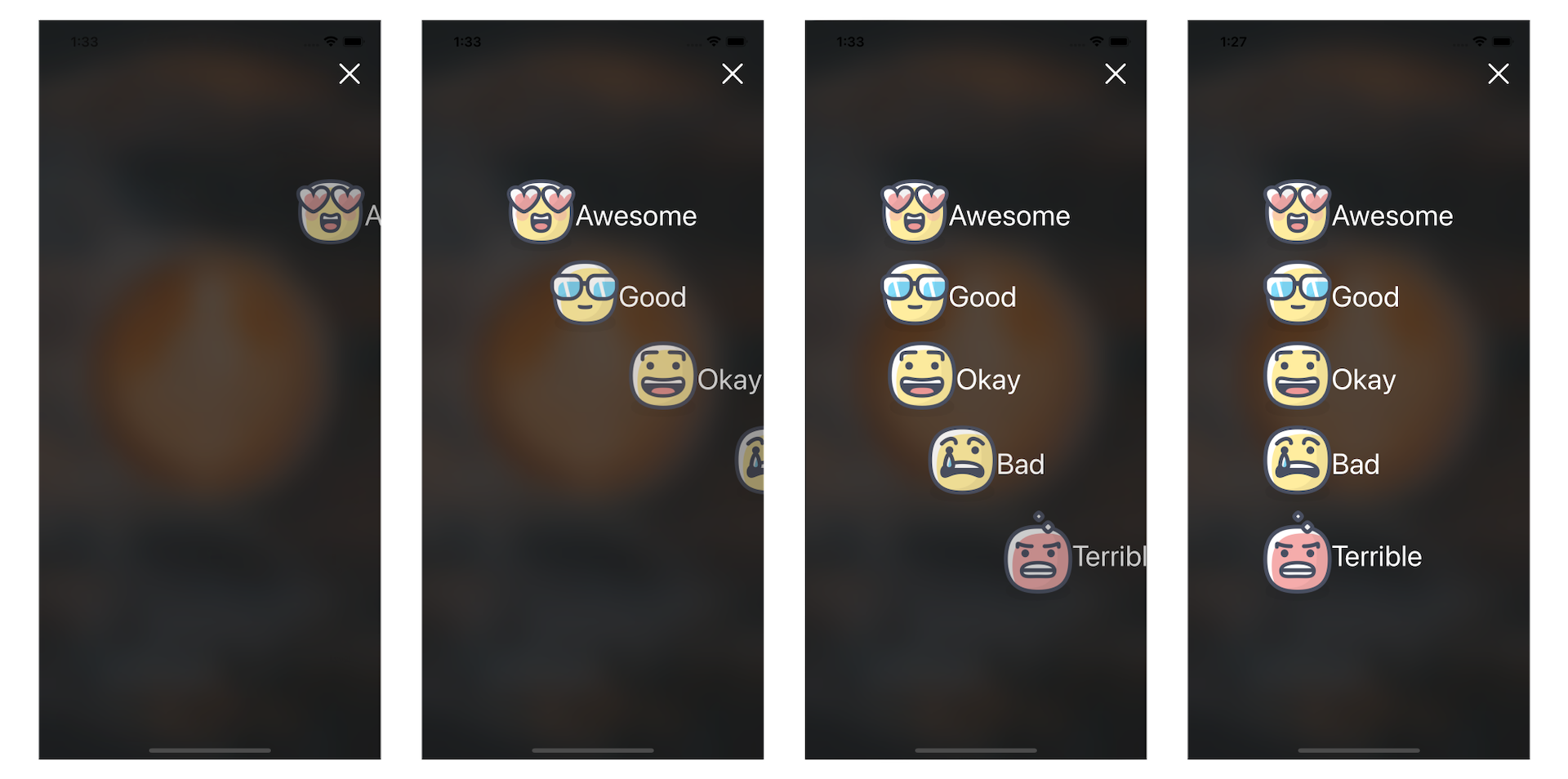
To create the slide-in animation, we will move all the rate buttons off the screen to the right. This is the start state. The end state is the original position of the buttons.
We need a state variable to control the start and end states. In ReviewView, declare a state variable and set its initial value to false:
@State private var showRatings = false
Here, a value of false means the rating buttons are hidden at the far right of the screen. Now attach the following modifiers to each of the rating buttons:
ForEach(Restaurant.Rating.allCases, id: \.self) { rating in
HStack {
.
.
.
}
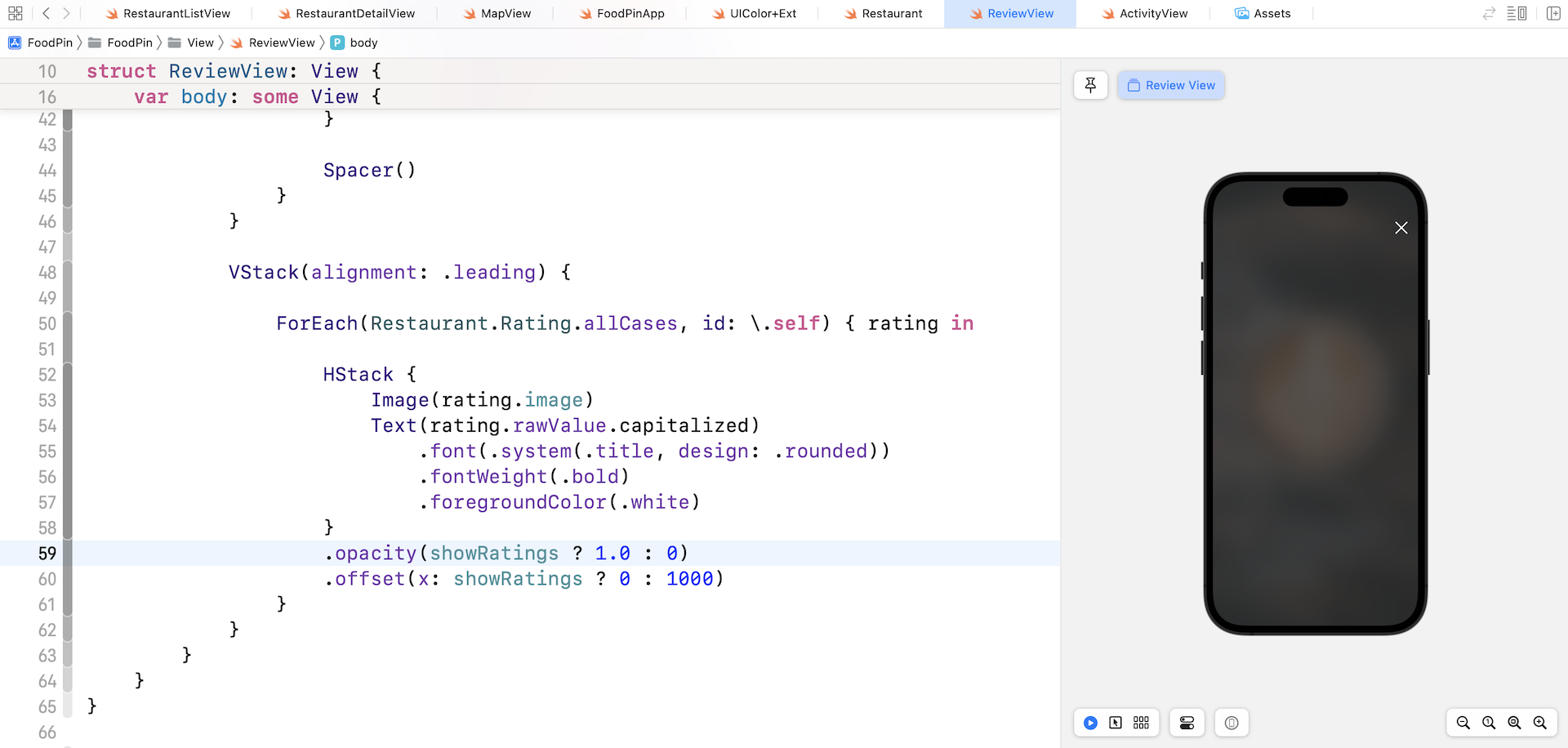
.opacity(showRatings ? 1.0 : 0)
.offset(x: showRatings ? 0 : 1000)
}
We use the offset modifier to move the rating button off the screen. A positive value (i.e. 1000) moves the view to the right. The .opacity modifier is optional. However, when we animate these state changes later, it will give a better animated effect.
With the changes above, all rating buttons are hidden. The review screen should display a blank screen.
So, how can we move the rating buttons back to the original position? The trick is to use the .onAppear modifier and set the showRatings property to true when the view appears.
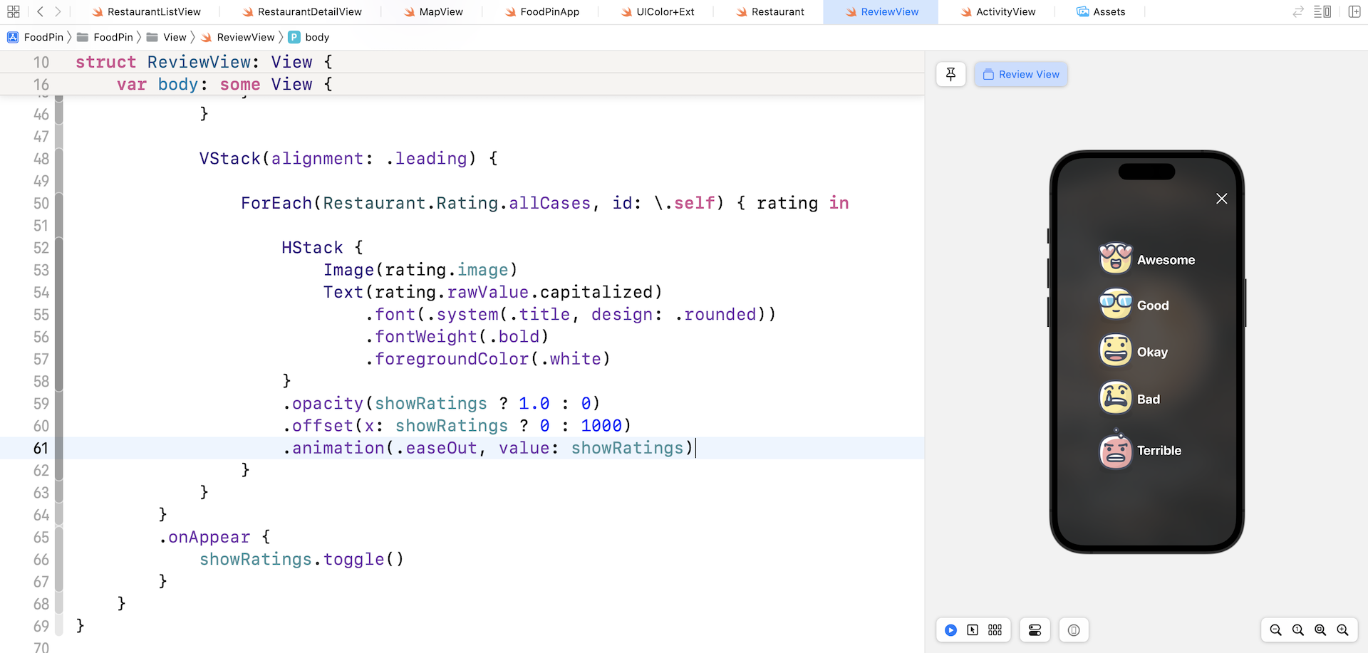
Attach the .onAppear modifier to the ZStack view:
.onAppear {
    showRatings.toggle()
}
Once you inserted the code, the rating buttons appear in the view again. But the state change is not animated yet. How can we create the slide-in animation?
All you need is to attach the .animation modifier to the HStack view and place it after the .offset modifier like this:
.animation(.easeOut, value: showRatings)
Earlier, we use withAnimation to create the animation. The animation modifier is another way to instruct SwiftUI to render the animation. When the state of showRatings is updated, the framework automatically animates all the changes. To test the animation, run the app in the preview pane.
We have successfully created the slide-in animation. That said, it's not the exact animation we want to build. It's a slide-in animation, however, all rating buttons fly into the screen at the same time. To implement the animation as displayed in figure 15-9, we have to add a delay for each of the buttons. Update the .animation modifier like this:
.animation(.easeOut.delay(Double(Restaurant.Rating.allCases.firstIndex(of: rating)!) * 0.05), value: showRatings)
The SwiftUI framework provides several built-in animations such as .easeOut. Each of these animations allows you to call its delay function to start the animation after a certain number of seconds. The first case of the Rating enum starts the animation without a delay. The second case of the enum will have a delay of 0.05 seconds. The third case will delay 0.1 seconds and vice versa.
Now run the app again to see the animation!
Summary
This is another huge chapter that covers animation and visual effects. SwiftUI has made it so easy to animate changes of a view. All you need to do is tell the framework what the start and end states are. SwiftUI then comes up with the required animation.
I only covered a couple of built-in animations (e.g. .easeOut) in this chapter. I would encourage you to try out other types of built-in animations such as spring animation to see how they work. Lastly, don't forget to take some time to complete the exercises.
For your reference, you can download the complete Xcode project from http://www.appcoda.com/resources/swift57/swiftui-foodpin-animation.zip. The solution to the exercises is included in the project.