- Made by AppCoda
- Contact us / Support
- Tweet this book
- Preface
- 1. The Development Tools, the Learning Approach, and the App Idea
- 2. Your First Taste of Swift with Playgrounds
- 3. Build Your First App in Swift and SwiftUI
- 4. Designing UI Using Stack Views
- 5. Introduction to Prototyping
- 6. Understanding List and ForEach
- 7. Customizing List Views
- 8. Displaying Confirmations and Handling List View Selection
- 9. Understanding Struct, Project Organization and Code Documentation
- 10. List Deletion, Swipe Actions, Context Menus and Activity Controller
- 11. Working with Navigation View
- 12. Detail View Enhancement, Custom Fonts and Navigation Bar Customization
- 13. Understanding Colors, Swift Extensions and Dynamic Type
- 14. Working with Maps
- 15. View Animations and Blur Effect
- 16. Working with Observable Objects and Combine
- 17. Working with Forms and Camera
- 18. Working with Core Data
- 19. Adding a Search Bar Using Searchable
- 20. Building Walkthrough Screens Using TabView
- 21. Working with Tab View and Tab Bar Customizations
- 22. Displaying Web Content with WKWebView and SFSafariViewController
- 23. Working with CloudKit
- 24. Localizing Your App to Support Multiple Languages
- 25. Deploying and Testing Your App on a Real iOS Device
- 26. Beta Testing with TestFlight and CloudKit Production Deployment
- 27. Submit Your App to App Store
- 28. Adopting Haptic Touch
- 29. Working with User Notifications
- 30. Appendix - Swift Basics
- Published with GitBook
Chapter 12
Detail View Enhancement, Custom Fonts and Navigation Bar Customization

To create something exceptional, your mindset must be relentlessly focused on the smallest detail.
- Giorgio Armani
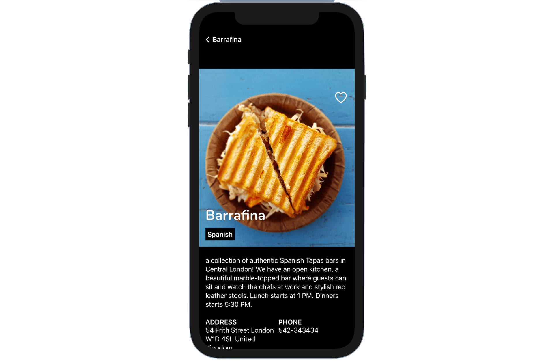
The detail view is a bit primitive. Wouldn't it be great to improve the detail view to the one shown above? In this chapter, we will further enhance the detail view to display more restaurant information. On top of that, you will learn how to use custom fonts in SwiftUI.
We will cover a lot of materials in this chapter. You will probably need a couple of hours to work on the project. I suggest you set aside other stuff and let yourself focus on it. If you are ready, let's begin to tweak the detail view to make it look great.
A Quick Look at the Starter Project
To begin, first download the FoodPin project from http://www.appcoda.com/resources/swift57/swiftui-foodpin-detailview-starter.zip. The project was based on what we have completed in the previous chapter but I have modified the Restaurant struct to add two more properties: description and phone:
struct Restaurant {
    var name: String
    var type: String
    var location: String
    var phone: String
    var description: String
    var image: String
    var isFavorite: Bool

    init(name: String, type: String, location: String, phone: String, description: String, image: String, isFavorite: Bool = false) {
        self.name = name
        self.type = type
        self.location = location
        self.phone = phone
        self.description = description
        self.image = image
        self.isFavorite = isFavorite
    }

    init() {
        self.init(name: "", type: "", location: "", phone: "", description: "", image: "", isFavorite: false)
    }
}
On top of that, I have updated the restaurant data with full address and phone numbers. You can refer to the RestaurantListView.swift file for details:
@State var restaurants = [ Restaurant(name: "Cafe Deadend", type: "Coffee & Tea Shop", location: "G/F, 72 Po Hing Fong, Sheung Wan, Hong Kong", phone: "232-923423", description: "Searching for great breakfast eateries and coffee? This place is for you. We open at 6:30 every morning, and close at 9 PM. We offer espresso and espresso based drink, such as capuccino, cafe latte, piccolo and many more. Come over and enjoy a great meal.", image: "cafedeadend", isFavorite: false),
    Restaurant(name: "Homei", type: "Cafe", location: "Shop B, G/F, 22-24A Tai Ping San Street SOHO, Sheung Wan, Hong Kong", phone: "348-233423", description: "A little gem hidden at the corner of the street is nothing but fantastic! This place is warm and cozy. We open at 7 every morning except Sunday, and close at 9 PM. We offer a variety of coffee drinks and specialties including lattes, cappuccinos, teas, and more. We serve breakfast, lunch, and dinner in an airy open setting. Come over, have a coffee and enjoy a chit-chat with our baristas.", image: "homei", isFavorite: false),

      ...

]
Since we added two new properties for the Restaurant struct, the RestaurantDetailView_Previews and RestaurantListView_Previews are updated as well.
struct RestaurantDetailView_Previews: PreviewProvider {
    static var previews: some View {
        RestaurantDetailView(restaurant: Restaurant(name: "Cafe Deadend", type: "Coffee & Tea Shop", location: "G/F, 72 Po Hing Fong, Sheung Wan, Hong Kong", phone: "232-923423", description: "Searching for great breakfast eateries and coffee? This place is for you. We open at 6:30 every morning, and close at 9 PM. We offer espresso and espresso based drink, such as capuccino, cafe latte, piccolo and many more. Come over and enjoy a great meal.", image: "cafedeadend", isFavorite: false))
    }
}
That's all the changes for the starter project. Take some time to familarize with the changes before you continue to read the next section.
Using Custom Fonts
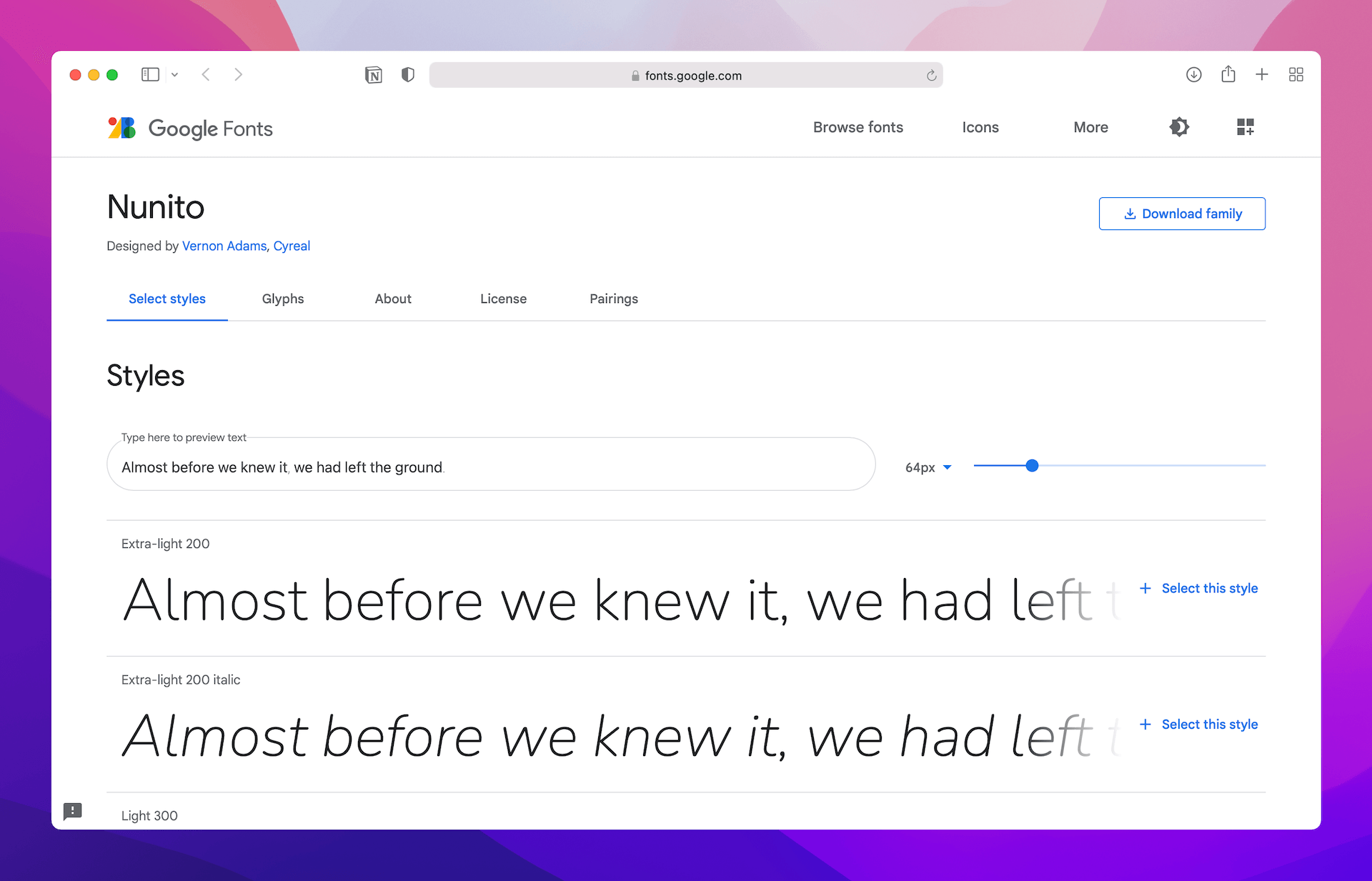
The San Francisco font was introduced in Nov 2014 and has been used as the default font in iOS apps. What if you find an open source font on Google Fonts (https://fonts.google.com) and want to use it in your app? How can you do it?
Xcode has made it very easy for developers to use custom fonts. All you need is just add the custom font files into your Xcode project. Let's say, you prefer to use Nunito in your app. You can go up to https://fonts.google.com/specimen/Nunito. Click Download Family to download the font files.
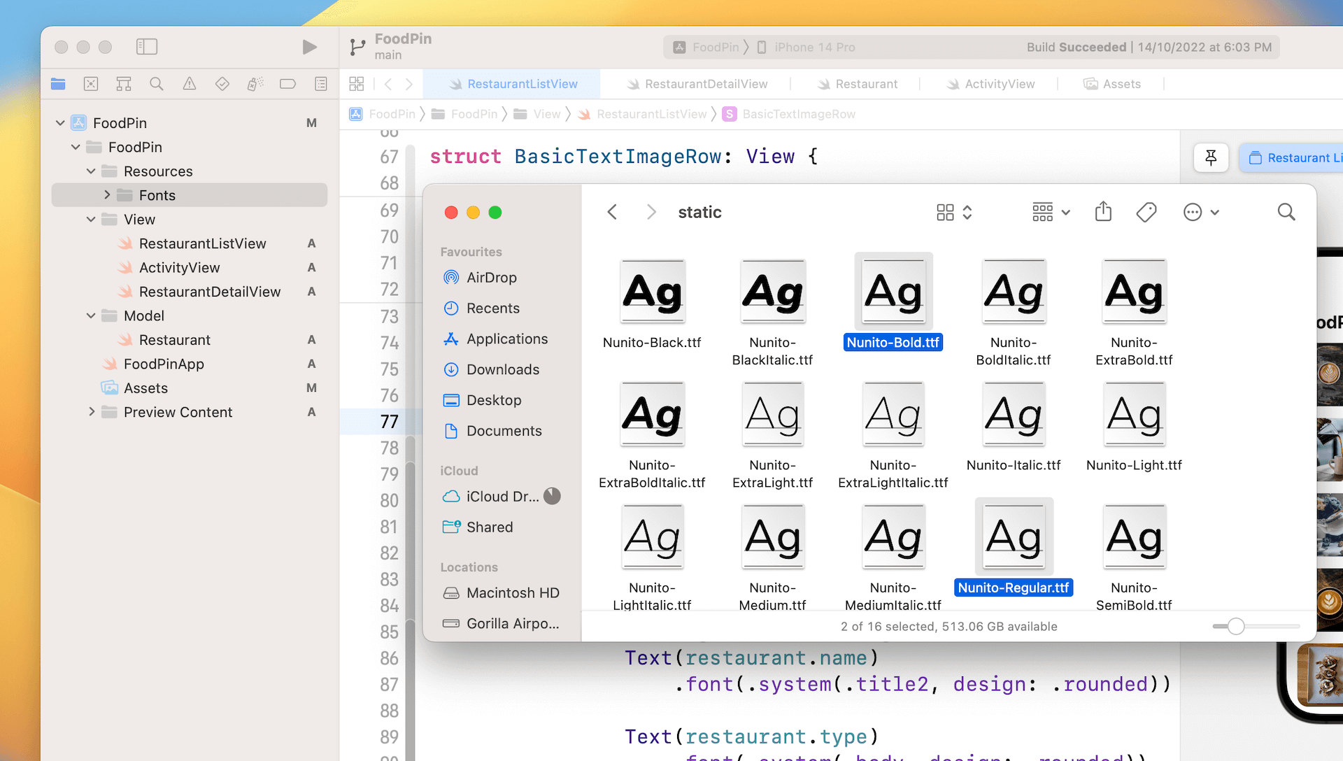
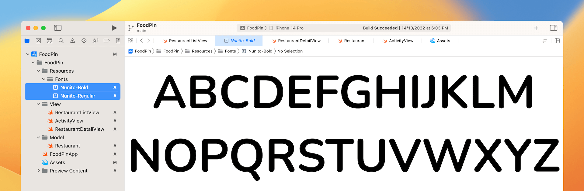
Now go back to Xcode and open the starter project (if you haven't). In the project navigator, right click the FoodPin folder and select New Group. Name the group Resources. Next, right click the Resources folder and select New Group to add a sub group. Name the sub group Fonts. Select Nunito-Regular.ttf and Nunito-Bold.ttf, and add them to the Fonts group. In case if you want to use all the font styles, you can add all the font files to the group.
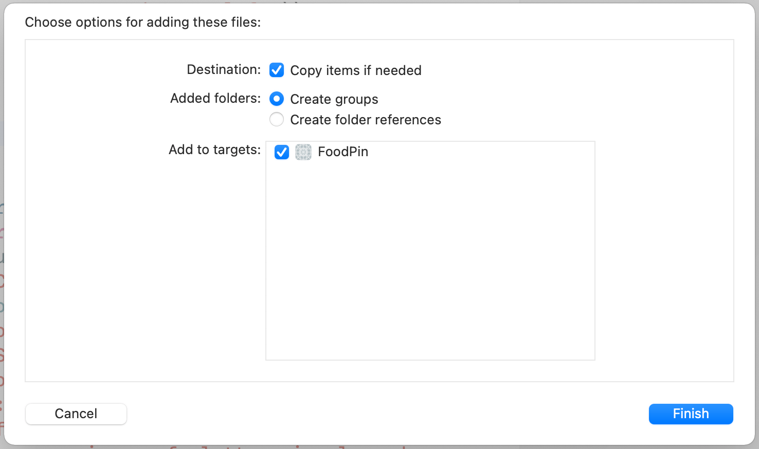
Note: Is it a mandate to create a sub group? No, it is my practice to organize resource files like that.Once you dropped the files into the Fonts group, you will be prompted with the dialog as shown in figure 12-3. Make sure you check the Copy items if needed option and the FoodPin target.
Once you hit Finish, the font files will appear in the project navigator. To ensure your app can use the font files, hold command key to select all the fonts files. In the File inspector, make sure the FoodPin option under target membership is enabled. If not, tick the option.
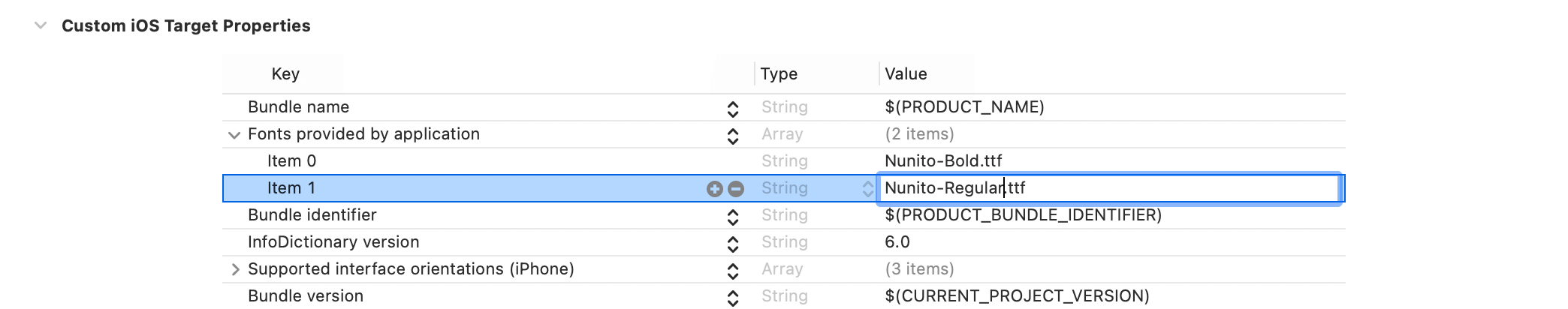
Lastly, we need to add a new key called Fonts provided by application in the Info.plist file. The Info.plist file is a configuration file for your Xcode project. To use the custom font files, you have to register them in the configuration.
By default, Xcode 14 doesn't show you the Info.plist file in the project navigator. You have to click the FoodPin project, followed by choosing the FoodPin target. Then select the Info tab to reveal the custom iOS Target Properties.
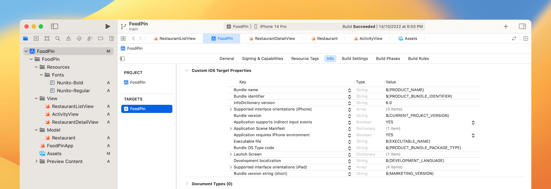
Next, place the cursor over Bundle name and then you will see a + button. Click it to add a new key. Set the key name to Fonts provided by application and fill the value of item 0 to Nunito-Bold.ttf. Then click the + button to add another item. Set the value of item 1 to Nunito-Regular.ttf.
That's the procedures to install custom fonts. Later, to use the custom font, you can write the code like this:
.font(.custom("Nunito-Regular", size: 25))
To use custom fonts with Dynamic Type, you can write the code like this:
.font(.custom("Nunito-Regular", size: 35, relativeTo: .largeTitle))
The .largeTitle font type will start at 35 points and scale up/down automatically.
Improving the Detail View
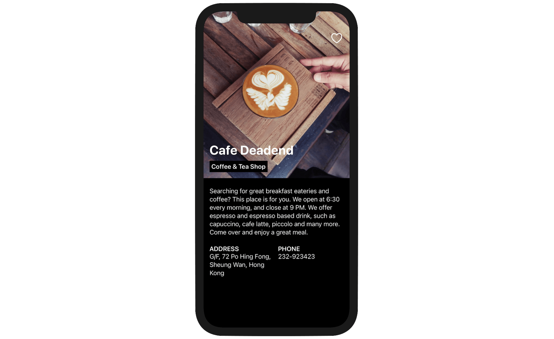
The detail view you have developed in the previous chapter just displayed the basic information of a restaurant. We are going to display more information like address and phone number, and make the UI look more professional. Take a look at figure 12-7. Does the UI look much better?
Now, switch over to RestaurantDetailView.swift and let's change the code. We no longer need to use the ZStack view. So, replace it with the following code:
ScrollView {

}
.navigationBarBackButtonHidden(true)
.toolbar {
    ToolbarItem(placement: .navigationBarLeading) {
        Button(action: {
            dismiss()
        }) {
            Text("\(Image(systemName: "chevron.left")) \(restaurant.name)")
        }
    }
}
We use a scroll view to hold the restaurant information because the content may be longer than the screen height. Inside the ScrollView, we will use a VStack to lay out the components. I'll break it into three parts:
- The featured image
- The restaurant description
- The restaurant address and phone
The Featured Image
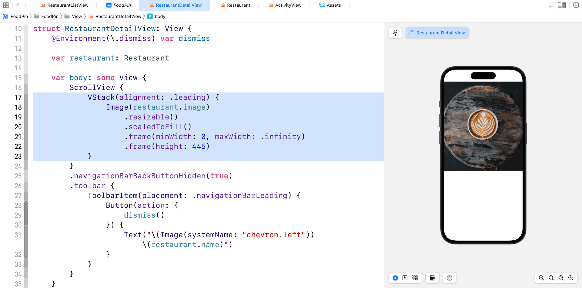
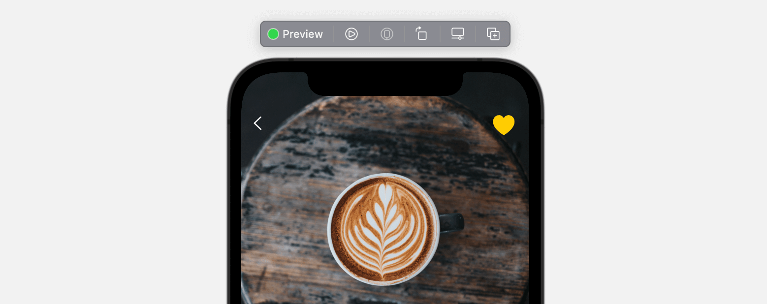
In the ScrollView, we use a VStack to arrange the UI component. Inside the VStack, the first element is the featured image. Insert the following code to create the image view:
VStack(alignment: .leading) {
    Image(restaurant.image)
        .resizable()
        .scaledToFill()
        .frame(minWidth: 0, maxWidth: .infinity)
        .frame(height: 445)
The code is very straightforward. We create an Image view to load the restaurant image. To scale the image, we use the scaledToFill mode. The frame modifier is attached for controlling the size of the image with the height limits to 445 points.
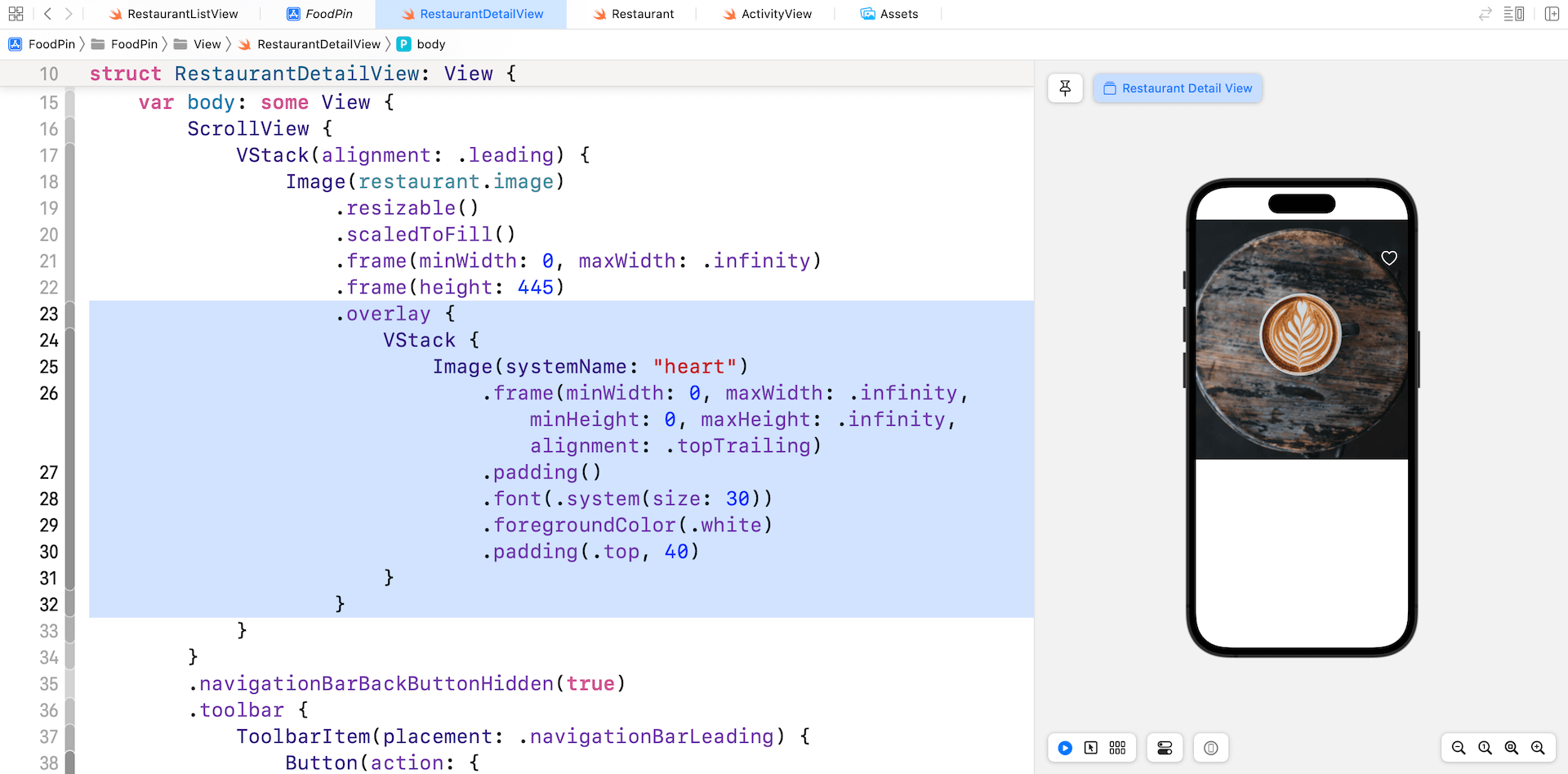
Next, we need to overlay some restaurant information on the image. As you may know, we can use the overlay modifier to achieve it. Attach the overlay modifier to the Image view like this:
.overlay {
    VStack {
        Image(systemName: "heart")
            .frame(minWidth: 0, maxWidth: .infinity, minHeight: 0, maxHeight: .infinity, alignment: .topTrailing)
            .padding()
            .font(.system(size: 30))
            .foregroundColor(.white)
            .padding(.top, 40)
    }
}
We start with the heart image, which is a system image provided by SF Symbols. You should be very familiar with the modifiers like foregroundColor, font, and padding. The tricky part is the frame modifier. What is it for?
There are a couple of ways to place the heart image at the top right corner of the view. Here, we use the frame modifier to handle the alignment. By setting the value of alignment to .topTrailing, we can move the heart image to the top-right corner.
The featured image part is not done yet. We still need to lay out the restaurant name and type. Insert the following line of code after the heart image view:
VStack(alignment: .leading, spacing: 5) {
    Text(restaurant.name)
        .font(.custom("Nunito-Regular", size: 35, relativeTo: .largeTitle))
        .bold()
    Text(restaurant.type)
        .font(.system(.headline, design: .rounded))
        .padding(.all, 5)
        .background(Color.black)
}
.frame(minWidth: 0, maxWidth: .infinity, minHeight: 0, maxHeight: .infinity, alignment: .bottomLeading)
.foregroundColor(.white)
.padding()
If you've added the code correctly, you should see the restaurant name and type in the preview.
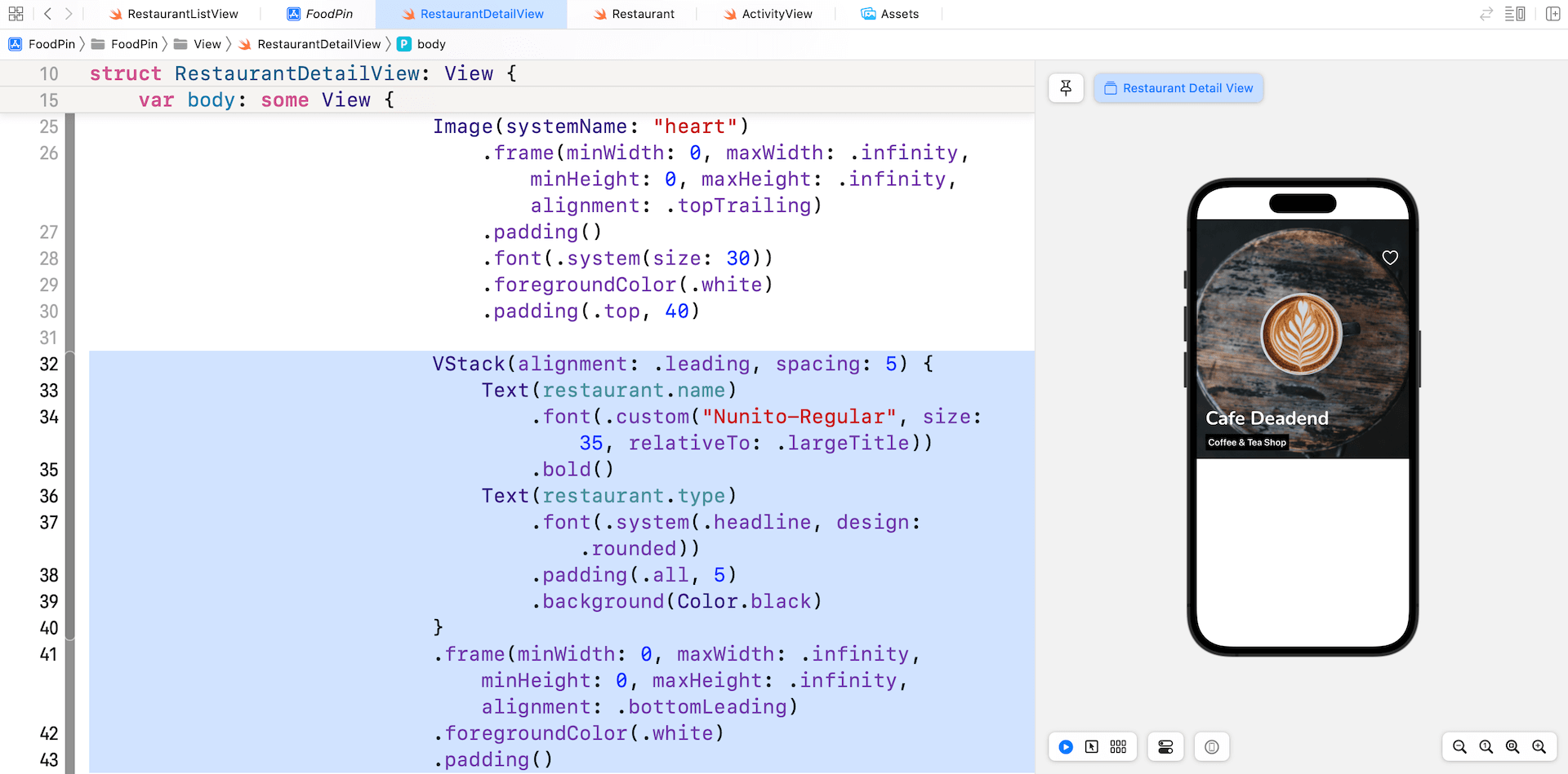
Obviously, to arrange both the name and type vertically, we have to use a VStack. Again, the frame modifier is used to align the VStack to the bottom left corner.
By default, there is quite a large gap between the restaurant name and type. To minimize the spacing, we explicitly tell the VStack to set the spacing to 5 points.
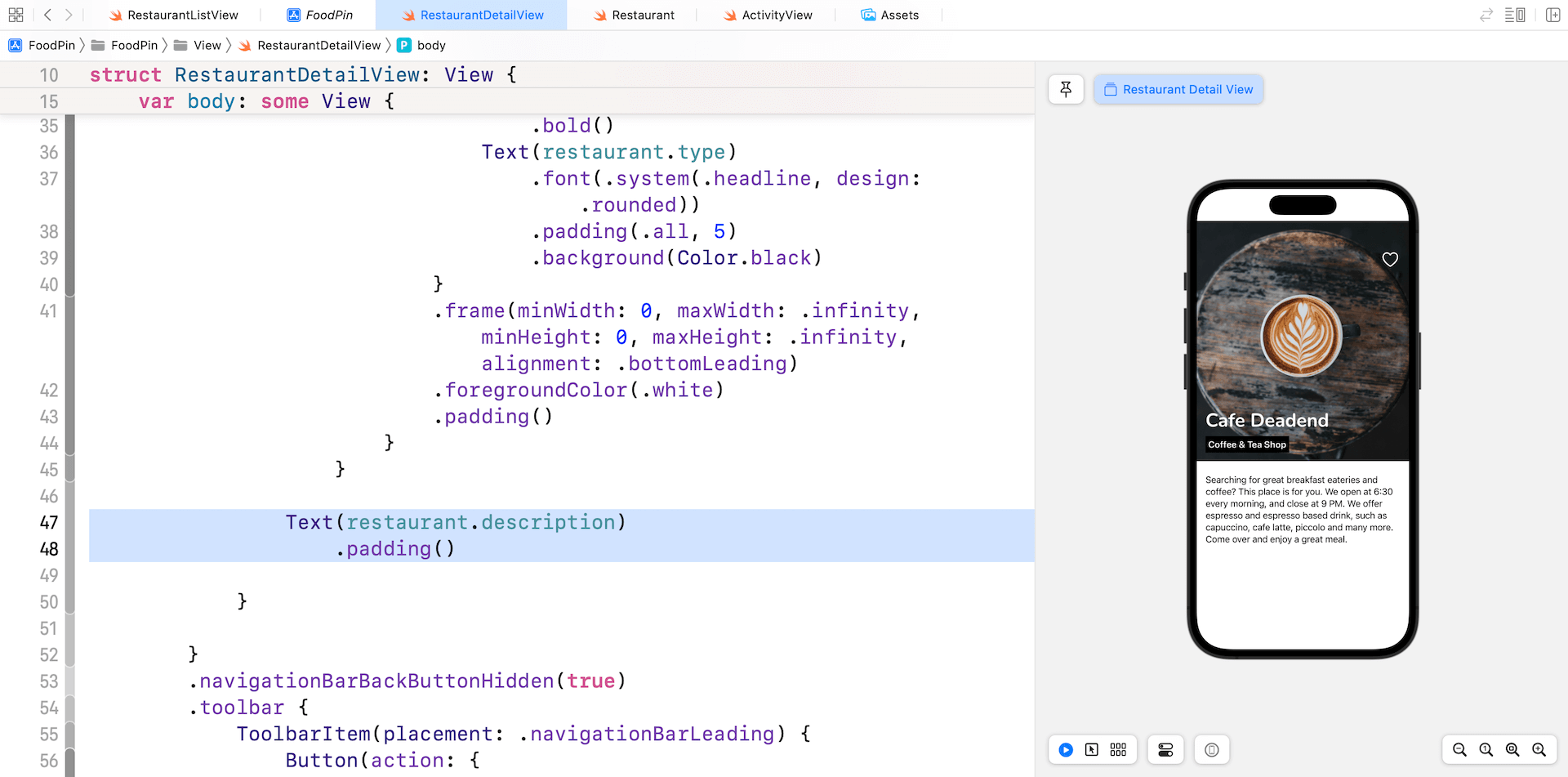
The Restaurant Description
To display the restaurant description, we simply use a Text view with a .padding modifier. Insert the following code in the root VStack view:
Text(restaurant.description)
    .padding()
Your preview should display the restaurant description as shown in figure 12-11.
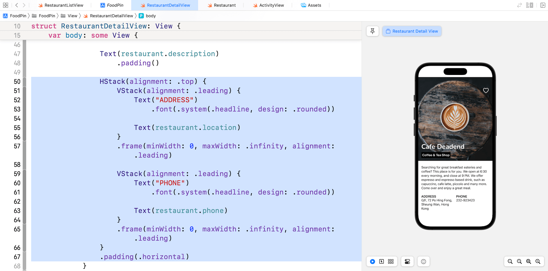
The Restaurant Address and Phone
For the restaurant address and phone, we will use a HStack view to arrange the layout. Continue to insert the following code inside the root VStack view:
HStack(alignment: .top) {
    VStack(alignment: .leading) {
        Text("ADDRESS")
            .font(.system(.headline, design: .rounded))

        Text(restaurant.location)
    }
    .frame(minWidth: 0, maxWidth: .infinity, alignment: .leading)

    VStack(alignment: .leading) {
        Text("PHONE")
            .font(.system(.headline, design: .rounded))

        Text(restaurant.phone)
    }
    .frame(minWidth: 0, maxWidth: .infinity, alignment: .leading)
}
.padding(.horizontal)
The trick to create two views side by side is to use the HStack view. And to make both views equal width, each of the VStack view (inside the HStack view) has the frame width set to .infinity.
If you have made the changes correctly, Xcode should show you a preview similar to that in figure 12-12.
Ignoring the Safe Area
The detail view looks pretty great, but have you tried to run the app? When you navigate from the list view to the detail view, the featured image is displayed right below the navigation bar. What we want to do is to display the image behind the bar.
To fix the issue, attach the following modifier to the ScrollView:
.ignoresSafeArea()
The .ignoresSafeArea modifier will tell iOS to lay out the detail view outside the screen’s safe areas.
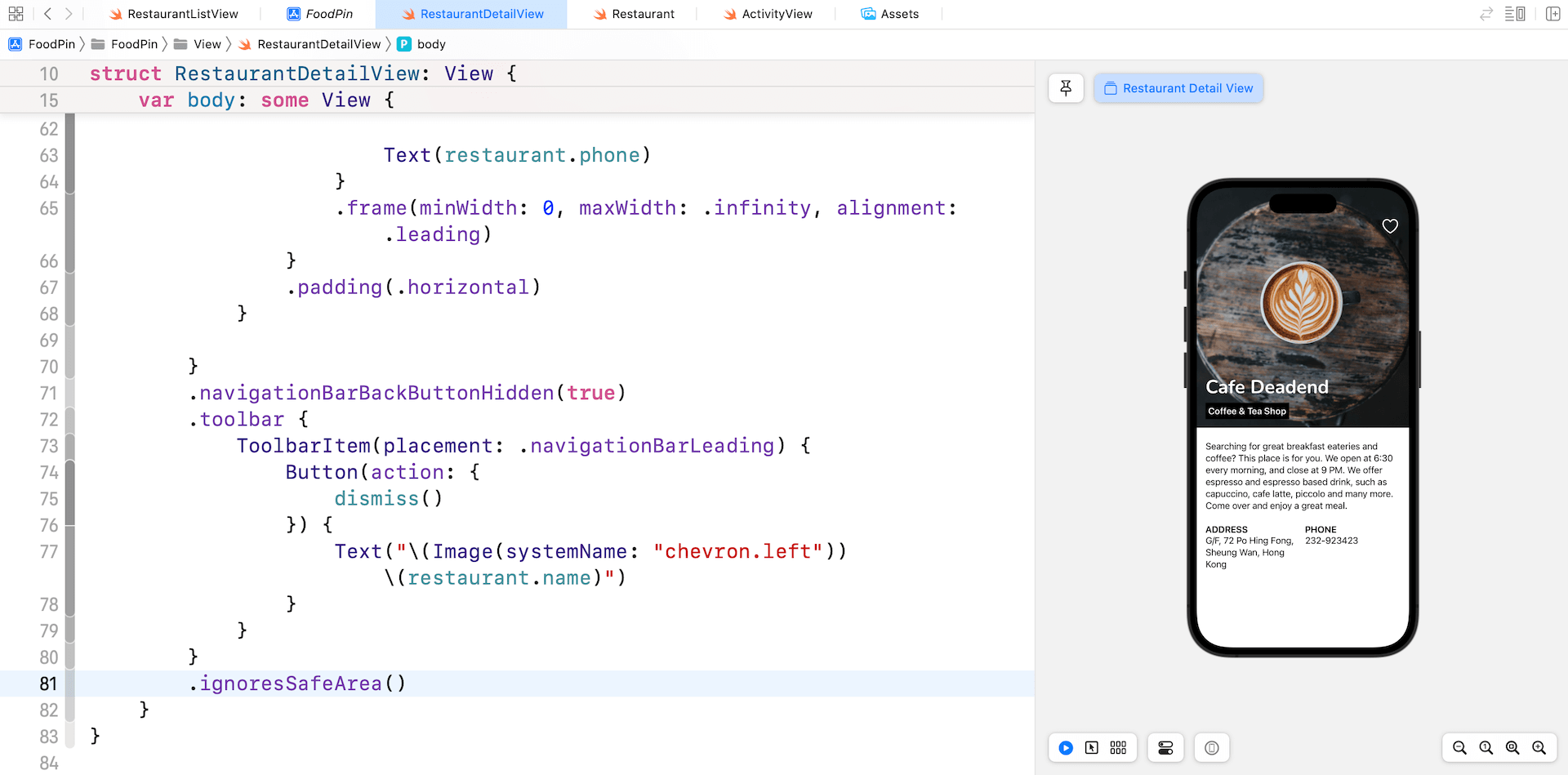
Once you made the change, the feature image should be pushed all the way up to the screen edge. To make the detail view even better, let's tweak the back button by removing the restaurant name like this:
Text("\(Image(systemName: "chevron.left"))")
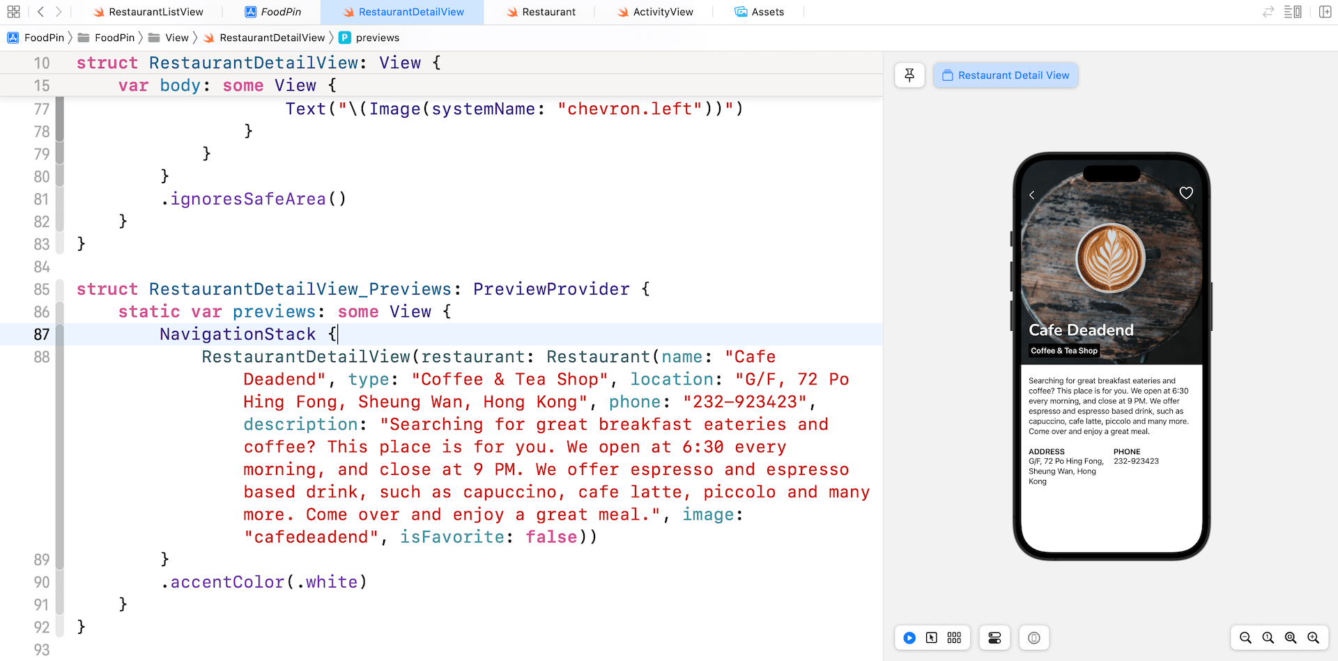
Previewing the Detail View inside a Navigation View
If you want to preview the detail view in a navigation view, you can edit the RestaurantDetailView_Previews struct like this:
struct RestaurantDetailView_Previews: PreviewProvider {
    static var previews: some View {
        NavigationStack {
            RestaurantDetailView(restaurant: Restaurant(name: "Cafe Deadend", type: "Coffee & Tea Shop", location: "G/F, 72 Po Hing Fong, Sheung Wan, Hong Kong", phone: "232-923423", description: "Searching for great breakfast eateries and coffee? This place is for you. We open at 6:30 every morning, and close at 9 PM. We offer espresso and espresso based drink, such as capuccino, cafe latte, piccolo and many more. Come over and enjoy a great meal.", image: "cafedeadend", isFavorite: false))
        }
        .accentColor(.white)
    }
}
This will embed the detail view in a navigation view and let you preview its look & feel without executing the app.
Customizing the Navigation Bar
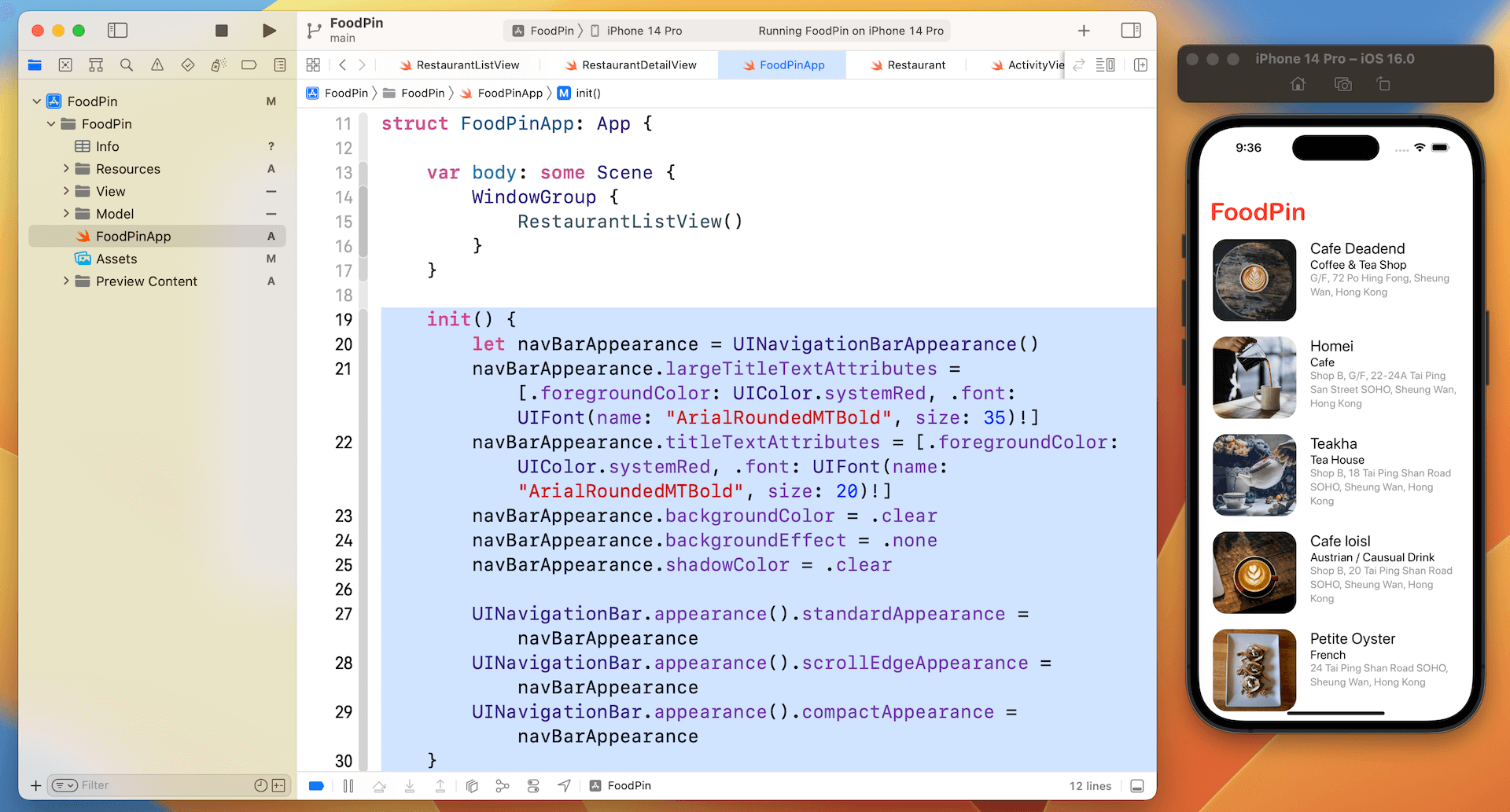
We've briefly showed you how to customize the navigation bar, but there are a couple of customizations I want to further discuss with you. The current version of SwiftUI still doesn't support all sorts of customization natively. For example, to change the font color of the navigation bar title, we need to revert it back to use UIKit.
Let's see how we can implement the customization. Open FoodPinApp.swift and insert the following new method:
init() {
    let navBarAppearance = UINavigationBarAppearance()
    navBarAppearance.largeTitleTextAttributes = [.foregroundColor: UIColor.systemRed, .font: UIFont(name: "ArialRoundedMTBold", size: 35)!]
    navBarAppearance.titleTextAttributes = [.foregroundColor: UIColor.systemRed, .font: UIFont(name: "ArialRoundedMTBold", size: 20)!]
    navBarAppearance.backgroundColor = .clear
    navBarAppearance.backgroundEffect = .none
    navBarAppearance.shadowColor = .clear

    UINavigationBar.appearance().standardAppearance = navBarAppearance
    UINavigationBar.appearance().scrollEdgeAppearance = navBarAppearance
    UINavigationBar.appearance().compactAppearance = navBarAppearance
}
With this init() method, the app will execute the customization code during the app launch. To customize the font and color of the navigation bar, we create an instance of UINavigationBarAppearance and configure our preferred font and background color. Once we set up the appearance object, we assign it to the standardAppearance, compactAppearance, and scrollEdgeAppearance properties of UINavigation. This is how you can customize a navigation bar in your SwiftUI projects.
Run the app to have a quick test. The navigation bar's title should change to red.
Exercise
Do you find a bug in the current app? In the list view, try to mark a restaurant as favorite. When you tap that restaurant and navigate to the detail view, the heart icon doesn't change its color to yellow. Your task is to fix the bug.
Summary
Great! You've made it. I hope you love it and the app you created. You've already built a quite polished app. It's not a complex app but you've managed to redesign the detail view to show more restaurant information. What's more is that you've learned how to work with custom fonts and customize the navigation bar title.
This is quite a huge chapter. Even if you can't wait to proceed to the next chapter, I suggest taking a break here. It needs time to let yourself digest all the materials we discussed so far. Grab a coffee or whatever drinks you like and relax.
For reference, you can download the complete project from http://www.appcoda.com/resources/swift57/swiftui-foodpin-detail-view.zip.