- Made by AppCoda
- Contact us / Support
- Tweet this book
- Preface
- 1. The Development Tools, the Learning Approach, and the App Idea
- 2. Your First Taste of Swift with Playgrounds
- 3. Build Your First App in Swift and SwiftUI
- 4. Designing UI Using Stack Views
- 5. Introduction to Prototyping
- 6. Understanding List and ForEach
- 7. Customizing List Views
- 8. Displaying Confirmations and Handling List View Selection
- 9. Understanding Struct, Project Organization and Code Documentation
- 10. List Deletion, Swipe Actions, Context Menus and Activity Controller
- 11. Working with Navigation View
- 12. Detail View Enhancement, Custom Fonts and Navigation Bar Customization
- 13. Understanding Colors, Swift Extensions and Dynamic Type
- 14. Working with Maps
- 15. View Animations and Blur Effect
- 16. Working with Observable Objects and Combine
- 17. Working with Forms and Camera
- 18. Working with Core Data
- 19. Adding a Search Bar Using Searchable
- 20. Building Walkthrough Screens Using TabView
- 21. Working with Tab View and Tab Bar Customizations
- 22. Displaying Web Content with WKWebView and SFSafariViewController
- 23. Working with CloudKit
- 24. Localizing Your App to Support Multiple Languages
- 25. Deploying and Testing Your App on a Real iOS Device
- 26. Beta Testing with TestFlight and CloudKit Production Deployment
- 27. Submit Your App to App Store
- 28. Adopting Haptic Touch
- 29. Working with User Notifications
- 30. Appendix - Swift Basics
- Published with GitBook
Chapter 13
Understanding Colors, Swift Extensions and Dynamic Type

Fun is one of the most important and underrated ingredients in any successful venture. If you're not having fun, then it's probably time to call it quits and try something else.
- Richard Branson
We have built a more eye-catching detail view in the previous chapter. If you haven't completed the exercise, you can download the full project at http://www.appcoda.com/resources/swift57/swiftui-foodpin-detail-view.zip.
In this chapter, we will focus on refining the navigation bar and detail view to make the app UI even better and flexible. Through the exercise, you will learn a number of topics including:
- Understanding what a Swift Extension is and how you can apply this Swift feature to write better code.
- Using Color Set to define colors in the asset catalog
- Using Dynamic Types to adjust the font size automatically
Let's get started.
Working with Custom Colors
The iOS SDK comes with some built-in colors which are ready to use. For example, when we customize the color of the navigation bar title, we set the color to .systemRed.
navBarAppearance.largeTitleTextAttributes = [.foregroundColor: UIColor.systemRed, .font: UIFont(name: "ArialRoundedMTBold", size: 35)!]
What if you want to use your own color? Say, you go up to flatuicolors.com and jot down this color code:
rgb(218, 96, 51)
How can you apply this color in our code? The UIColor class has an initializer that accepts the red, green, and blue components. To create an instance of UIColor using the color code above, you can initialize UIColor like this:
UIColor(red: 218/255, green: 96/255, blue: 51/255, alpha: 1.0)
Here we instantiate a UIColor object with custom RGB values. Because UIColor only accepts the RGB value in the scale of 0 to 1, we have to divide each of the RGB components by 255 during initialization.
In the FoodPinApp.swift file, you can update these lines of code to use the custom red color:
navBarAppearance.largeTitleTextAttributes = [.foregroundColor: UIColor(red: 218/255, green: 96/255, blue: 51/255, alpha: 1.0), .font: UIFont(name: "ArialRoundedMTBold", size: 35)!]
navBarAppearance.titleTextAttributes = [.foregroundColor: UIColor(red: 218/255, green: 96/255, blue: 51/255, alpha: 1.0), .font: UIFont(name: "ArialRoundedMTBold", size: 20)!]
Swift Extensions
Before I go on to discuss with you about color customizations, I want to take a detour here and talk about a feature in Swift known as Extensions. This is a great Swift feature that you shouldn't miss.
Extensions in Swift is a great feature that lets you add new functionality to an existing class or other types including Struct and Enum. What does it mean to you? How can you use this feature to write better code?
Let's use this line of code as an example:
UIColor(red: 218/255, green: 96/255, blue: 51/255, alpha: 1.0)
To satisfy the requirement of the initialization, we have to divide each of the RGB components by 255. Does this sound troublesome to you? Can we simplify the code to this?
UIColor(red: 218, green: 96, blue: 51)
In this case, we can apply extensions to extend the functionality of UIColor. Even though UIColor is a built-in class provided by the iOS SDK, we can use Swift extensions to add more features to it.
Let's jump back to the FoodPin project and see how to create an extension. To better organize our projects, first create a group for storing the extension file. In project navigator, right click the FoodPin folder and choose New Group. Name the group Extensions.
Next, right click Extensions and select New File…. Choose the Swift File template and name the file UIColor+Ext.swift. Once the file is created, update the code like this:
import UIKit

extension UIColor {
    convenience init(red: Int, green: Int, blue: Int) {
        let redValue = CGFloat(red) / 255.0
        let greenValue = CGFloat(green) / 255.0
        let blueValue = CGFloat(blue) / 255.0
        self.init(red: redValue, green: greenValue, blue: blueValue, alpha: 1.0)
    }
}
To declare an extension for an existing class, you start with the keyword extension followed by the class you want to extend. Here it is the UIColor class.
We implement an additional convenience initializer that accepts three parameters: red, green and blue. In the body of the initializer, we perform the conversion by dividing the given RGB value by 255. Finally, we call the original init method with the converted RGB components.
That's how you use Swift extensions to add another initializer to a built-in class. Now the new initializer is ready for use. You can change the following lines of code in FoodPinApp.swift from:
navBarAppearance.largeTitleTextAttributes = [.foregroundColor: UIColor(red: 218/255, green: 96/255, blue: 51/255, alpha: 1.0), .font: UIFont(name: "ArialRoundedMTBold", size: 35)!]
navBarAppearance.titleTextAttributes = [.foregroundColor: UIColor(red: 218/255, green: 96/255, blue: 51/255, alpha: 1.0), .font: UIFont(name: "ArialRoundedMTBold", size: 20)!]
To:
navBarAppearance.largeTitleTextAttributes = [.foregroundColor: UIColor(red: 218, green: 96, blue: 51), .font: UIFont(name: "ArialRoundedMTBold", size: 35)!]
navBarAppearance.titleTextAttributes = [.foregroundColor: UIColor(red: 218, green: 96, blue: 51), .font: UIFont(name: "ArialRoundedMTBold", size: 20)!]
Now the code looks simpler, right?
Can you still use the original initializer? Absolutely. The new initializer just simplifies the redundant conversion and lets you type less code.
Adapting Colors for Dark Mode
With the introduction of Dark Mode, your app should cater for both light and dark appearance. Up till now, the FoodPin app works pretty well in Dark mode. One main reason is that we mostly use the system colors provided by Apple. All system colors are designed to adapt to both light and dark modes.
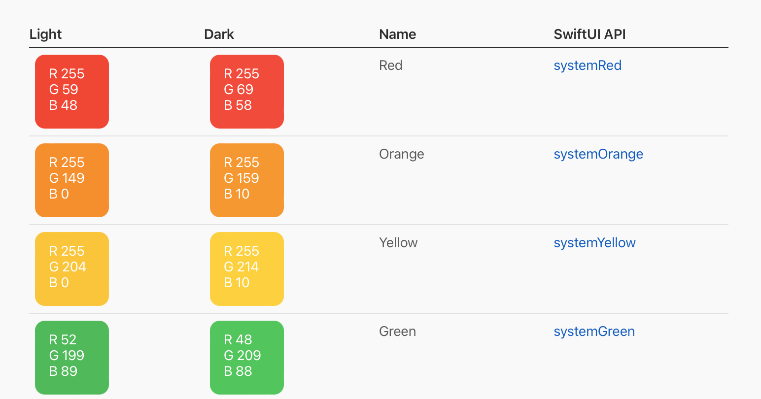
Other than system colors, Apple also introduced another type of built-in color known as semantic colors. Semantic colors are those that describe the intention of the color. Here are a few examples:
UIColor.label- the color for text labels that contain primary content.UIColor.secondaryLabel- the color for text labels that contain secondary content.UIColor.systemBackground- the color for the main background of your interface.
Similarly, semantic colors are also designed to be adaptive and return different color values for different interface styles.
According to Apple, developers are encouraged to use system and semantic colors because it makes you a lot easier to support dark mode. You should avoid creating a UIColor object with hardcoded color values. That said, what if we want to use our own color instead of the built-in ones like the one we used for the navigation bar title?
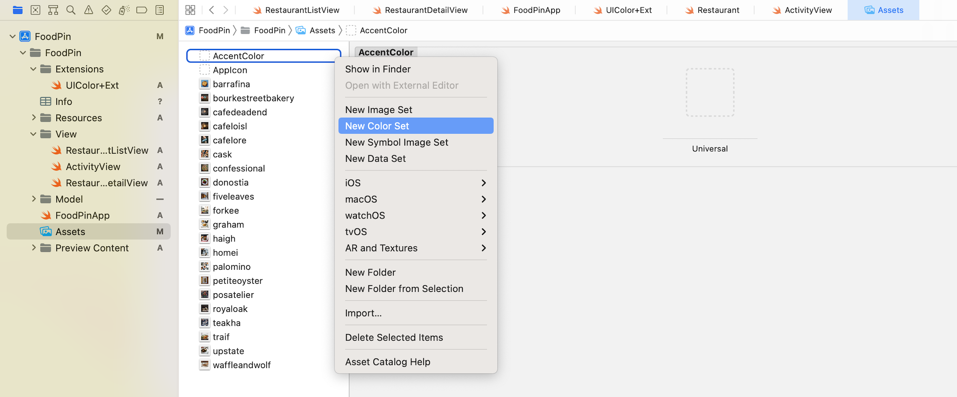
We often use the asset catalog to store images and icons. This catalog also provides a feature for managing colors. Open Assets and then right click on the white area to bring up the context menu. Choose Color Set to create a color set. Set its name to NavigationBarTitle. We are going to define a new color for the bar title.
You can define two different colors in the color set. For Any Appearance, set the color to #DA6033. For Dark Appearance, set the color to #D35400. To set the color in hex format, change the input method to 8-bit Hexadecimal in the Attributes inspector. Then you can fill in the Hex value.
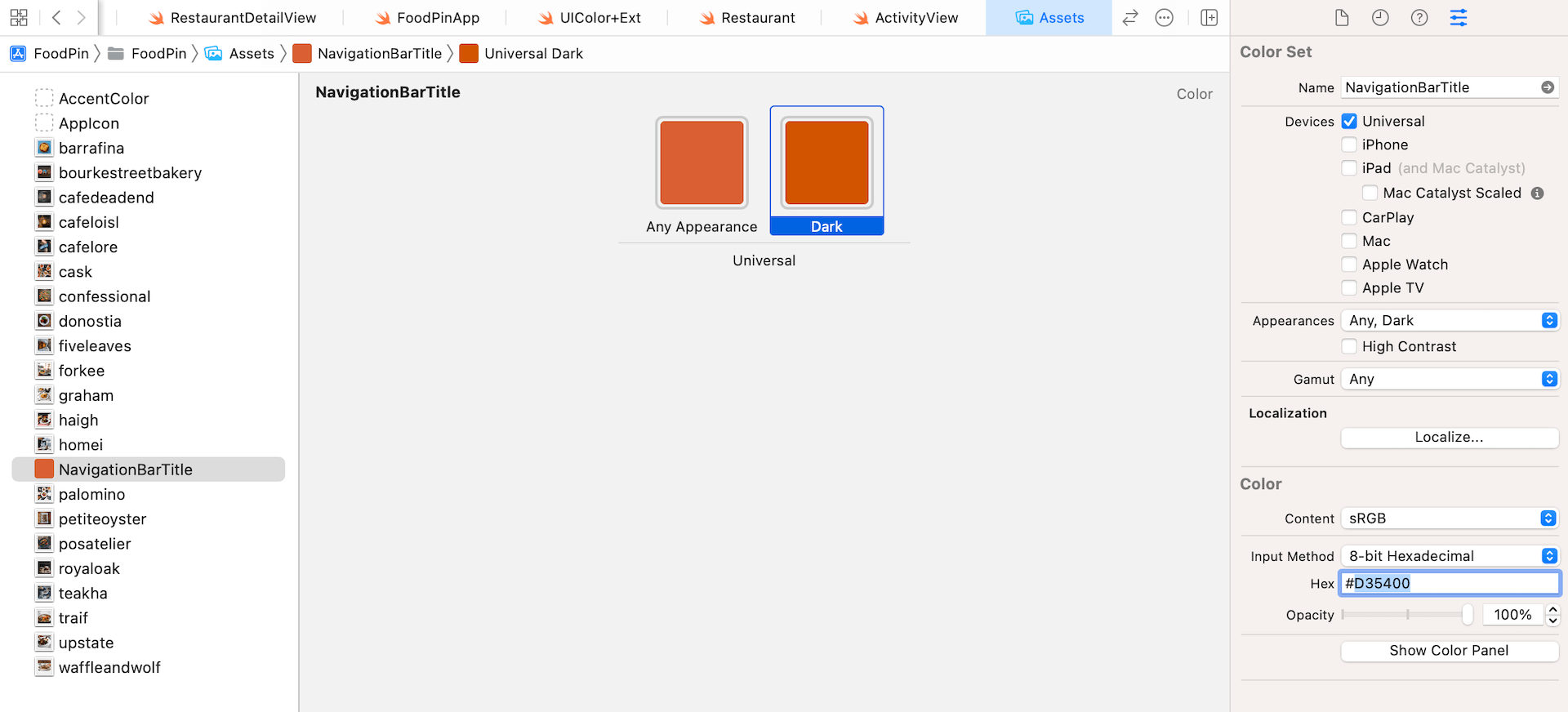
Later, when you use this color set, the system will automatically pick the color for you, depending on the user's system settings (i.e. light/dark mode).
Now open the FoodPinApp.swift file again. Instead of using the red color, let's change the color of the navigation bar title to the color we just defined. Modify the code in init() and change the value of largeTitleTextAttributes and titleTextAttributes like this:
navBarAppearance.largeTitleTextAttributes = [.foregroundColor: UIColor(named: "NavigationBarTitle") ?? UIColor.systemRed, .font: UIFont(name: "ArialRoundedMTBold", size: 35)!]
navBarAppearance.titleTextAttributes = [.foregroundColor: UIColor(named: "NavigationBarTitle") ?? UIColor.systemRed, .font: UIFont(name: "ArialRoundedMTBold", size: 20)!]
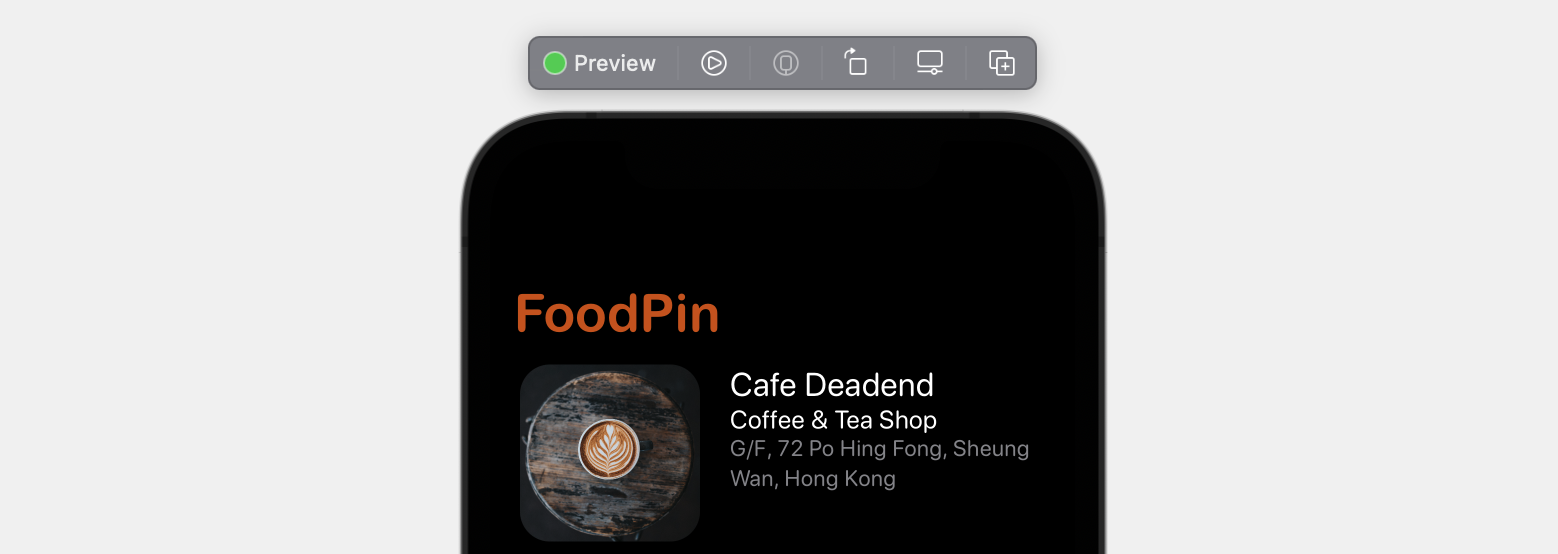
Run the app in both light and dark mode. You should notice the color difference.
Dynamic Type
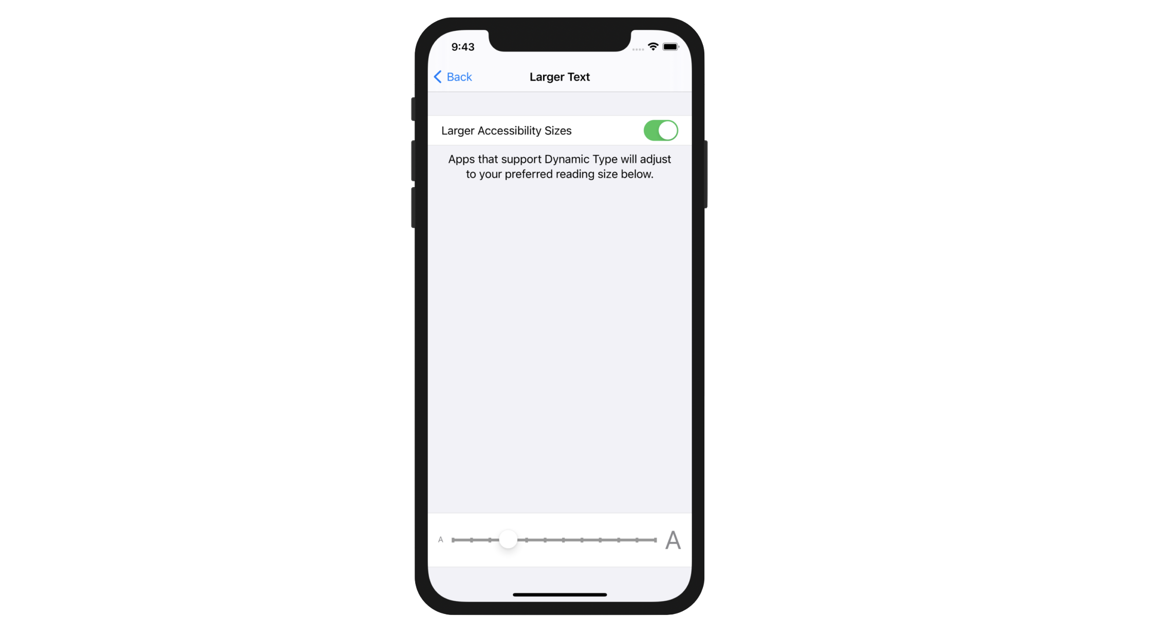
What is Dynamic Type? You may not have heard of Dynamic Type but you should have seen the setting screen (Settings > Accessibility > Display & Text Size > Large Text shown in figure 13-5.
Dynamic Type is not new and has been introduced since iOS 7. With this feature, users are able to customize the text size of an app to fit their own needs. However, there is a catch - only apps that adopt Dynamic Type respond to the text change.
All of the stock apps have adopted Dynamic Type. For third party apps, it is up to developers' decision. Though Apple doesn't mandate developers to support Dynamic Type, it is always recommended so users can choose their own text size.
So how can you adopt Dynamic Type? With SwiftUI, adopting Dynamic Type is just a piece of cake. Recalled that we configured all the labels to use text style, this is what you need to adopt Dynamic Type: use a text style instead of a fixed font type. For example, the following line of code instructs iOS to use the headline text style:
Text("PHONE")
    .font(.system(.headline, design: .rounded))
So, how can you test dynamic types using the built-in simulator? One way is to change the setting in the simulator by going to Settings > Accessibility > Display & Text Size > Large Text. Enable Larger Accessibility Sizes and drag the slider to your right to enlarge the font.
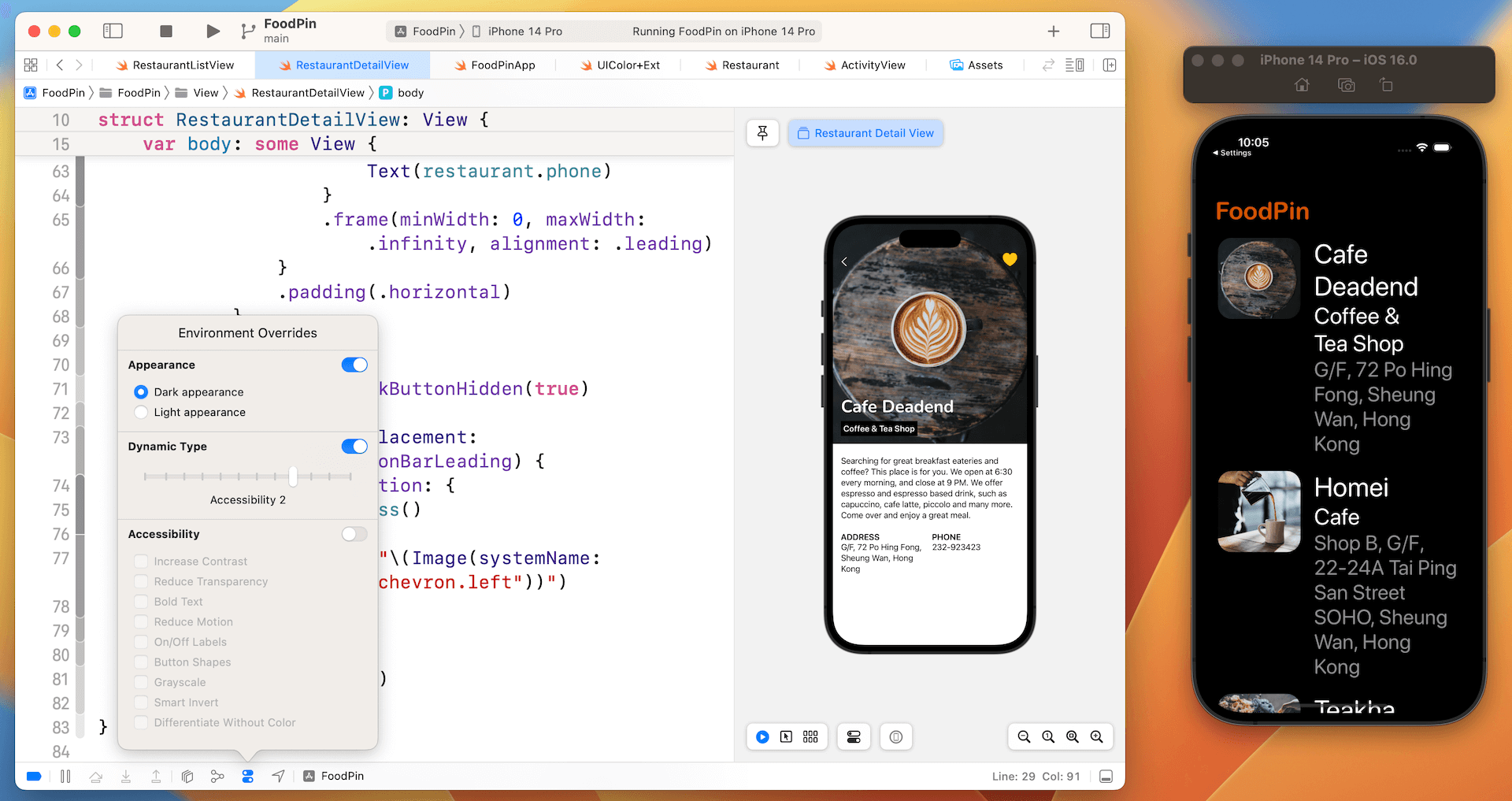
A more convenience approach is use the environment modifier in Xcode. While running the app in simulators, click the Environment Overrides button and switch on the Text option. You can use the Dynamic Type slider to adjust the font size. In the simulator, the app should respond to the size change.
That's how you test dynamic type using a standalone simulator. If you prefer an even more convenient approach, you can test dynamic type by attaching the environment modifier to a view.
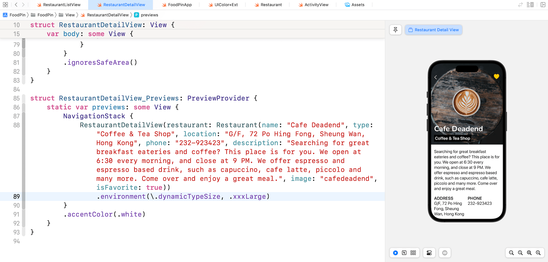
Let's open RestaurantDetailView.swift and update the RestaurantDetailView_Previews struct like this:
struct RestaurantDetailView_Previews: PreviewProvider {
    static var previews: some View {
        NavigationView {
            RestaurantDetailView(restaurant: Restaurant(name: "Cafe Deadend", type: "Coffee & Tea Shop", location: "G/F, 72 Po Hing Fong, Sheung Wan, Hong Kong", phone: "232-923423", description: "Searching for great breakfast eateries and coffee? This place is for you. We open at 6:30 every morning, and close at 9 PM. We offer espresso and espresso based drink, such as capuccino, cafe latte, piccolo and many more. Come over and enjoy a great meal.", image: "cafedeadend", isFavorite: true))
                .environment(\.dynamicTypeSize, .xxxLarge)
        }
        .accentColor(.white)
    }
}
In the code above, we attach the environment modifier and set the dynamic type size to .xxxLarge. The preview then renders the UI with enlarged fonts.
Summary
In this chapter, you've learned how to apply color set to adapt your color for both light and dark appearance. We also discussed the usage of Dynamic Type that provides additional flexibility by letting users choose their preferred text size. Apple encourages all iOS developers to adopt this technology because this gives your users a choice. For people with less acute vision, they probably prefer a larger text size. For some people, they may prefer a smaller text size. Whenever possible, try your best to support Dynamic Type in your apps.
For reference, you can download the Xcode project (including the solution to exercise) from http://www.appcoda.com/resources/swift57/swiftui-foodpin-dynamic-type.zip.
You can also refer to Apple's iOS Human Interface Guidelines for further reference.