- Made by AppCoda
- Contact us / Support
- Tweet this book
- Preface
- 1. The Development Tools, the Learning Approach, and the App Idea
- 2. Your First Taste of Swift with Playgrounds
- 3. Build Your First App in Swift and SwiftUI
- 4. Designing UI Using Stack Views
- 5. Introduction to Prototyping
- 6. Understanding List and ForEach
- 7. Customizing List Views
- 8. Displaying Confirmations and Handling List View Selection
- 9. Understanding Struct, Project Organization and Code Documentation
- 10. List Deletion, Swipe Actions, Context Menus and Activity Controller
- 11. Working with Navigation View
- 12. Detail View Enhancement, Custom Fonts and Navigation Bar Customization
- 13. Understanding Colors, Swift Extensions and Dynamic Type
- 14. Working with Maps
- 15. View Animations and Blur Effect
- 16. Working with Observable Objects and Combine
- 17. Working with Forms and Camera
- 18. Working with Core Data
- 19. Adding a Search Bar Using Searchable
- 20. Building Walkthrough Screens Using TabView
- 21. Working with Tab View and Tab Bar Customizations
- 22. Displaying Web Content with WKWebView and SFSafariViewController
- 23. Working with CloudKit
- 24. Localizing Your App to Support Multiple Languages
- 25. Deploying and Testing Your App on a Real iOS Device
- 26. Beta Testing with TestFlight and CloudKit Production Deployment
- 27. Submit Your App to App Store
- 28. Adopting Haptic Touch
- 29. Working with User Notifications
- 30. Appendix - Swift Basics
- Published with GitBook
Chapter 8
Displaying Confirmations and Handling List View Selection

There is no learning without trying lots of ideas and failing lots of times.
- Jonathan Ive
Are you able to complete the previous exercise and create the redesigned row layout? No worries if you can't. I will go through the solution with you in this chapter and introduce some new layout techniques. Up till now, we only focus on displaying data in a list view. I guess you may wonder how we can interact with the list view and detect row selections. This is what we will also discuss in this chapter.
To begin, first download the complete project we built in the previous chapter (http://www.appcoda.com/resources/swift57/swiftui-foodpin-custom-list.zip). We will continue to enhance the app and make it even better. In brief, here are what we are going to implement:
- Add an alternate design of the row layout
- Bring up a menu when a user taps one of the items in the list view. The menu offers two options: Reserve a table and Mark as favorite.
- Display a heart icon when the user selects the Mark as favorite option.
Through implementing these new features, you will also learn how to better organize the SwiftUI code and use actions sheets to display alerts in iOS.
Building a more Elegant Row Layout
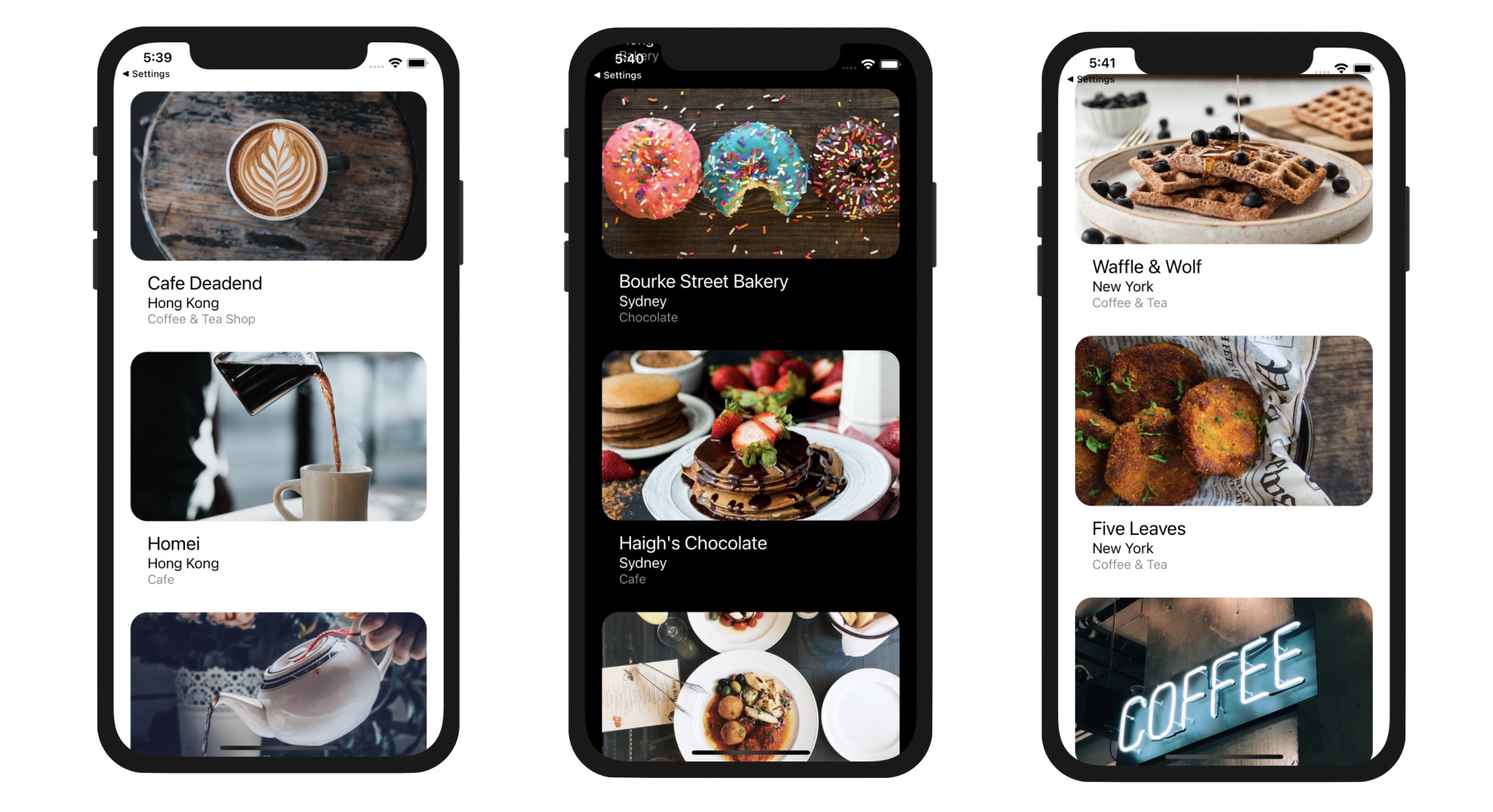
Previously, I had an exercise for you and asked you to redesign the row layout to make it look like that shown in figure 8-2. I hope you already tried to figure out the solution. Even if you couldn't find a way to design the row, I appreciate your effort. It is not an easy exercise for beginners.
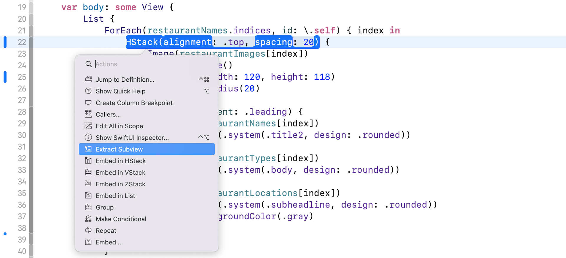
Now let's see how to design the row layout. Assuming you have already downloaded the project and open it in Xcode, select RestaurantListView to edit the code. Instead of deleting the existing HStack inside ForEach and write the code for the new layout, let's extract the HStack as a subview. By doing so, we can easily switch between the old and new row layout.
As mentioned before, Xcode provides a handy feature known as Extract subviews for developers to easily extract a certain block into a subview. The HStack view is designed to manage the row layout, let's extract it to a subview to better organize our code. Hold the command key and click HStack. Xcode extracts the code and name the subview ExtractedView by default. Let's rename it to BasicTextImageRow.
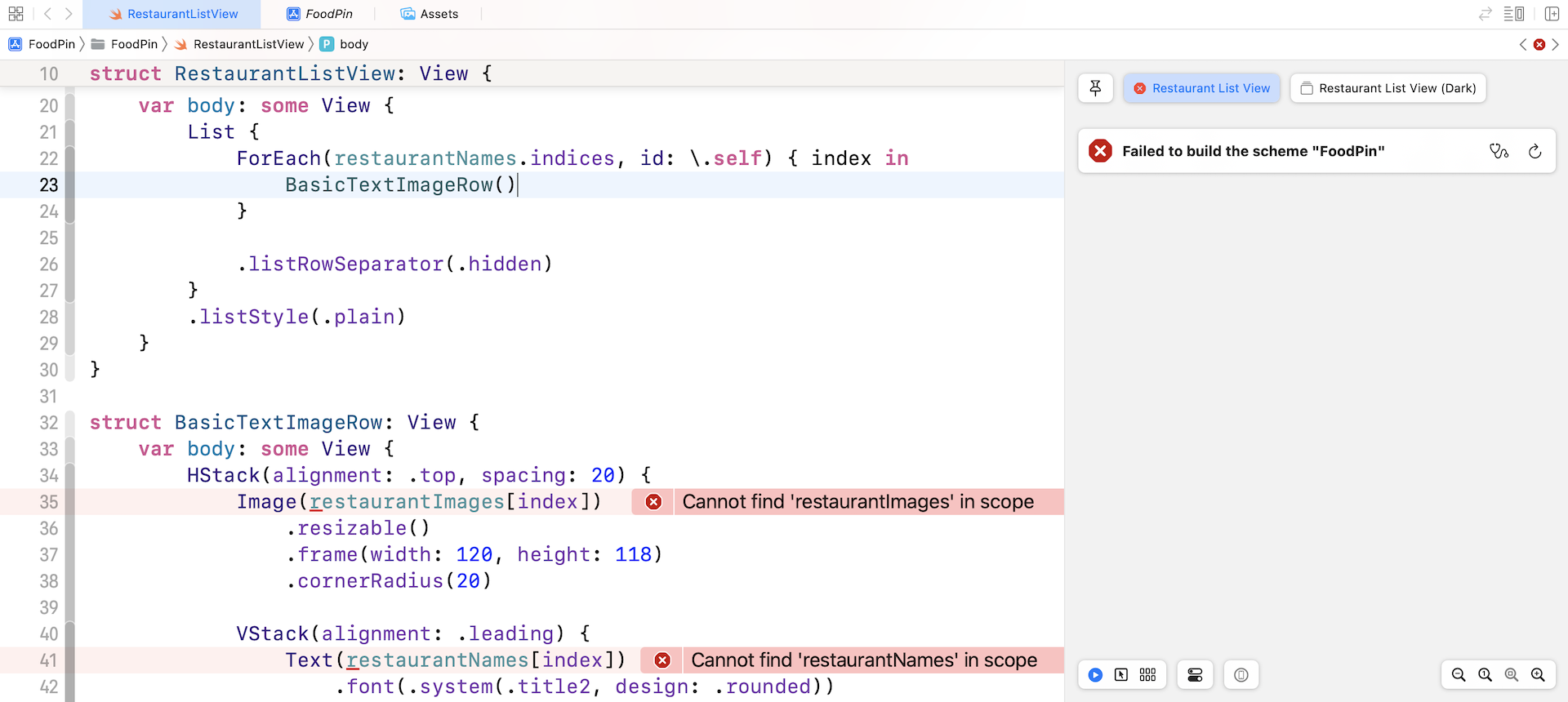
Once you extracted the code, Xcode should prompt you an error. The reason is that the new BasicTextImageRow struct doesn't have restaurantImages, restaurantNames, restaurantTypes, and restaurantLocations variables.
To fix the error, let's create a few variables in the BasicTextImageRow struct and update the code accordingly:
struct BasicTextImageRow: View {

    var imageName: String
    var name: String
    var type: String
    var location: String

    var body: some View {
        HStack(alignment: .top, spacing: 20) {
            Image(imageName)
                .resizable()
                .frame(width: 120, height: 118)
                .cornerRadius(20)

            VStack(alignment: .leading) {
                Text(name)
                    .font(.system(.title2, design: .rounded))

                Text(type)
                    .font(.system(.body, design: .rounded))

                Text(location)
                    .font(.system(.subheadline, design: .rounded))
                    .foregroundColor(.gray)
            }
        }
    }
}
The BasicTextImageRow struct now accepts 4 parameters including imageName, name, type, and location. With this change, you will need to update the List view and pass the required values for BasicTextImageRow:
List {
    ForEach(restaurantNames.indices, id: \.self) { index in
        BasicTextImageRow(imageName: restaurantImages[index], name: restaurantNames[index], type: restaurantTypes[index], location: restaurantLocations[index])
    }

    .listRowSeparator(.hidden)
}
.listStyle(.plain)
As you can see, the RestaurantListView is now simplified. Though the UI is still the same, the code is more readable and easier to manage.
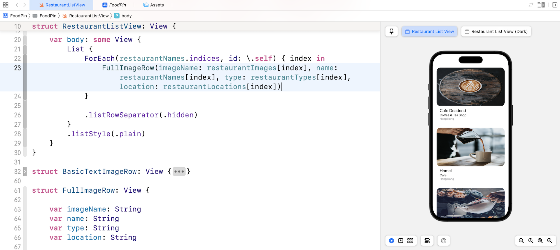
Now let's create a new struct for the new row layout as displayed in figure 8-2. Insert the following lines of code in the file:
struct FullImageRow: View {

    var imageName: String
    var name: String
    var type: String
    var location: String

    var body: some View {
        VStack(alignment: .leading, spacing: 10) {
            Image(imageName)
                .resizable()
                .frame(height: 200)
                .cornerRadius(20)

            VStack(alignment: .leading) {
                Text(name)
                    .font(.system(.title2, design: .rounded))

                Text(type)
                    .font(.system(.body, design: .rounded))

                Text(location)
                    .font(.system(.subheadline, design: .rounded))
                    .foregroundColor(.gray)
            }
            .padding(.horizontal)
            .padding(.bottom)
        }
    }
}
We use two vertical stacks to create the new row layout. One VStack is used to arrange the restaurant name, type, and location. The other VStack is used to embed both the Image view and the child VStack. For the Image view, we set the frame's height to 200 points. As we left out the width parameter, SwiftUI automatically expands the image's width.
To use the new FullImageRow, replace BasicTextImageRow with FullImageRow like this:
FullImageRow(imageName: restaurantImages[index], name: restaurantNames[index], type: restaurantTypes[index], location: restaurantLocations[index])
Once you update the code, the List view uses the new row layout and the preview should show you the new row layout.
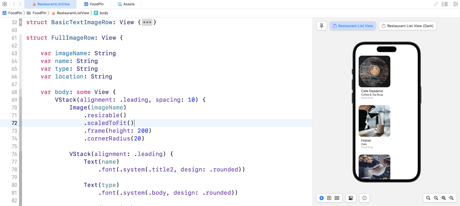
If you take a closer at the image of the new layout, it's not scaled properly. You've learned to use the scaledToFit modifier to keep the aspect ratio of an image. Can we use this modifier to fix the issue? Let's try it out.
Update the Image view in FullImageRow and attach the scaledToFit modifier like this:
Image(imageName)
    .resizable()
    .scaledToFit()
    .frame(height: 200)
    .cornerRadius(20)
Take a look at the preview. Does this resolve the scaling issue of the image view? Obviously, the solution doesn't work. While we can keep the aspect ratio of the image, the image becomes smaller (see figure 8-6).
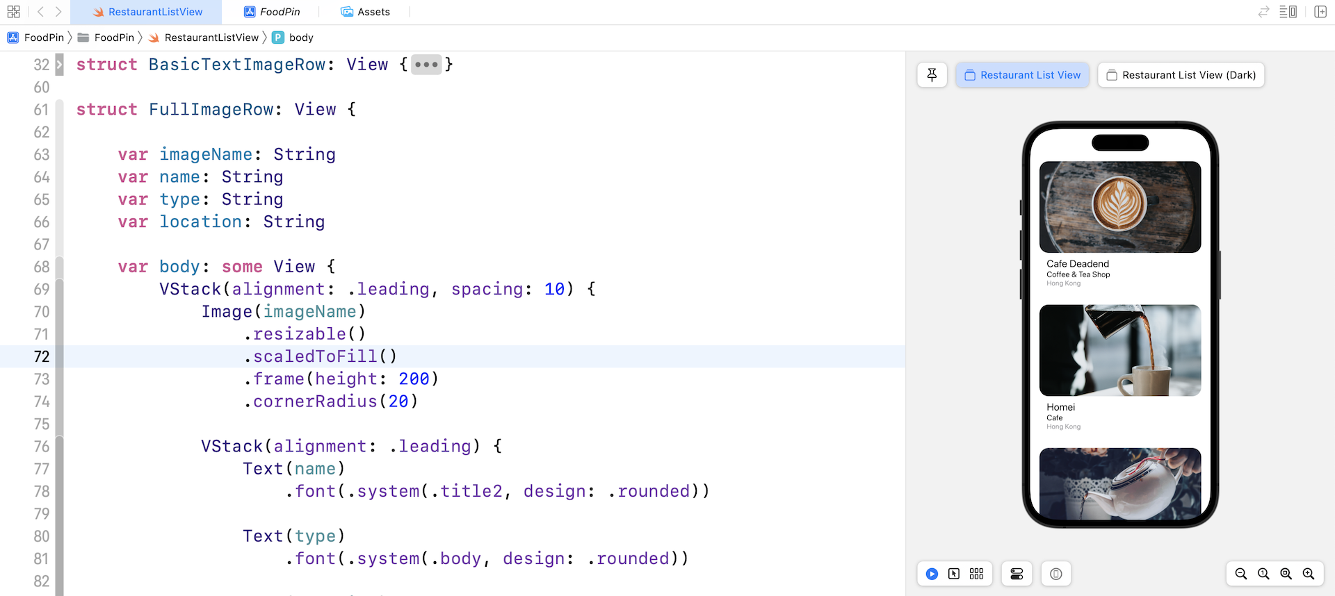
So, how can we keep the aspect ratio and keep the width of the image view? Other than scaledToFit, you can use another modifier called scaledToFill. By attaching this modifier to the Image view, it will scale the image to fill the image view while keeping the aspect ratio.
Looking Up the Documentation
You may wonder why I know all these modifiers and their usage.
The answer is "Read the documentation". You're granted free access to the Apple's official iOS developer reference (https://developer.apple.com/documentation/). As an iOS developer, you need to get used to reading the API documentation. There is no single book on earth to cover everything about the iOS SDK. Most of the time when we want to learn more about a class or a protocol, we have to look up to the API documentation.
Apple provides a simple way to access the documentation in Xcode. You can press and hold the option key and click on the modifier name (or class name) to bring up the documentation. Alternatively, you can use the keyboard shortcut control-command-? and then place the cursor over modifier (e.g. scaledToFill). This brings up a popover showing the description of the modifier.
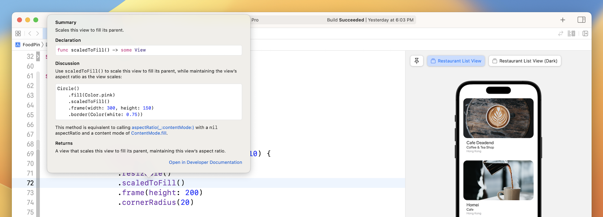
If you want to look into the details, you can click the "Open in Developer Documentation" link. Clicking the link will bring up the documentation browser.
Before you continue, let's change the row layout from FullImageRow to BasicTextImageRow. I prefer to the basic layout.
BasicTextImageRow(imageName: restaurantImages[index], name: restaurantNames[index], type: restaurantTypes[index], location: restaurantLocations[index])
Managing Row Selections Using State
What we are going to do next is to bring up a menu when a user taps one of the items in the list view. Before I showed you how to implement the feature, let me give you a quick introduction to a new property wrapper named @State.
State management is something every developer has to deal with in application development. When a user taps a restaurant (or a row), there must be some ways to keep track of its state (i.e. tapped or not tapped).
SwiftUI comes with a few built-in features for state management. In particular, it introduces a property wrapper named @State. When you annotate a property with @State, SwiftUI automatically stores it somewhere in your application. What's more, views that make use of that property automatically listen to the value change of the property. When the state changes, SwiftUI will recompute those views and update the application's appearance.
Doesn't it sound great? Or are you a bit confused with state management?
You will get a better understanding of state and binding after going through the coding examples. Now in the BasicTextImageRow struct, insert the following line of code:
@State private var showOptions = false
Here, we declare a state variable by annotated it using @State. It's a boolean variable with the initial value set to false. When any of the row item is tapped, we will change its value from false to true.
Detecting Touches and Displaying a Confirmation Dialog
So, how can we detect a tap from users? In SwiftUI, you can attach a modifier called onTapGesture to a view to detect a user's touch. In BasicTextImageRow, attach the modifier to the HStack like this:
HStack(alignment: .top, spacing: 20) {

  .
  .
  .

}
.onTapGesture {
    showOptions.toggle()
}
In the closure of onTapGesture, we toggle the value of showOptions. In other words, when a user's tap is detected, we update the value of showOptions from false to true. This is how we change the state of a row by using @State variables.
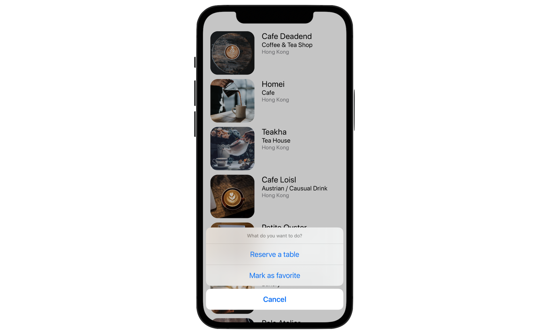
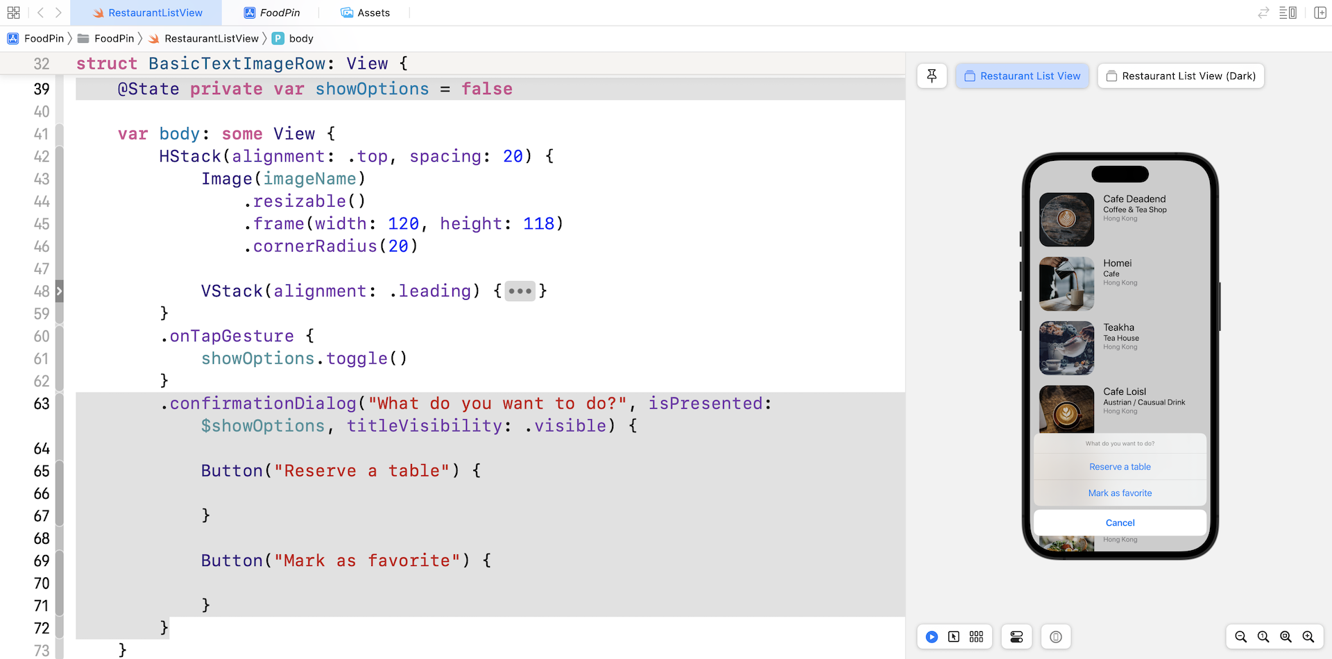
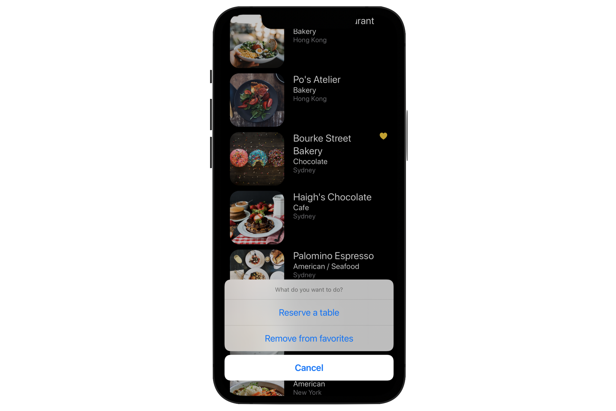
What's next? We can now detect the user's touch. How can we bring up an option menu? In SwiftUI, it provides a modifier called confirmationDialog to display a selection menu like the one shown in Figure 8-9. This new modifier was first introduced in iOS 15 as a replacement of actionSheet. From now on, it's recommended to use confirmationDialog instead of actionSheet for displaying an option menu.
Now attach the confirmationDialog modifier to the HStack like this:
HStack(alignment: .top, spacing: 20) {

  .
  .
  .

}
.onTapGesture {
    showOptions.toggle()
}
.confirmationDialog("What do you want to do?", isPresented: $showOptions, titleVisibility: .visible) {

    Button("Reserve a table") {

    }

    Button("Mark as favorite") {

    }
}
The confirmationDialog modifier monitors the showOptions state variable to determine if the dialog is visible to users. In other words, if the value of showOptions is set to false, the confirmation dialog is hidden. It only appears when showOptions is updated to true.
Therefore, when a user taps the cell, the showOptions state variable is set to true. The app then brings up the confirmation dialog. We also set the title of the confirmation dialog to "What do you want to do?" The titleVisibility parameter is set to .visible to ensure the title is always displayed.
To create a confirmation dialog with three buttons, we create two actions in the closure. The Cancel button is automatically generated by the confirmation dialog.
Run the app in a simulator or test the app in the preview pane. You should be able to bring up the action sheet by tapping any of the rows.
Understanding Binding
Do you have any questions about the code in confirmationDialog? I guess you may have one. Do you notice the showOptions variable we passed to confirmationDialog was prefixed by a $ sign? What's that $ sign?
Let's open the documentation of confirmationDialog to check out the details. In the declaration section, it specifies that the isPresented parameter accepts a binding to a Boolean value.
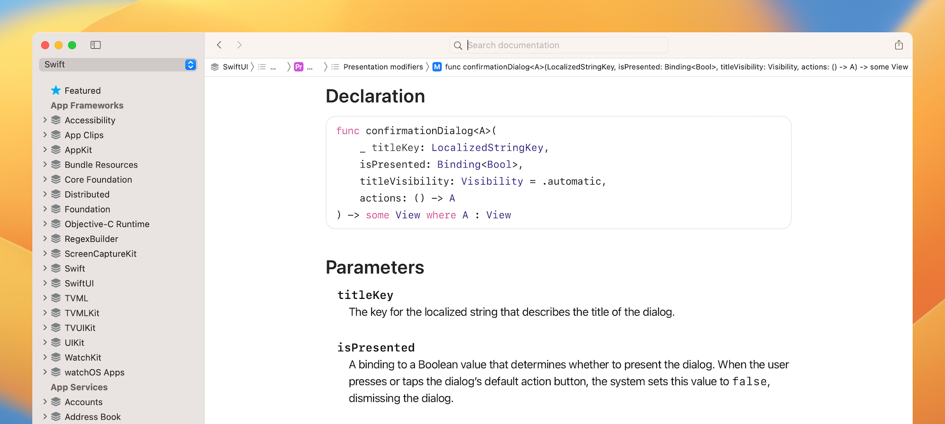
In short, when you need to pass a binding, you have to prefix the variable by a $ sign.
But, what's binding? A binding in SwiftUI is a two-way connection between a property that stores data, and a view that displays and changes the data. It's not easy to understand this definition especially you are new to SwiftUI.
Let's revisit the code sample we just wrote. showOptions is the property that controls the appearance of action sheet. When it's set to true, action sheet will make itself visible and display the menu options.
What happens when a user taps the Cancel button or other menu options? The action sheet now automatically hides itself. In other words, it also updates the value of showOptions from true to false.
In SwiftUI, you can't just pass the value of showOptions and let confirmationDialog update the value. In this case, we need to use binding. By passing the binding of showOptions to confirmationDialog, the dialog can update the value of showOptions.
Displaying an Alert Message
Right now, no matter which option you choose, the app just dismisses the action sheet without performing any actions. This is because we haven't implemented the follow-up action for the default buttons.
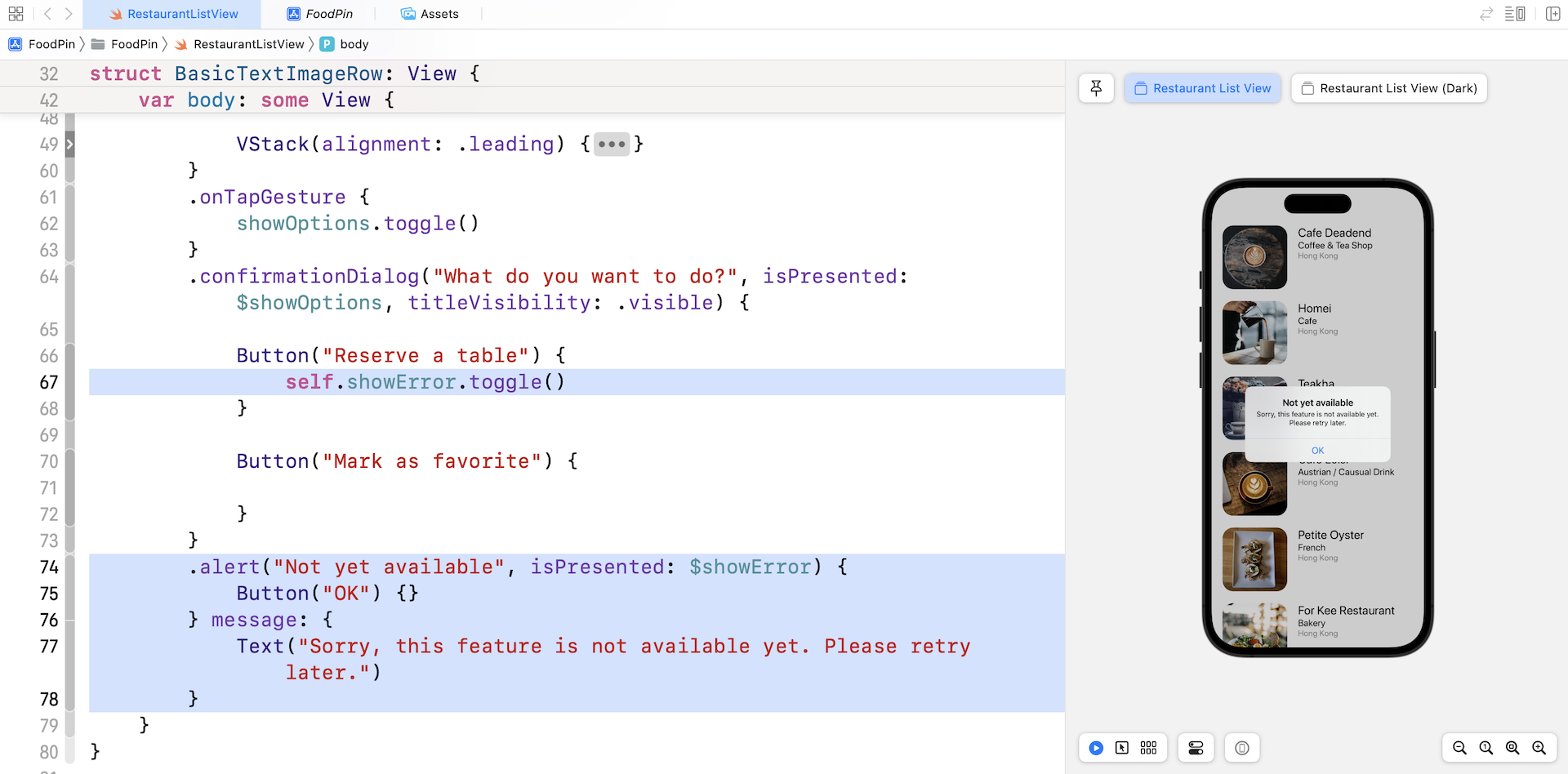
For the Reserve a table button, we will display an alert message telling users the function is not ready for use. SwiftUI comes with another modifier called .alert for displaying alert messages.
Similar to action sheet, we need a variable to control the visibility of the alert. Therefore, declare another state variable named showError in the BasicTextImageRow struct:
@State private var showError = false
Next, attach the .alert modifier to the HStack:
.alert("Not yet available", isPresented: $showError) {
    Button("OK") {}
} message: {
    Text("Sorry, this feature is not available yet. Please retry later.")
}
The alert is triggered when showError is set to true. So, update the closure of the Reserve a table button like this:
Button("Reserve a table") {
    self.showError.toggle()
}
This is how we display an alert dialog in SwiftUI. Run the app to have a quick test. When you select the Reserve a table option, you should see the alert message.
Implementing the Mark as Favorite Feature
What's left is the implementation of the Mark as favorite feature. When you let users mark a restaurant as favorite, this status should be stored somewhere. We have to find another way to keep track of the checked items. How about creating another array to save the checked restaurants? In the RestaurantListView struct, declare a Boolean array:
@State var restaurantIsFavorites = Array(repeating: false, count: 21)
Bool is a data type in Swift that holds a Boolean value. Swift provides two Boolean values: true and false. We declare the restaurantIsFavorites array to hold a collection of Bool values. Each value in the array indicates whether the corresponding restaurant is marked as a favorite . For example, we can look into the value of restaurantIsFavorites[0] to see if Cafe Deadend is marked as a favorite or not.
The values in the array are initialized to false. In other words, the items are unchecked by default. The above line of code shows you a way to initialize an array in Swift with repeated values. The initialization is the same as the following:
@State var restaurantIsFavorites = [false, false, false, false, false, false, false, false, false, false, false, false, false, false, false, false, false, false, false, false, false]
The reason why we have to annotate the variable with @State is that we need to update the values. When a user selects the Mark as Favorite option, we will update the value of restaurantIsFavorites and displays a heart icon right next to the restaurant name.
To implement this feature, declare one more property in BasicTextImageRow:
@Binding var isFavorite: Bool
The @Binding keyword indicates that the caller must provide the binding of the state variable. As explained before, a binding is essentially a two-way connection between a property and a view that needs to change the value of that property. Here, we connect the restaurantIsFavorites property in the RestaurantListView with the isFavorite variable in the BasicTextImageRow. Updating isFavorite in the BasicTextImageRow view propagates its value back to the corresponding item of the restaurantIsFavorites array in the RestaurantListView.
We still haven't updated the value of isFavorite when a user selects the option. Let's add a line of code to toggle the value:
Button("Mark as favorite") {
    self.isFavorite.toggle()
}
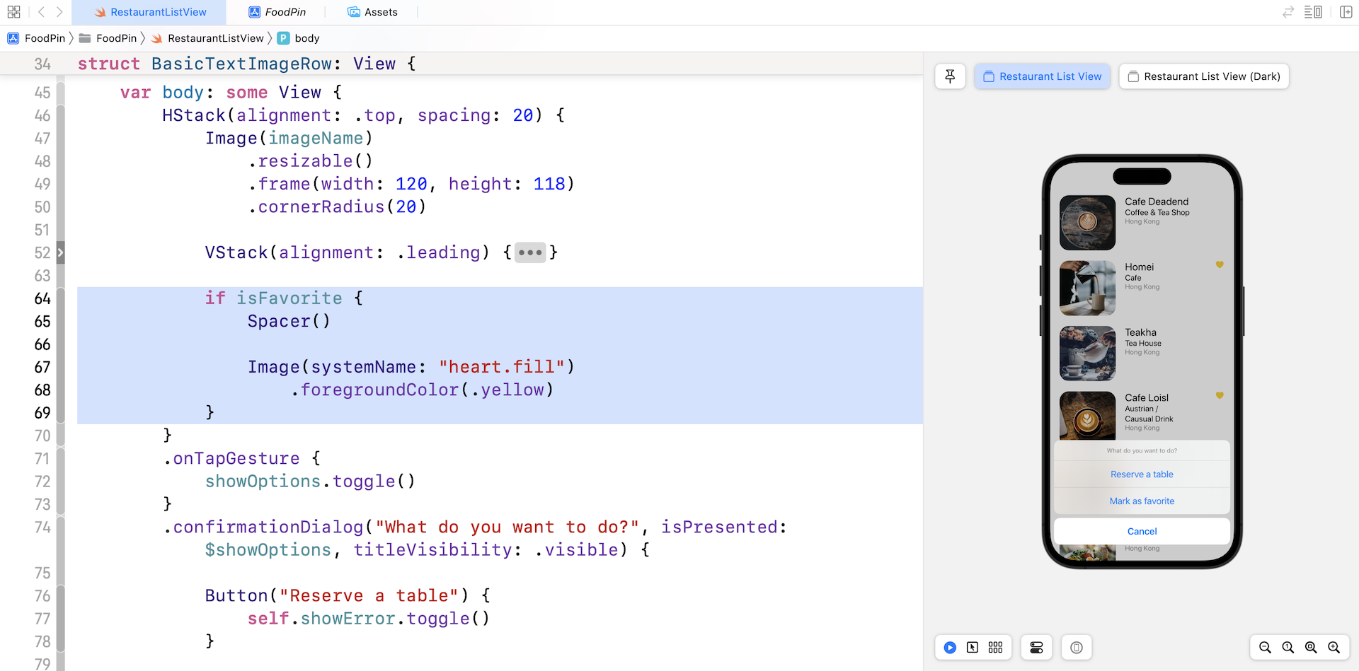
Next, update the code of HStack by adding the heart image:
HStack(alignment: .top, spacing: 20) {
    Image(imageName)
        .resizable()
        .frame(width: 120, height: 118)
        .cornerRadius(20)

    .
    .
    .

    if isFavorite {
        Spacer()

        Image(systemName: "heart.fill")
            .foregroundColor(.yellow)
    }
}
We check if the value of isFavorite is set to true. In this case, we add the Image view to the HStack. We use the built-in system image from SF Symbols and set the color of the image to yellow. The Spacer is used to push the heart image to the right edge.
The BasicTextImageRow is now ready to add a heart icon for restaurants which are marked as favorites. The last step is to update the following line of code in RestaurantListView from:
BasicTextImageRow(imageName: restaurantImages[index], name: restaurantNames[index], type: restaurantTypes[index], location: restaurantLocations[index])
To:
BasicTextImageRow(imageName: restaurantImages[index], name: restaurantNames[index], type: restaurantTypes[index], location: restaurantLocations[index], isFavorite: $restaurantIsFavorites[index])
We inserted the new parameter isFavorite and pass the binding of the corresponding array item. That's it! Let's test the app by running it on a simulator or in the preview pane.
Previewing the Row Layout
Before we close this chapter, let me share a trick to preview the row layout. Now we have implemented two row layouts including BasicTextImageRow and FullImageRow. We can easily switch between one and another in the RestaurantListView struct.
That said, what if I want to preview these row layouts at the same time? How can we do that?
All views in SwiftUI can be previewed. You can update the RestaurantListView_Previews struct like this:
struct RestaurantListView_Previews: PreviewProvider {
    static var previews: some View {
        RestaurantListView()

        RestaurantListView()
            .preferredColorScheme(.dark)
            .previewDisplayName("Restaurant List View (Dark)")

        BasicTextImageRow(imageName: "cafedeadend", name: "Cafe Deadend", type: "Cafe", location: "Hong Kong", isFavorite: .constant(true))
            .previewLayout(.sizeThatFits)
            .previewDisplayName("BasicTextImageRow")

        FullImageRow(imageName: "cafedeadend", name: "Cafe Deadend", type: "Cafe", location: "Hong Kong")
            .previewLayout(.sizeThatFits)
            .previewDisplayName("FullImageRow")
    }
}
We added the BasicTextImageRow and FullImageRow views to the preview struct. The modifier previewLayout is new to you. Instead of previewing the row layout on a full-sized simulator, I just want to render the preview in a container. By attaching the previewLayout modifier and set its value to .sizeThatFits, we can achieve a preview of the row layouts like that shown in Figure 8-14. Please note that you need to change to Selectable mode to preview the layout.
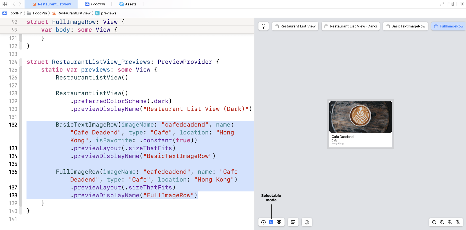
The .constant(true) is known as a constant binding. For preview purpose, we just pass BasicTextImageRow a hard-coded value that don't change.
Exercise #1
In the project, we also created another type of row layout called FullImageRow. Your task is to modify the code of FullImageRow such that it also supports the Mark as favorite feature.

Exercise #2
Presently the app doesn't allow users to remove the heart icon. Think about how you can alter the code such that the app can toggle the heart icon. You'll also need to show a different title for the Remove from favorites button if the selected restaurant is marked. It's not too hard to make the changes. Take some time to work on the exercise. I'm sure you'll learn a lot.
Summary
At this point, you should have a solid understanding of how to create list views, implement various types of row layout and handle row selection. You're ready to build a simple list view app on your own. I always recommend you to create your own project. I don't mean you have to start a big one. If you love to travel, create a simple app that displays a list of your favorite destinations. If you love music, create your own app that shows a list of your favorite albums. Just play around with Xcode, make mistake and learn along the way.
For reference, you can download the complete Xcode project from http://www.appcoda.com/resources/swift57/swiftui-foodpin-list-selection.zip. For the solution of the exercise, you can download it from http://www.appcoda.com/resources/swift57/swiftui-foodpin-list-selection-exercise.zip.
In the next chapter, we'll continue to explore list view and see how you can delete a row from the list.