- Made by AppCoda
- Contact us / Support
- Tweet this book
- Preface
- 1. The Development Tools, the Learning Approach, and the App Idea
- 2. Your First Taste of Swift with Playgrounds
- 3. Build Your First App in Swift and SwiftUI
- 4. Designing UI Using Stack Views
- 5. Introduction to Prototyping
- 6. Understanding List and ForEach
- 7. Customizing List Views
- 8. Displaying Confirmations and Handling List View Selection
- 9. Understanding Struct, Project Organization and Code Documentation
- 10. List Deletion, Swipe Actions, Context Menus and Activity Controller
- 11. Working with Navigation View
- 12. Detail View Enhancement, Custom Fonts and Navigation Bar Customization
- 13. Understanding Colors, Swift Extensions and Dynamic Type
- 14. Working with Maps
- 15. View Animations and Blur Effect
- 16. Working with Observable Objects and Combine
- 17. Working with Forms and Camera
- 18. Working with Core Data
- 19. Adding a Search Bar Using Searchable
- 20. Building Walkthrough Screens Using TabView
- 21. Working with Tab View and Tab Bar Customizations
- 22. Displaying Web Content with WKWebView and SFSafariViewController
- 23. Working with CloudKit
- 24. Localizing Your App to Support Multiple Languages
- 25. Deploying and Testing Your App on a Real iOS Device
- 26. Beta Testing with TestFlight and CloudKit Production Deployment
- 27. Submit Your App to App Store
- 28. Adopting Haptic Touch
- 29. Working with User Notifications
- 30. Appendix - Swift Basics
- Published with GitBook
Chapter 17
Working with Forms and Camera

My biggest motivation? Just to keep challenging myself. I see life almost like one long University education that I never had. Every day I'm learning something new.
- Richard Branson
Up till now, the FoodPin app is only capable of displaying content. We need to find a way for users to add a new restaurant. In this chapter, we will create a new screen that displays an input form for collecting restaurant information. In the form, it will let users pick a restaurant photo from the built-in photo library. You'll learn a number of techniques:
- How to create a form input using
TextFieldandTextEditor - How to access the built-in photo library and work with camera
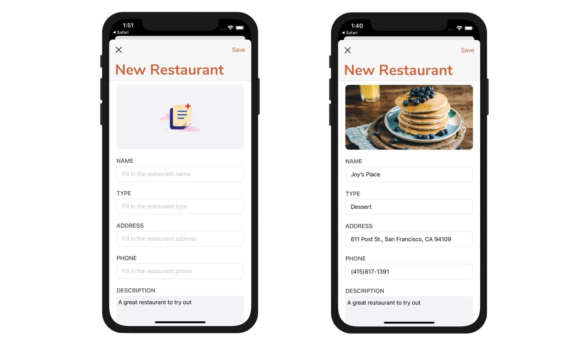
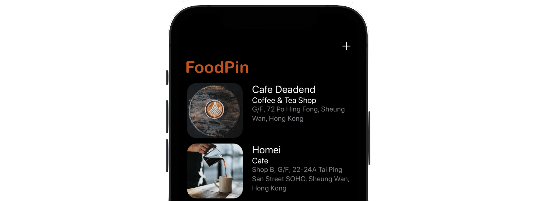
Figure 17-1 shows you the screen that we are going to build. It's a simple input form that comprises text fields and text view.
Understanding Text Field in SwiftUI
If you read this book from the very beginning, you should be very familiar with stack views. By using VStack, you can easily create the form layout. The question is how to create a text field in SwiftUI?
The framework provides a view componenent named TextField for you to create text fields. You usually initiate TextField with a field and a binding to its field value. Here is an example:
TextField("Name", text: $name)
    .font(.system(size: 20, weight: .semibold, design: .rounded))
    .padding(.horizontal)
This renders an editable text field with the user's input stored in the given binding. Similar to other types of view in SwiftUI, you can modify its look & feel by applying the associated modifiers.
Building Generic Form Fields for User Input
The most straightforward way to lay out the form is to create each of the form fields one by one. Having that said, you should notice that most of the form fields share the same design. Basically, we can break the form fields into two categories:
- A text field having a label for securing the input of name, type, address, and phone.
- A text view with a label for securing the description input.
In this case, we can create a generic form field for each of the categories. If you haven't opened the FoodPin project, it's time to launch Xcode.
Let's start by creating a new file named NewRestaurantView.swift under the View folder. Right click the View folder and choose New file.... Select the SwiftUI View template and name the file NewRestaurantView.swift.
Our goal is to create a generic text field that takes in a label name and a binding for holding the field value. I don't want to jump to the final answer. Let's implement it step by step. First, we will see how to layout one of the text fields (e.g. NAME). Now update the NewRestaurantView struct like this:
struct NewRestaurantView: View {

    @State var restaurantName = ""

    var body: some View {
        TextField("Fill in the restaurant name", text: $restaurantName)
            .font(.system(size: 20, weight: .semibold, design: .rounded))
            .padding(.horizontal)
    }
}
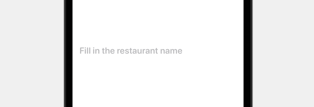
The code above instantiates a text field with a place holder and a binding to restaurantName. In the preview, you should see a text field without borders. If you want to fill in some values, you have to run the app.
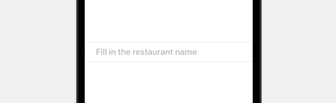
To add borders to the text field, we can attach the overlay modifier and draw a rounded rectangle around it. Update the text field like below:
TextField("Fill in the restaurant name", text: $restaurantName)
    .font(.system(size: 20, weight: .semibold, design: .rounded))
    .padding(.horizontal)
    .padding(10)
    .overlay(
        RoundedRectangle(cornerRadius: 5)
            .stroke(Color(.systemGray5), lineWidth: 1)
    )
    .padding(.vertical, 10)
To draw an empty rectangle, we create a RoundedRectangle view and apply the stroke modifier. The line width is set to 1 point and the stroke color is set to light gray.
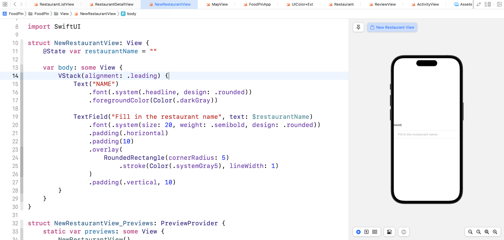
Lastly, let's wrap the text field using a VStack and add a label for the text field like this:
VStack(alignment: .leading) {
    Text("NAME")
        .font(.system(.headline, design: .rounded))
        .foregroundColor(Color(.darkGray))

    TextField("Fill in the restaurant name", text: $restaurantName)
        .font(.system(size: 20, weight: .semibold, design: .rounded))
        .padding(.horizontal)
        .padding(10)
        .overlay(
            RoundedRectangle(cornerRadius: 5)
                .stroke(Color(.systemGray5), lineWidth: 1)
        )
        .padding(.vertical, 10)
}
The code is very straightforward. We added a Text view to display the label for the text field. The figure below shows you the result.
Now that you should understand how to create a text field, the next step is to convert it into a dynamic text field, so that we do not need to replicate the code for building other text fields.
Let's create a new struct named FormTextField like this:
struct FormTextField: View {
    let label: String
    var placeholder: String = ""

    @Binding var value: String

    var body: some View {
        VStack(alignment: .leading) {
            Text(label.uppercased())
                .font(.system(.headline, design: .rounded))
                .foregroundColor(Color(.darkGray))

            TextField(placeholder, text: $value)
                .font(.system(.body, design: .rounded))
                .textFieldStyle(PlainTextFieldStyle())
                .padding(10)
                .overlay(
                    RoundedRectangle(cornerRadius: 5)
                        .stroke(Color(.systemGray5), lineWidth: 1)
                )
                .padding(.vertical, 10)

        }
    }
}
The code in the body part is almost the same as before except that the field label, placeholder, and field value depend on these parameters:
label- the label displayed right above the text fieldplaceholder- the initial value of the text fieldvalue- the binding to the field value
By passing a different value of the parameters, we can easily create a custom text field. For example, to create the same text field as we discussed earlier, we can write the code like below:
FormTextField(label: "Name", placeholder: "Fill in the restaurant name", value: $restaurantName)
Isn't this great? We can easily create more text fields without writing a lot of lines of code.
For better preview experience, you further edit NewRestaurantView_Previews like this:
struct NewRestaurantView_Previews: PreviewProvider {
static var previews: some View {
NewRestaurantView()
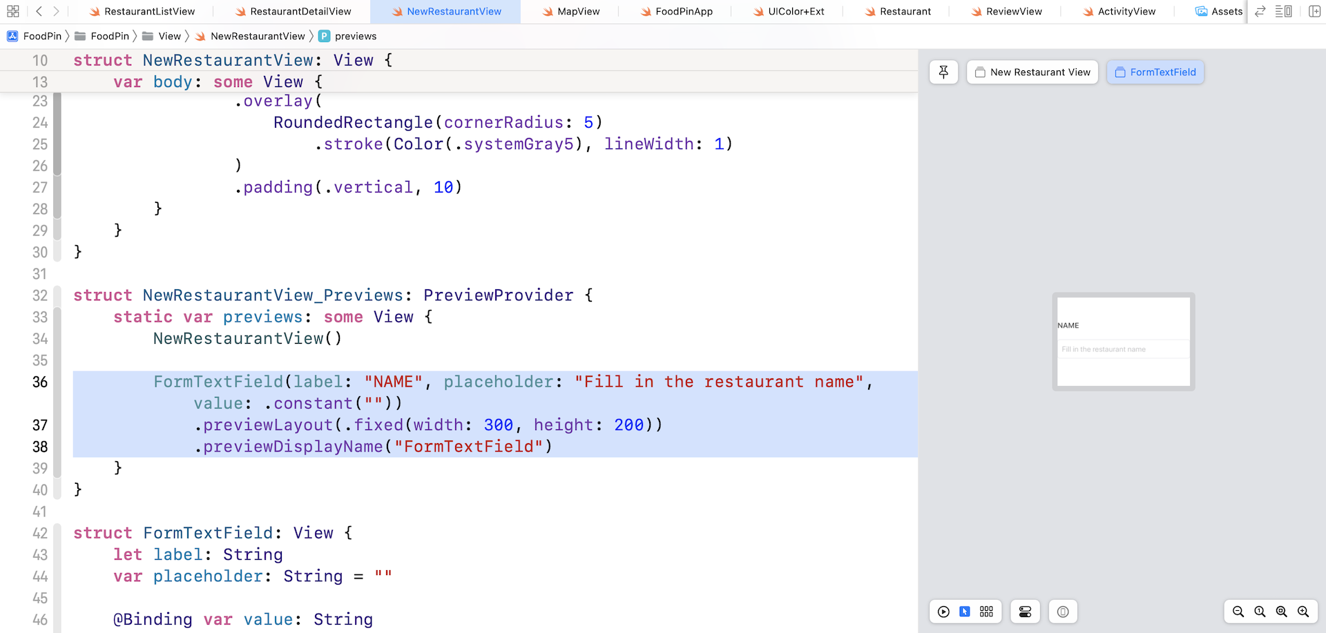
FormTextField(label: "NAME", placeholder: "Fill in the restaurant name", value: .constant(""))
.previewLayout(.fixed(width: 300, height: 200))
.previewDisplayName("FormTextField")
}
}
Xcode then renders a separate preview for the text field. This technique is very useful when you want to set up a preview for a specific view component. Please select the Selectable mode in order to preview a fixed-size layout.
Now that we have completed the implementation of the text field, let's move onto the multiline text view. For multiline input, you can use TextEditor provided by the SwiftUI framework.
Similar to FormTextField, we create an independent view component for the text view. Let's name it FormTextView and implement it like this:
struct FormTextView: View {

    let label: String

    @Binding var value: String

    var height: CGFloat = 200.0

    var body: some View {
        VStack(alignment: .leading) {
            Text(label.uppercased())
                .font(.system(.headline, design: .rounded))
                .foregroundColor(Color(.darkGray))

            TextEditor(text: $value)
                .frame(maxWidth: .infinity)
                .frame(height: height)
                .padding(10)
                .overlay(
                    RoundedRectangle(cornerRadius: 5)
                        .stroke(Color(.systemGray5), lineWidth: 1)
                )
                .padding(.top, 10)

        }
    }
}
To use TextEditor, you just need to pass a binding to store the value of the user input. To preview the FormTextView, insert the following line of code in NewRestaurantView_Previews:
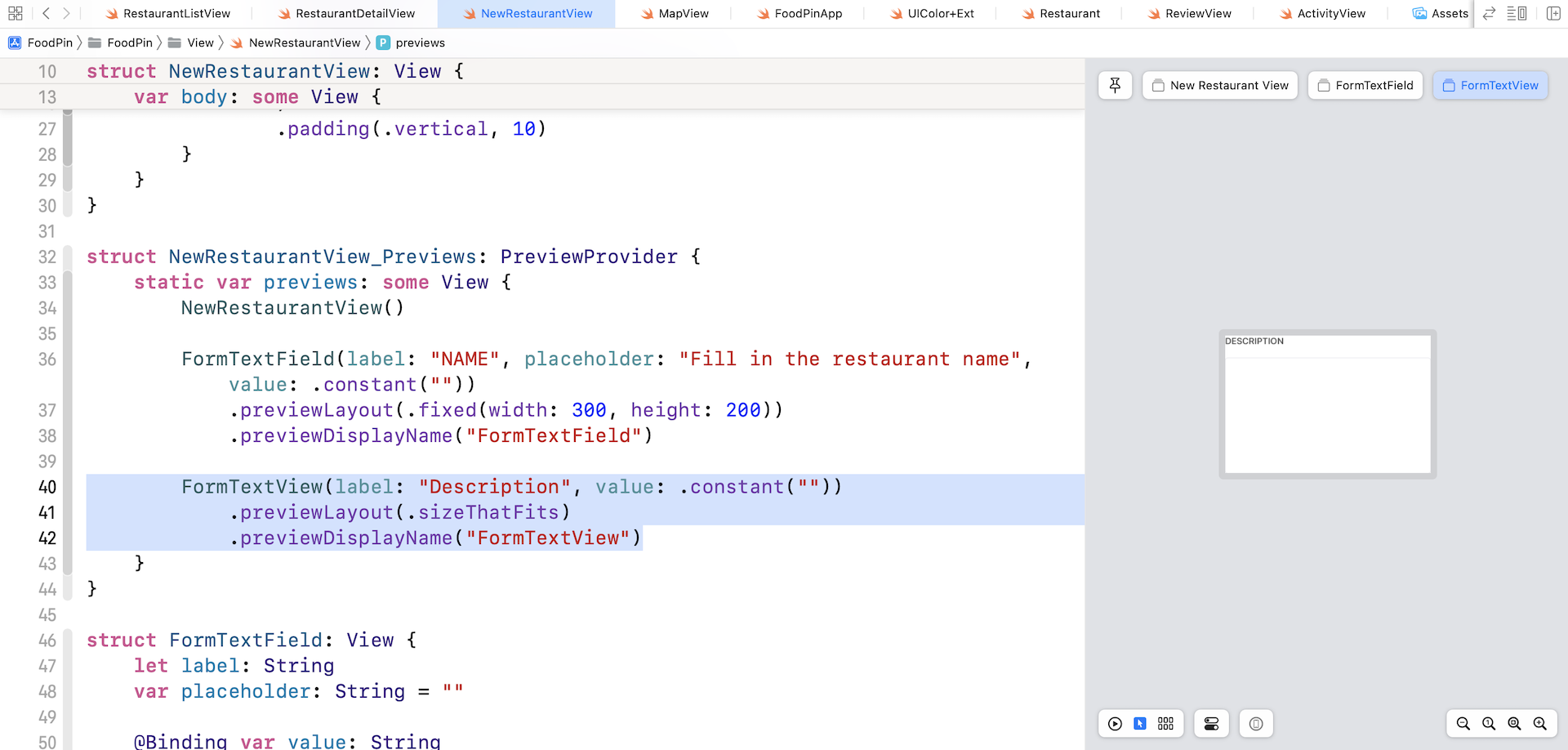
FormTextView(label: "Description", value: .constant(""))
    .previewLayout(.sizeThatFits)
    .previewDisplayName("FormTextView")
If you made the changes correctly, Xcode should render the text view in the preview pane.
Implementing the Restaurant Form
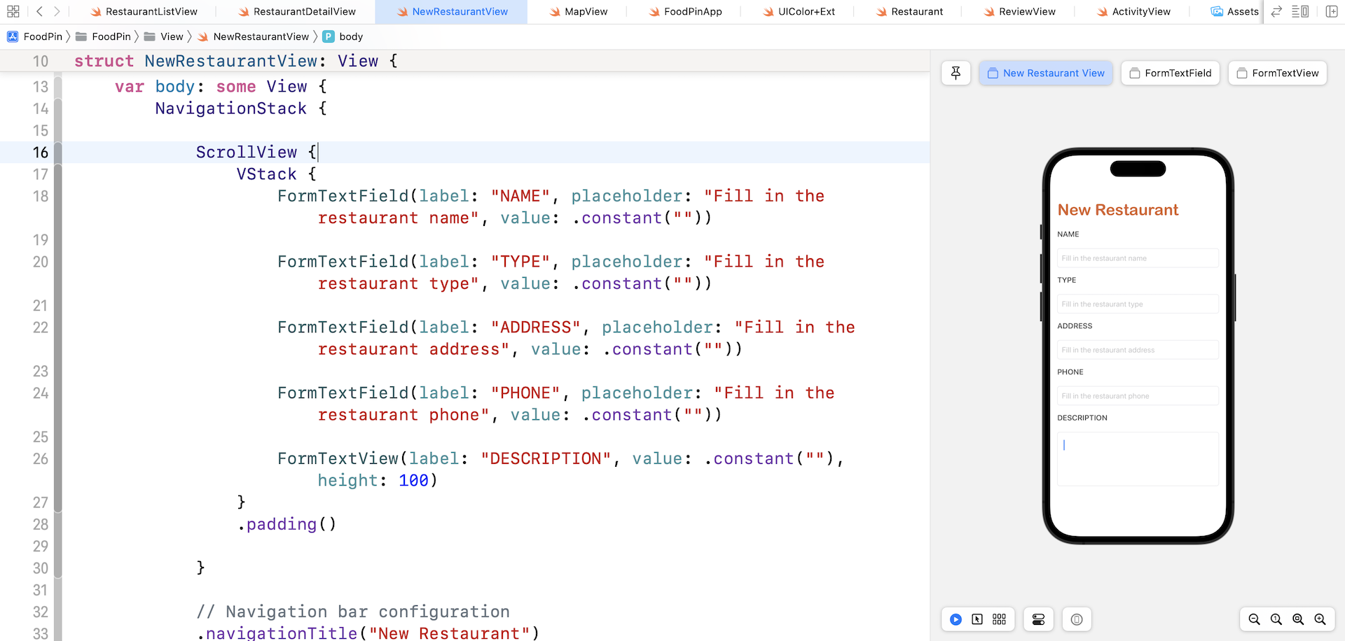
With the implementation of both FormTextField and FormTextView, we are now ready to build the restaurant form. Update the NewRestaurantView struct like this:
struct NewRestaurantView: View {

    var body: some View {
        NavigationStack {

            ScrollView {
                VStack {
                    FormTextField(label: "NAME", placeholder: "Fill in the restaurant name", value: .constant(""))

                    FormTextField(label: "TYPE", placeholder: "Fill in the restaurant type", value: .constant(""))

                    FormTextField(label: "ADDRESS", placeholder: "Fill in the restaurant address", value: .constant(""))

                    FormTextField(label: "PHONE", placeholder: "Fill in the restaurant phone", value: .constant(""))

                    FormTextView(label: "DESCRIPTION", value: .constant(""), height: 100)
                }
                .padding()

            }

            // Navigation bar configuration
            .navigationTitle("New Restaurant")
        }
    }
}
First, we have a navigation view with a bar title New Restaurant. The form is quite long, so we wrap the form fields with a ScrollView. Inside the scroll view, we create 4 text fields and a text view by using the subviews we just created. Currently, the value of the fields is set to .constant(""). In the next chapter, we will further change the code.
Test the app in the preview pane and it should show you an editable form.
Working with Photo Library and Camera
The restaurant form has a field for users to attach the restaurant photo, which can be chosen from the built-in photo library or taken using the device's camera. In this section, we will look into the implementation.
Before we begin to build the camera feature, please download this image file (https://www.appcoda.com/resources/swift53/newphotoicon.zip) and add it to the asset catalog.
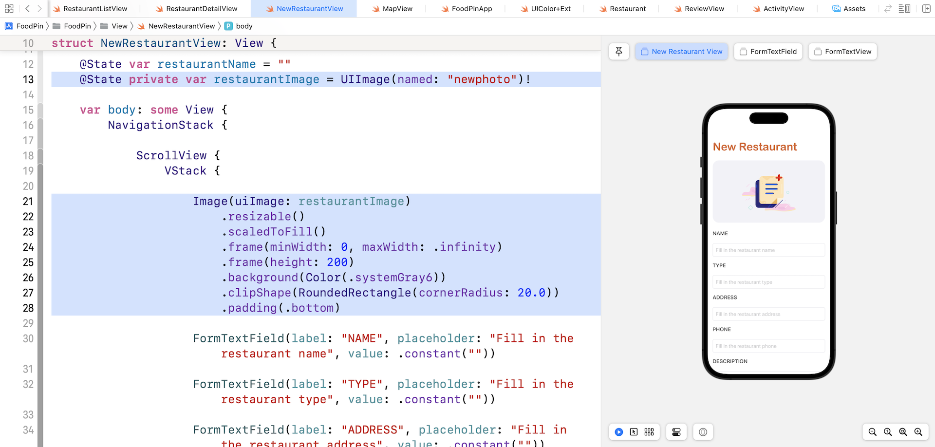
In the restaurant form, we are going to add an image view to hold the restaurant photo. To do that, we need a state variable to keep track of the user's selection. In NewRestaurantView, declare the following variable:
@State private var restaurantImage = UIImage(named: "newphoto")!
We initialize the variable with the newphoto image using UIImage. The reason why we store the image as an UIImage object is that the image returned from the photo library also has a type of UIImage.
Next, insert the following code snippet before the first FormTextField:
Image(uiImage: restaurantImage)
    .resizable()
    .scaledToFill()
    .frame(minWidth: 0, maxWidth: .infinity)
    .frame(height: 200)
    .background(Color(.systemGray6))
    .clipShape(RoundedRectangle(cornerRadius: 20.0))
    .padding(.bottom)
We load the restaurantImage using the Image view and set the scaling mode to scaledToFill. In the preview, it should show you an image view right above all the other form fields.
When the image view is tapped, the app will bring up an action sheet and ask the user to choose the photo source (either photo library or camera). To do so, we need a state variable to trigger the action sheet. Declare the following variable in NewRestaurantView:
@State private var showPhotoOptions = false
Also, declare an enum to represent the available photo source and a state variable to hold the photo source selection:
enum PhotoSource: Identifiable {
    case photoLibrary
    case camera

    var id: Int {
        hashValue
    }
}

@State private var photoSource: PhotoSource?
Next, attach the .actionSheet modifier to the navigation stack:
.actionSheet(isPresented: $showPhotoOptions) {

    ActionSheet(title: Text("Choose your photo source"),
                message: nil,
                buttons: [
                    .default(Text("Camera")) {
                        self.photoSource = .camera
                    },
                    .default(Text("Photo Library")) {
                        self.photoSource = .photoLibrary
                    },
                    .cancel()
                ])
}
The .actionSheet modifier monitors the status of the showPhotoOptions variable. If it's set to true, it instantiates the ActionSheet with the camera and photo library options.
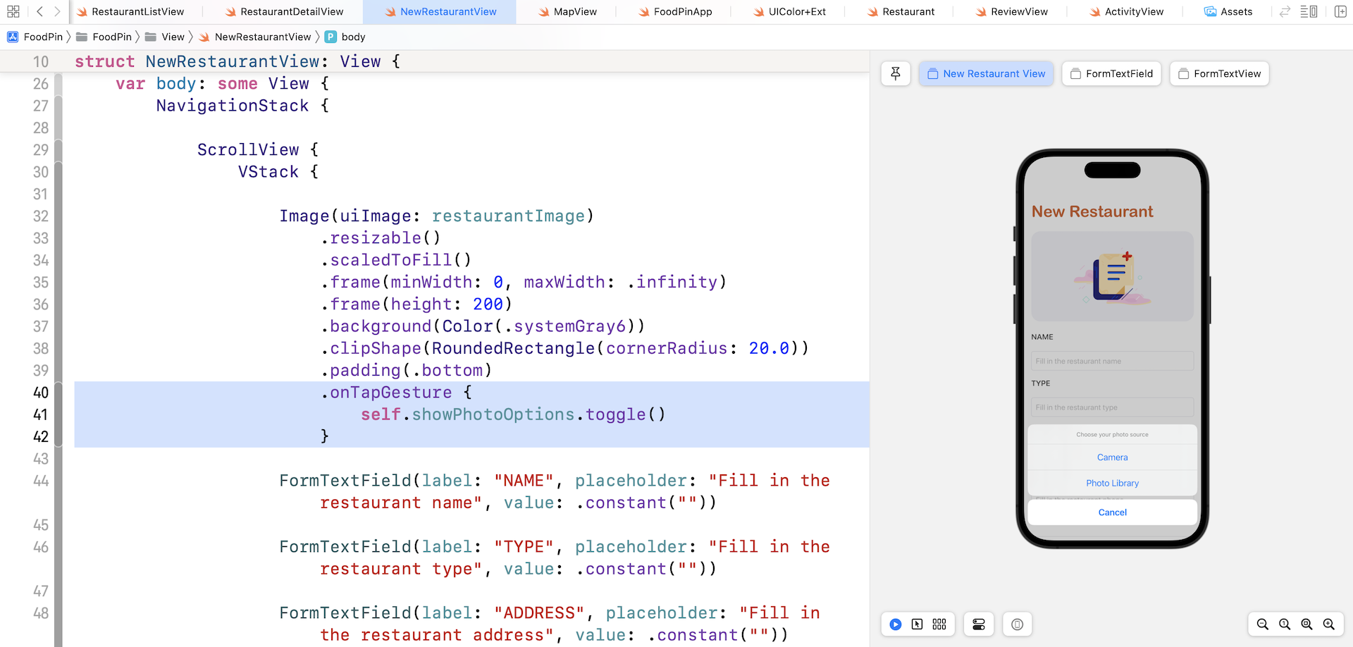
Lastly, attach the .onTapGesture modifier to the Image view to trigger the action sheet:
.onTapGesture {
    self.showPhotoOptions.toggle()
}
To test the change, tap the image in the preview pane. You should see the action sheet when you tap the image view.
So, how can you access the photo library and camera using SwiftUI? The SwiftUI framework doesn't come with a native component for working with camera. We have to use the UIImagePickerController class from UIKit.
In the project navigator, let's create a new group called Util (Right click FoodPin and choose New Group). We will create a SwiftUI version of UIImagePickerController here.
Next, right click the Util folder and choose New File.... Select the Swift File template and name the file ImagePicker.swift.
Once the file is created, replace the content like this:
import UIKit
import SwiftUI

struct ImagePicker: UIViewControllerRepresentable {

    var sourceType: UIImagePickerController.SourceType = .photoLibrary

    @Binding var selectedImage: UIImage
    @Environment(\.dismiss) private var dismiss

    func makeUIViewController(context: UIViewControllerRepresentableContext<ImagePicker>) -> UIImagePickerController {

        let imagePicker = UIImagePickerController()
        imagePicker.allowsEditing = false
        imagePicker.sourceType = sourceType
        imagePicker.delegate = context.coordinator

        return imagePicker
    }

    func updateUIViewController(_ uiViewController: UIImagePickerController, context: UIViewControllerRepresentableContext<ImagePicker>) {

    }

    func makeCoordinator() -> Coordinator {
        Coordinator(self)
    }

    final class Coordinator: NSObject, UIImagePickerControllerDelegate, UINavigationControllerDelegate {

        var parent: ImagePicker

        init(_ parent: ImagePicker) {
            self.parent = parent
        }

        func imagePickerController(_ picker: UIImagePickerController, didFinishPickingMediaWithInfo info: [UIImagePickerController.InfoKey : Any]) {

            if let image = info[UIImagePickerController.InfoKey.originalImage] as? UIImage {
                parent.selectedImage = image
            }

            parent.dismiss()
        }
    }
}
For the purpose of backward compatibility, Apple introduced a couple of new protocols, namely UIViewRepresentable and UIViewControllerRepresentable in the iOS SDK. With these protocols, you can wrap a UIKit view (or view controller) and make it available to your SwiftUI project.
Basically, you just need to create a struct in SwiftUI that adopts the protocol to create and manage a UIView object. Here is the skeleton of the custom wrapper for a UIKit view:
struct CustomView: UIViewRepresentable {

    func makeUIView(context: Context) -> some UIView {
        // Return the UIView object
    }

    func updateUIView(_ uiView: some UIView, context: Context) {
        // Update the view
    }
}
In the actual implementation, we replace some UIView with the UIKit view you want to wrap. Here it's UIImagePickerController.
The ImagePicker struct accepts a source type, which is set to photo library by default, and a binding to the selected image. In the makeUIViewController method, we instantiate an instance of UIImagePickerController and set its source type. This is how you open the photo library or access the device's camera.
The Coordinator class is used to save the user's selected photo into the selectedImage binding. It conforms to the UIImagePickerControllerDelegate protocol and implement the imagePickerController(_:didFinishPickingMediaWithInfo) method.
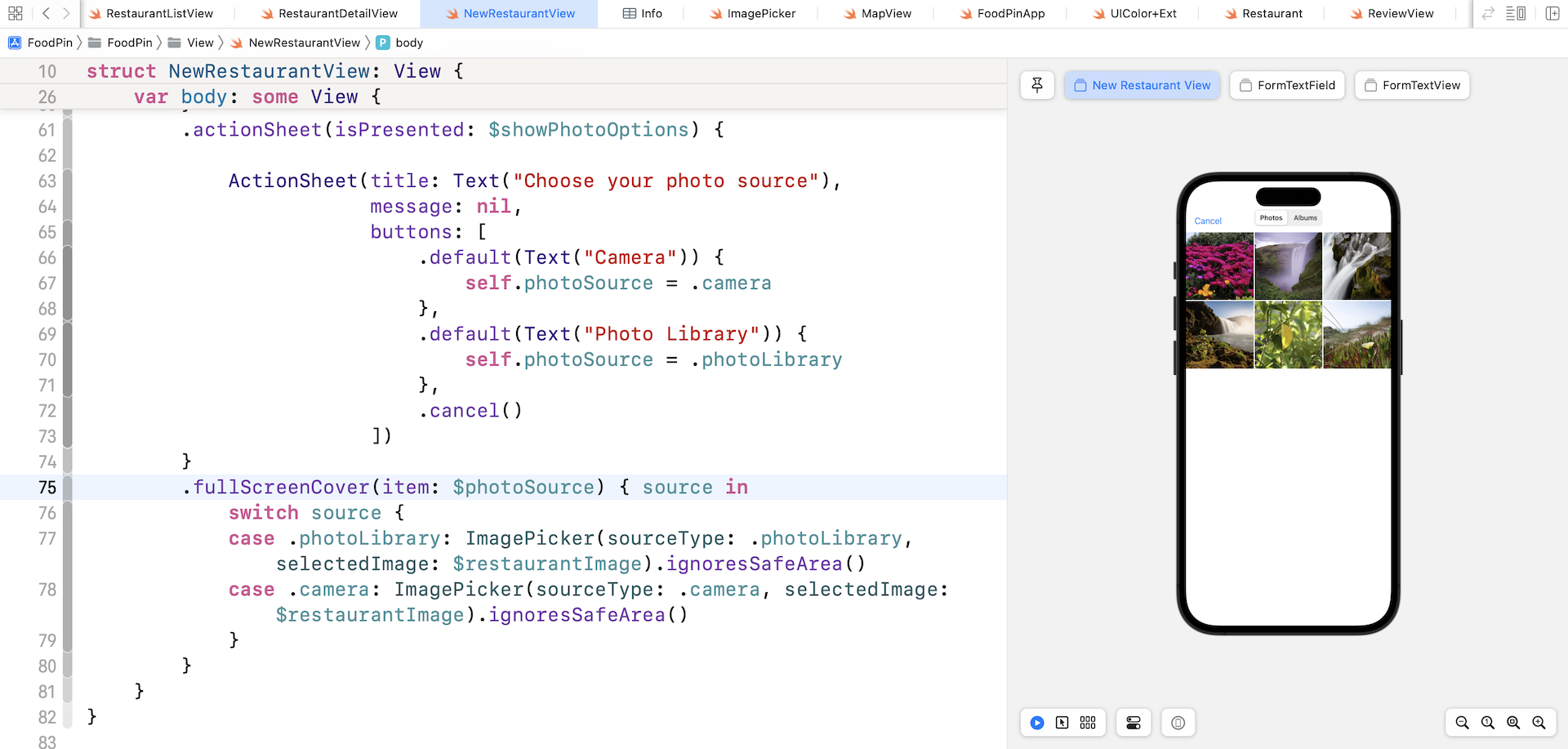
Now switch back NewRestaurantView.swift to modify the code. Attach the .fullScreenCover modifier to the navigation view:
.fullScreenCover(item: $photoSource) { source in
    switch source {
    case .photoLibrary: ImagePicker(sourceType: .photoLibrary, selectedImage: $restaurantImage).ignoresSafeArea()
    case .camera: ImagePicker(sourceType: .camera, selectedImage: $restaurantImage).ignoresSafeArea()
    }
}
The .fullScreenCover modifier works like .actionSheet but presents the modal view in full screen style. In the code above, we monitor the value change of photoSource and bring up the ImagePicker accordingly. We pass the binding of restaurantImage to ImagePicker. When the user takes a photo or chooses one from the photo library, the selected photo will be stored in restaurantImage. Thus, SwiftUI will update the image view automatically to display the selected image.
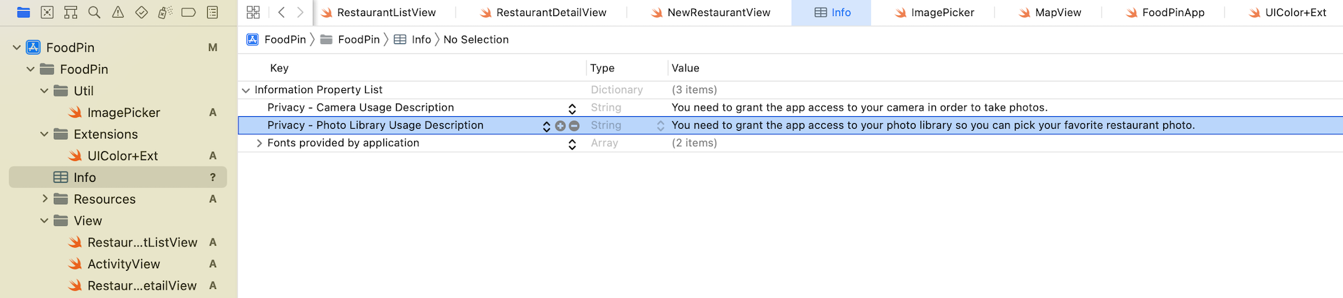
There is one more configuration need to be done. For privacy reasons, you have to explicitly describe the reason why your app accesses the user's photo library or camera. If you fail to do so, you may end up with an error. This is why you need to add two keys ( NSPhotoLibraryUsageDescription and NSCameraUsageDescription) in the Info.plist file and provide your reason.
Now select Info.plist in the project navigator. Right-click Information Property List in the editor and select Add Row. Choose "Privacy - Photo Library Usage Description" for the key and set the value to:
You need to grant the app access to your photo library so you can pick your favorite restaurant photo.
Repeat the same procedure and add another row. Set the key to "Privacy - Camera Usage Description" and the value to:
You need to grant the app access to your camera in order to take photos.
Now test the app in a simulator or in the preview pane. You should be able to access the photo library. If you test the app on a real device, you will be able to open the built-in camera.
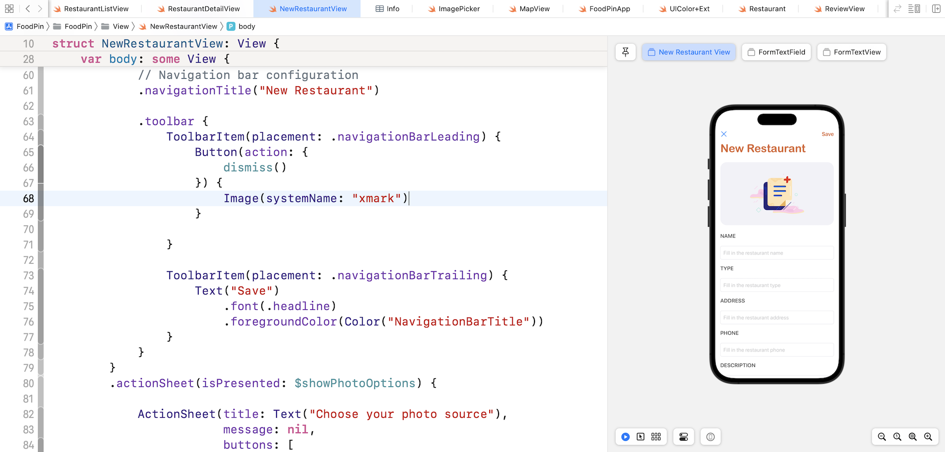
Adding Toolbar Buttons
There are two buttons missing in the form: Save and Cancel. We will add these buttons by using a toolbar that places the buttons in the top space of the view.
In NewRestaurant, insert the following code right below .navigationTitle("New Restaurant"):
.toolbar {
    ToolbarItem(placement: .navigationBarLeading) {
        Button(action: {
            dismiss()
        }) {
            Image(systemName: "xmark")
        }

    }

    ToolbarItem(placement: .navigationBarTrailing) {
        Text("Save")
            .font(.headline)
            .foregroundColor(Color("NavigationBarTitle"))
    }
}
The .toolbar modifier creates toolbar at the top space of the view. In the closure, we create two toolbar items: one for the cancel button and the other for the save button.
The cancel button will dismiss the current view, while the implementation of the save button will be implemented in a later chapter.
To make the code work, we also need to declare the dismiss variable like this:
@Environment(\.dismiss) var dismiss
The New Restaurant screen now should display a toolbar above the New Restaurant title.
You may notice that the close button is in blue. To change its color to black, you can attach the .accentColor modifier to the navigation stack:
.accentColor(.primary)
Presenting the New Restaurant View
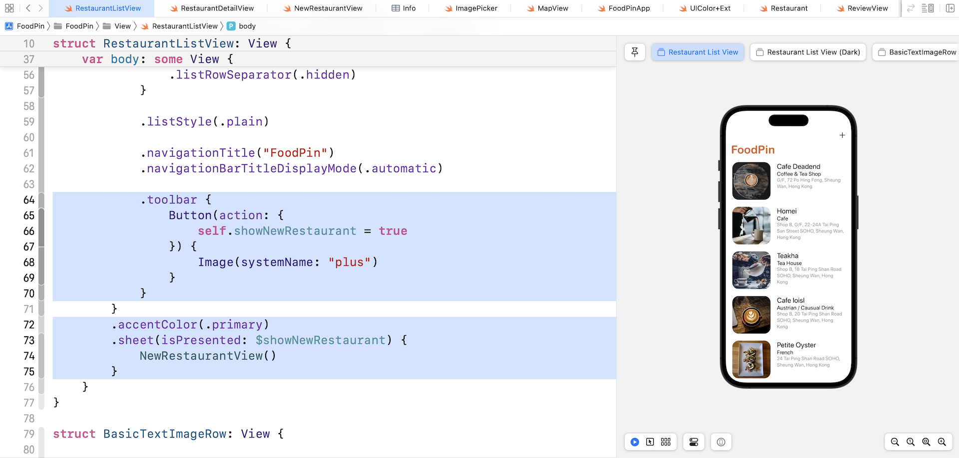
The New Restaurant view works pretty good. It's time to go to the RestaurantListView.swift file and edit the code to launch the screen. We will add a toolbar item in the navigation bar of the list view for users to bring up the form view.
In RestaurantListView, declare a new state variable:
@State private var showNewRestaurant = false
Then attach the .sheet modifier to the navigation stack for opening the New Restaurant view:
.sheet(isPresented: $showNewRestaurant) {
    NewRestaurantView()
}
The .sheet modifier monitors the status of showNewRestaurant. If it's set to true, it will open the view modally.
Lastly, create a toolbar button for users to add a new restaurant. Insert the following code below .navigationBarTitleDisplayMode(.automatic):
.toolbar {
    Button(action: {
        self.showNewRestaurant = true
    }) {
        Image(systemName: "plus")
    }
}
You may need to update the .accentColor modifier and set the color to .primary:
.accentColor(.primary)
That's it! You are ready to have the final test. Run the app in a simulator and tap the + button to open the New Restaurant view.
Summary
In this chapter, you learned how to create text field and text view for multiline input using TextField and TextEditor. You also learned how to access the built-in photo library by tapping into UIImagePickerController from UIKit.
The SwiftUI framework is still fairly new. Though it's ready for production development, one drawback is that it doesn't come with all the standard UI components. From time to time, you may need to tap into the old UIKit framework. That said, once you understand the usage of the UIViewRepresentable protocol, it's not difficult to integrate UIKit views in SwiftUI projects.
For reference, you can download the complete Xcode project from http://www.appcoda.com/resources/swift57/swiftui-foodpin-camera.zip.
Next up, we will talk about Core Data and see how to save the restaurant data in a database.